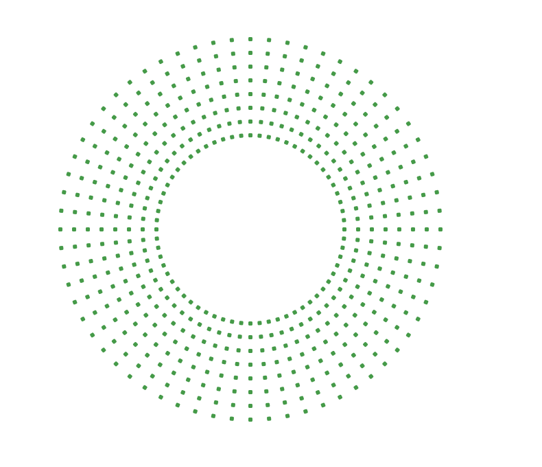
圆圈中心的波纹
我把每个圆都做成点阵列,我试图使用来自中心的Anime.js创建涟漪效果。我已经尝试了各种方法并努力使它正常工作,是否有人知道我该怎么做?
到目前为止,我的代码是CodePen,动画部分在底部。我希望它像this那样起伏不定,但不能在这种情况下起作用。
var container     = document.getElementById('container');
var numberOfDots    = 512;
var numberOfCircles = 8;
var dotsPerCircle   = numberOfDots / numberOfCircles;
var circles         = [];

function createDot(i, circleDepth) {
    var rotation  = (360 / dotsPerCircle) * i;
    var height    = "calc( 30% + " + (circleDepth * 10) + "px)";
    var container = document.createElement('div');
          container.classList = 'dot';
          container.style.height = height;
          container.style.transform = 'rotate(' + rotation + 'deg) translateY(-50%)';

    var dot       = document.createElement('span');
        container.appendChild(dot);

    return container;
}

function createCircle(circleDepth) {
    var dotArray = [];
    for (var i = 1; i <= dotsPerCircle; i++) {
        var dot = createDot(i, circleDepth);
        container.appendChild(dot);
        dotArray.push(dot.querySelector('span'));
    }
    return dotArray;
}

for (var i = 1; i <= numberOfCircles; i++) {
    circles.push(createCircle(i));
}

// Animation
var duration   = 6000;
var delay      = duration / numberOfDots;
var myTimeline = anime.timeline({
    complete: function() { myTimeline.restart(); }
});
for (var i = 0; i < circles.length; i++) {
    var dotArray = circles[i];
    myTimeline.add({
        targets: dotArray,
        easing: 'easeInOutSine',
        direction: 'alternate',
        duration: duration * .1,
        scale: [
            {value: 1.6, easing: 'spring(1, 80, 10, 0)', duration: 1000},
            {value: 1, easing: 'spring(1, 80, 10, 0)', duration: 1000}
        ],
    }, "-=990")
}
1 个答案:
答案 0 :(得分:0)
这是我的建议:使用CSS动画!与anime.js之类的库相比,它们总是永远更流畅,更高性能。通过根据元素所在的层为animation-delay元素设置不同的.dot属性,可以使点从内圈传播到最外层,一次形成一层波纹。
我认为以下内容看起来不太糟。注意,这实际上仅是使用html和css。 javascript仅用于生成html!
let makeRipple = (numRings=8, dotsPerRing=64, ringEndAmt=0.5, rippleMs=1000) => {

  // ringEndAmt: The portion of ripple filled by rings (0.5 = half the radius is empty of dots)
  // rippleMs: The amount of time between the inner layer and outer layer pulsing

  let ripple = document.createElement('div');
  ripple.classList.add('ripple');

  for (let r = 0; r < numRings; r++) { for (let d = 0; d < dotsPerRing; d++) {

    // `r` indexes the layer we're in, from inner to outermost
    // `d` indexes the specific dot within layer `r`

    let radius = 1 - ((r / numRings) * ringEndAmt);
    let angAmt = (d / dotsPerRing) * Math.PI * 2;

    let [ x, y ] = [ Math.cos(angAmt), Math.sin(angAmt) ].map(v => v * radius);

    let dot = document.createElement('div');
    dot.classList.add('dot');
    dot.style.left = `${(x + 1) * 50}%`;
    dot.style.top = `${(y + 1) * 50}%`;
    dot.style.animationDelay = `${Math.round((1 - ((r + 1) / numRings)) * rippleMs)}ms`;
    ripple.appendChild(dot);

  }}

  return ripple;

};

document.body.appendChild(makeRipple());
@keyframes pulseRipple {
0% { transform: scale(0.8); }
12% { transform: scale(0.8); }
16% { transform: scale(0.82); }
24% { transform: scale(0.993); }
26% { transform: scale(1); }
33% { transform: scale(0.8); }
100% { transform: scale(0.8); }
}
@keyframes pulseDot {
0% { background-color: rgba(0, 150, 0, 0.1); transform: translate(0px, 0px) scale(1); }
10% { background-color: rgba(0, 150, 0, 0.1); transform: translate(0px, 0px) scale(1); }
20% { background-color: rgba(0, 150, 0, 0.8); transform: translate(2px, 2px) scale(2); }
30% { background-color: rgba(0, 150, 0, 0.1); transform: translate(0px, 0px) scale(1); }
}
.ripple {
position: relative;
background-color: rgba(0, 150, 0, 0.02);
border-radius: 100%;
width: 45%; padding-bottom: 45%;
box-shadow: 0 0 0 2px rgba(0, 150, 0, 0.02);
animation-name: pulseRipple;
animation-duration: 8000ms;
animation-iteration-count: infinite;
animation-timing-function: ease-in;
}
.ripple > .dot {
position: absolute;
background-color: rgba(0, 150, 0, 0.1);
width: 4px;
height: 4px;
margin-left: -2px; margin-top: -2px; /* Dots are centered */
border-radius: 100%;
animation-name: pulseDot;
animation-duration: 8000ms;
animation-iteration-count: infinite;
animation-timing-function: ease-in-out;
}
相关问题
最新问题
- 我写了这段代码,但我无法理解我的错误
- 我无法从一个代码实例的列表中删除 None 值,但我可以在另一个实例中。为什么它适用于一个细分市场而不适用于另一个细分市场?
- 是否有可能使 loadstring 不可能等于打印?卢阿
- java中的random.expovariate()
- Appscript 通过会议在 Google 日历中发送电子邮件和创建活动
- 为什么我的 Onclick 箭头功能在 React 中不起作用?
- 在此代码中是否有使用“this”的替代方法?
- 在 SQL Server 和 PostgreSQL 上查询,我如何从第一个表获得第二个表的可视化
- 每千个数字得到
- 更新了城市边界 KML 文件的来源?