SVG Drop Shadow Layering
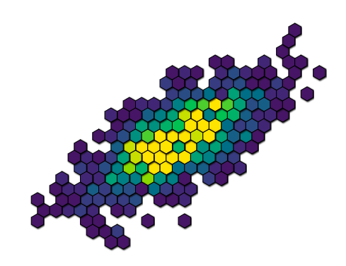
我想使用d3和SVG制作阴影,但是我遇到了与相邻元素重叠的阴影问题。请参阅下图,了解其当前外观。请注意,中间的六边形似乎具有不同的高度,因为阴影正在其中一些上方呈现。我想做的是设置阴影,使它们只在背景上渲染,而不是在其他相邻的十六进制顶部。
以下是当前如何定义阴影的代码:
      var filter = defs.append("filter")
        .attr("id", "drop-shadow")
        .attr("height", "130%");

    // SourceAlpha refers to opacity of graphic that this filter will be applied to
    // convolve that with a Gaussian with standard deviation 3 and store result
    // in blur
    filter.append("feGaussianBlur")
        .attr("in", "SourceAlpha")
        .attr("stdDeviation", 1)
        .attr("result", "blur");

    // translate output of Gaussian blur to the right and downwards with 2px
    // store result in offsetBlur
    filter.append("feOffset")
        .attr("in", "blur")
        .attr("dx", 1)
        .attr("dy", 1)
        .attr("result", "offsetBlur");

    // overlay original SourceGraphic over translated blurred opacity by using
    // feMerge filter. Order of specifying inputs is important!
    var feMerge = filter.append("feMerge");

    feMerge.append("feMergeNode")
        .attr("in", "offsetBlur")
    feMerge.append("feMergeNode")
        .attr("in", "SourceGraphic");
然后将这些样式应用于六边形:
d3.select(this).style("filter", "url(#drop-shadow)")
2 个答案:
答案 0 :(得分:5)
您不需要在两个层中创建一大堆重复项。您需要做的就是将所有六边形包装在一个组(<g>)中并将过滤器应用于该组。
&#13;
&#13;
&#13;
&#13;
<svg>
  <defs>
    <filter id="drop-shadow" width="150%" height="150%">
      <feGaussianBlur in="SourceAlpha" stdDeviation="3" result="blur"/>
      <feOffset in="blur" dx="2" dy="2" result="offsetBlur"/>
      <feMerge>
        <feMergeNode in="offsetBlur"/>
        <feMergeNode in="SourceGraphic"/>
      </feMerge>
    </filter>
  </defs>

  <rect x="75" y="75" width="50" height="50" fill="cyan"
        filter="url(#drop-shadow)"/>
  <rect x="75" y="25" width="50" height="50" fill="gold"
        filter="url(#drop-shadow)"/>
  <rect x="25" y="75" width="50" height="50" fill="lime"
        filter="url(#drop-shadow)"/>
  <rect x="25" y="25" width="50" height="50" fill="red"
        filter="url(#drop-shadow)"/>

  <g filter="url(#drop-shadow)" transform="translate(150,0)">
    <rect x="75" y="75" width="50" height="50" fill="cyan"/>
    <rect x="75" y="25" width="50" height="50" fill="gold"/>
    <rect x="25" y="75" width="50" height="50" fill="lime"/>
    <rect x="25" y="25" width="50" height="50" fill="red"/>
  </g>
</svg>
答案 1 :(得分:-2)
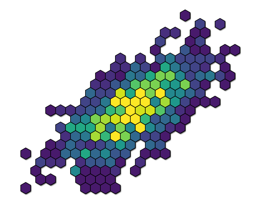 我找到了一个临时解决方案。基本上,它涉及在不同的层上创建两组六边形:
- 在底层上设置一个没有填充/描边但有阴影的
- 在顶层上设置了一个包含所有填充/笔划但没有阴影的
由于#2高于#1,阴影不会出现在任何可见的六边形之上......
相关问题
最新问题
- 我写了这段代码,但我无法理解我的错误
- 我无法从一个代码实例的列表中删除 None 值,但我可以在另一个实例中。为什么它适用于一个细分市场而不适用于另一个细分市场?
- 是否有可能使 loadstring 不可能等于打印?卢阿
- java中的random.expovariate()
- Appscript 通过会议在 Google 日历中发送电子邮件和创建活动
- 为什么我的 Onclick 箭头功能在 React 中不起作用?
- 在此代码中是否有使用“this”的替代方法?
- 在 SQL Server 和 PostgreSQL 上查询,我如何从第一个表获得第二个表的可视化
- 每千个数字得到
- 更新了城市边界 KML 文件的来源?