灰度背景Css图像
我在网上搜索过很多但我找不到一个跨浏览器解决方案来淡化css背景图像到灰度和背面。
唯一可行的解决方案是应用CSS3过滤器灰度:
-webkit-filter: grayscale(100%);
但这适用于Chrome v.15 +和Safari v.6 + (你可以在这里看到:http://css3.bradshawenterprises.com/filters/)
许多在线网页都谈到了灰色元素的解决方案:
filter: url("data:image/svg+xml;utf8,<svg xmlns=\'http://www.w3.org/2000/svg\'><filter id=\'grayscale\'><feColorMatrix type=\'matrix\' values=\'0.3333 0.3333 0.3333 0 0 0.3333 0.3333 0.3333 0 0 0.3333 0.3333 0.3333 0 0 0 0 0 1 0\'/></filter></svg>#grayscale"); /* Firefox 10+, Firefox on Android */
filter: gray; /* IE6-9 */
(正如您在此处所见:http://www.karlhorky.com/2012/06/cross-browser-image-grayscale-with-css.html)
但实际上它似乎不适用于CSS背景图像,就像webkit过滤器一样。
是否有任何解决方案(可能使用jquery?)来破解在不太高级的浏览器上缺少对过滤器的支持?
5 个答案:
答案 0 :(得分:71)
你走了:
<html xmlns="http://www.w3.org/1999/xhtml">
<head runat="server">
<title>bluantinoo CSS Grayscale Bg Image Sample</title>
<style type="text/css">
    div {
        border: 1px solid black;
        padding: 5px;
        margin: 5px;
        width: 600px;
        height: 600px;
        float: left;
        color: white;
    }
     .grayscale {
         background: url(yourimagehere.jpg);
         -moz-filter: url("data:image/svg+xml;utf8,<svg xmlns=\'http://www.w3.org/2000/svg\'><filter id=\'grayscale\'><feColorMatrix type=\'matrix\' values=\'0.3333 0.3333 0.3333 0 0 0.3333 0.3333 0.3333 0 0 0.3333 0.3333 0.3333 0 0 0 0 0 1 0\'/></filter></svg>#grayscale");
         -o-filter: url("data:image/svg+xml;utf8,<svg xmlns=\'http://www.w3.org/2000/svg\'><filter id=\'grayscale\'><feColorMatrix type=\'matrix\' values=\'0.3333 0.3333 0.3333 0 0 0.3333 0.3333 0.3333 0 0 0.3333 0.3333 0.3333 0 0 0 0 0 1 0\'/></filter></svg>#grayscale");
         -webkit-filter: grayscale(100%);
         filter: gray;
         filter: url("data:image/svg+xml;utf8,<svg xmlns=\'http://www.w3.org/2000/svg\'><filter id=\'grayscale\'><feColorMatrix type=\'matrix\' values=\'0.3333 0.3333 0.3333 0 0 0.3333 0.3333 0.3333 0 0 0.3333 0.3333 0.3333 0 0 0 0 0 1 0\'/></filter></svg>#grayscale");
     }

    .nongrayscale {
        background: url(yourimagehere.jpg);
    }
</style>
</head>
<body>
    <div class="nongrayscale">
        this is a non-grayscale of the bg image
    </div>
    <div class="grayscale">
        this is a grayscale of the bg image
    </div>
</body>
</html>
在FireFox,Chrome和IE中测试过它。我还附上了一张图片,以显示我执行此操作的结果。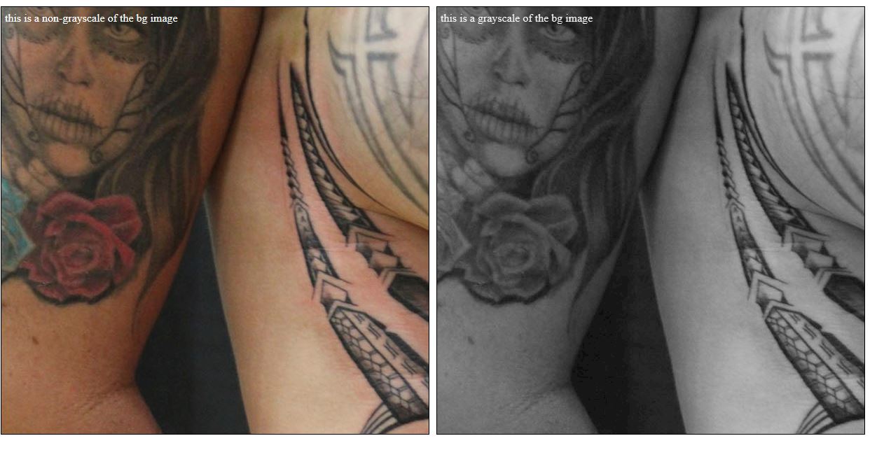
编辑:另外,如果你想让图像只是用jQuery来回切换,这里是页面源代码...我已经将jt的web链接包括在内了在线,所以你应该只能复制/粘贴测试它:
<html xmlns="http://www.w3.org/1999/xhtml">
<head runat="server">
<title>bluantinoo CSS Grayscale Bg Image Sample</title>
<script src="http://code.jquery.com/jquery-1.11.0.min.js"></script>
<style type="text/css">
    div {
        border: 1px solid black;
        padding: 5px;
        margin: 5px;
        width: 600px;
        height: 600px;
        float: left;
        color: white;
    }
     .grayscale {
         background: url(http://www.polyrootstattoo.com/images/Artists/Buda/40.jpg);
         -moz-filter: url("data:image/svg+xml;utf8,<svg xmlns=\'http://www.w3.org/2000/svg\'><filter id=\'grayscale\'><feColorMatrix type=\'matrix\' values=\'0.3333 0.3333 0.3333 0 0 0.3333 0.3333 0.3333 0 0 0.3333 0.3333 0.3333 0 0 0 0 0 1 0\'/></filter></svg>#grayscale");
         -o-filter: url("data:image/svg+xml;utf8,<svg xmlns=\'http://www.w3.org/2000/svg\'><filter id=\'grayscale\'><feColorMatrix type=\'matrix\' values=\'0.3333 0.3333 0.3333 0 0 0.3333 0.3333 0.3333 0 0 0.3333 0.3333 0.3333 0 0 0 0 0 1 0\'/></filter></svg>#grayscale");
         -webkit-filter: grayscale(100%);
         filter: gray;
         filter: url("data:image/svg+xml;utf8,<svg xmlns=\'http://www.w3.org/2000/svg\'><filter id=\'grayscale\'><feColorMatrix type=\'matrix\' values=\'0.3333 0.3333 0.3333 0 0 0.3333 0.3333 0.3333 0 0 0.3333 0.3333 0.3333 0 0 0 0 0 1 0\'/></filter></svg>#grayscale");
     }

    .nongrayscale {
        background: url(http://www.polyrootstattoo.com/images/Artists/Buda/40.jpg);
    }
</style>
    <script type="text/javascript">
        $(document).ready(function () {
            $("#image").mouseover(function () {
                $(".nongrayscale").removeClass().fadeTo(400,0.8).addClass("grayscale").fadeTo(400, 1);
            });
            $("#image").mouseout(function () {
                $(".grayscale").removeClass().fadeTo(400, 0.8).addClass("nongrayscale").fadeTo(400, 1);
            });
        });
</script>
</head>
<body>
    <div id="image" class="nongrayscale">
        rollover this image to toggle grayscale
    </div>
</body>
</html>
编辑2(对于IE10-11用户):上述解决方案不适用于微软最近对浏览器所做的更改,因此这里有一个更新的解决方案,可以让您进行灰度(或去饱和)你的图像。
<svg>
  <defs>
    <filter xmlns="http://www.w3.org/2000/svg" id="desaturate">
      <feColorMatrix type="saturate" values="0" />
    </filter>
  </defs>
  <image xlink:href="http://www.polyrootstattoo.com/images/Artists/Buda/40.jpg" width="600" height="600" filter="url(#desaturate)" />
</svg>
答案 1 :(得分:15)
使用当前浏览器,您可以像这样使用它:
img {
  -webkit-filter: grayscale(100%); /* Chrome, Safari, Opera */
  filter: grayscale(100%);
}
并补救:
img:hover{
   -webkit-filter: grayscale(0%); /* Chrome, Safari, Opera */
   filter: grayscale(0%);
}
与我合作并且更短。 CSS中还有更多可以做的事情:
filter: none | blur() | brightness() | contrast() | drop-shadow() | grayscale() |
        hue-rotate() | invert() | opacity() | saturate() | sepia() | url();
有关更多信息和支持的浏览器,请参阅:http://www.w3schools.com/cssref/css3_pr_filter.asp
答案 2 :(得分:7)
我知道这是一个非常老的问题,但这是在duckduckgo上的第一个结果,因此我想分享一下我认为这是一个更好,更现代的解决方案。
您可以使用background-blend-mode属性来获得灰度图像:
#something {
  background-color: #fff;
  background-image: url("yourimage");
  background-blend-mode: luminosity;
}
如果要删除效果,只需将混合模式更改为initial。
如果此元素位于具有背景的物体上,则可能需要使用背景色。我发现灰度并不取决于实际的颜色,而是取决于alpha值。因此,如果父级背景为蓝色,请在#something上设置相同的背景。
您还可以使用两张图像,一张带有彩色图像,另一张不带有彩色图像,并将它们设置为背景并在其他混合模式下播放。
https://www.w3schools.com/cssref/pr_background-blend-mode.asp
虽然它在Edge上不起作用。
编辑:我已经错过了问题的“淡入淡出”部分。
如果您不想使其从灰度渐变为淡入淡出,则可以在背景色上使用css过渡来更改其alpha值:
#something {
  background-color: rgba(255,255,255,1);
  background-image: url("yourimage");
  background-blend-mode: luminosity;
  transition: background-color 1s ease-out;
}
#something:hover {
  background-color: rgba(255,255,255,0);
}
我还为完整性https://codepen.io/anon/pen/OBKKVZ添加了一个Codepen示例
答案 3 :(得分:-3)
您也可以使用:
img{
   filter:grayscale(100%);
}


img:hover{
   filter:none;
}
答案 4 :(得分:-5)
你真的不需要使用复杂的编码!
Greyscale Hover:
-webkit-filter:灰度(100%);
灰度“悬停”:
-webkit-filter:灰度(0%);
我只是让我的css类有一个单独的悬停类,并在第二个灰度级中添加。如果你真的不喜欢复杂性,这真的很简单。
- 我写了这段代码,但我无法理解我的错误
- 我无法从一个代码实例的列表中删除 None 值,但我可以在另一个实例中。为什么它适用于一个细分市场而不适用于另一个细分市场?
- 是否有可能使 loadstring 不可能等于打印?卢阿
- java中的random.expovariate()
- Appscript 通过会议在 Google 日历中发送电子邮件和创建活动
- 为什么我的 Onclick 箭头功能在 React 中不起作用?
- 在此代码中是否有使用“this”的替代方法?
- 在 SQL Server 和 PostgreSQL 上查询,我如何从第一个表获得第二个表的可视化
- 每千个数字得到
- 更新了城市边界 KML 文件的来源?