html / css六边形与里面的图像
是否有可能将图像放在六边形内? 我习惯hexagonal shaped cells in html,但我不能用(背景?)图像填充它。
以下是我的尝试:
.top {
  height: 0;
  width: 0;
  display: block;
  border: 20px solid red;
  border-top-color: transparent;
  border-right-color: transparent;
  border-bottom-color: red;
  border-left-color: transparent;
}
.middle {
  height: 20px;
  background: red;
  width: 40px;
  display: block;
}
.bottom {
  height: 0;
  width: 0;
  display: block;
  border: 20px solid red;
  border-top-color: red;
  border-right-color: transparent;
  border-bottom-color: transparent;
  border-left-color: transparent;
}
<div class="hexagon pic">
<span class="top" style="background: url(http://placekitten.com/400/400/)"></span>
<span class="middle" style="background: url(http://placekitten.com/400/400/)"></span>
<span class="bottom" style="background: url(http://placekitten.com/400/400/)"></span>
</div>
<div class="hexagon">
<span class="top" style="overflow: hidden;"><img src="http://placekitten.com/400/400/" /></span>
<span class="middle" style="overflow: hidden;"><img src="http://placekitten.com/400/400/" /></span>
<span class="bottom" style="overflow: hidden;"><img src="http://placekitten.com/400/400/" /></span>
</div>
<div class="hexagon">
<span class="top"><img src="http://placekitten.com/400/400/" /></span>
<span class="middle"><img src="http://placekitten.com/400/400/" /></span>
<span class="bottom"><img src="http://placekitten.com/400/400/" /></span>
</div>
这是一个小提琴:http://jsfiddle.net/jnz31/kGSCA/
7 个答案:
答案 0 :(得分:65)
使用CSS3几乎一切皆有可能:http://jsfiddle.net/kizu/bhGn4/
在那里我使用overflow: hidden进行了不同的旋转,因此你可以获得一个跨浏览器(好吧,现代交叉更加蒙版)的面具甚至可以在蒙面区域上进行覆盖和点击
答案 1 :(得分:16)
使用图像实现六边形的最灵活方法是使用内嵌SVG :
svg{
  width:30%;
}
<svg viewBox="0 0 100 100" version="1.1" xmlns="http://www.w3.org/2000/svg">
<defs>
<pattern id="img" patternUnits="userSpaceOnUse" width="100" height="100">
<image xlink:href="https://farm4.staticflickr.com/3165/5733278274_2626612c70.jpg" x="-25" width="150" height="100" />
</pattern>
</defs>
<polygon points="50 1 95 25 95 75 50 99 5 75 5 25" fill="url(#img)"/>
</svg>
使用SVG至少有两种方法可以实现六边形图像:
- 制作一个六边形多边形并用图像填充多边形和
pattern元素(我在前一个片段中使用的方法) - 使用六角形多边形剪切图像(请参阅下一个代码段)
svg{width:30%}<svg viewbox="0 0 100 100" version="1.1" xmlns="http://www.w3.org/2000/svg">
<defs>
<clipPath id="hexClip">
<polygon points="50 1 99 25 99 75 50 99 1 75 1 25"/>
</clipPath>
</defs>
<image xlink:href="https://farm4.staticflickr.com/3165/5733278274_2626612c70.jpg" x="-25" width="150" height="100" clip-path="url(#hexClip)"/>
</svg>
SVG方法允许控制六边形形状和图像的许多方面。它们可以用CSS设计。这是一个例子:
svg{
  width:30%;
  margin:0 auto;
}
#hex{
  stroke-width:2;
  stroke: teal;
  fill-opacity:0.6;
  transition:fill-opacity .8s;
}
#hex:hover{
  fill-opacity:1;
}
#text{
  stroke-width:0.5;
  stroke:teal;
  fill-opacity:0.4;
  fill:teal;
  transition:fill-opacity .8s;
}
#hex:hover + #text{
  fill-opacity:1;
}
<svg viewbox="0 0 100 100" version="1.1" xmlns="http://www.w3.org/2000/svg">
<defs>
<pattern id="img" patternUnits="userSpaceOnUse" width="100" height="100">
<image xlink:href="https://farm4.staticflickr.com/3165/5733278274_2626612c70.jpg" x="-25" width="150" height="100" />
</pattern>
</defs>
<polygon id="hex" points="50 1 95 25 95 75 50 99 5 75 5 25" fill="url(#img)"/>
<text id="text" font-size="20" x="50" y="50" text-anchor="middle">Some text</text>
</svg>
另一种制作带有图像的六边形的方法请查看以下问题:Responsive grid of hexagons
答案 2 :(得分:6)
你可以通过覆盖这样的角来实现:
http://jsfiddle.net/Eric/kGSCA/3/
HTML:
<div class="hexagon pic">
    <span class="top"></span>
    <span class="bottom"></span>
</div>
CSS:
.hexagon {
    background: url(http://placekitten.com/400/400/);
    width: 400px;
    height: 346px;
    position: relative;
}

.hexagon span {
    position: absolute;
    display: block;
    border-left: 100px solid red;
    border-right: 100px solid red;
    width: 200px;
}

.top {
    top: 0;
    border-bottom: 173px solid transparent;
}

.bottom {
    bottom: 0;
    border-top: 173px solid transparent;
}
答案 3 :(得分:6)
一种新的简单方法是使用css3 clip-path属性。
clip-path CSS属性可以阻止元素的一部分 通过定义要显示的剪辑区域来显示,即, 只显示元素的特定区域。
以下css将显示六边形的矩形元素:
div.hexagon {
  clip-path: polygon(50% 0, 100% 25%, 100% 75%, 50% 100%, 0 75%, 0 25%);
}
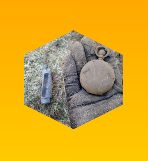
输出图片:
body {
  background: linear-gradient(orange, yellow);
  min-height: 100vh;
  margin: 0;
}
.hexagon {
  clip-path: polygon(50% 0, 100% 25%, 100% 75%, 50% 100%, 0 75%, 0 25%);
  background: url("https://i.imgur.com/waDgcnc.jpg") no-repeat;
  background-size: cover;
  margin: 10px auto;
  height: 200px;
  width: 200px;
}
<div class="hexagon">
</div>
我们可以使用此属性绘制我们想要的任何形状。以下是几个例子:
div.pentagon {
  clip-path: polygon(50% 0, 100% 45%, 80% 100%, 20% 100%, 0 45%);
}
div.octagon {
  clip-path: polygon(33.33% 0%, 66.66% 0%, 100% 33.33%, 100% 66.66%, 66.66% 100%, 33.33% 100%, 0 66.66%, 0 33.33%);
}
输出图片:

body {
  background: linear-gradient(orange, yellow);
  min-height: 100vh;
  margin: 0;
}
div {
  background: url("https://i.imgur.com/waDgcnc.jpg") no-repeat;
  background-size: cover;
  margin: 10px 20px;
  height: 170px;
  width: 170px;
  float: left;
}

.pentagon {
  clip-path: polygon(50% 0, 100% 45%, 80% 100%, 20% 100%, 0 45%);
}

.octagon {
  clip-path: polygon(33.33% 0%, 66.66% 0%, 100% 33.33%, 100% 66.66%, 66.66% 100%, 33.33% 100%, 0 66.66%, 0 33.33%);
}
<div class="pentagon">
</div>
<div class="octagon">
</div>
注意:IE和Edge不支持
clip-pathcss属性。 但是,预计Edge的未来版本将支持此功能 属性。
答案 4 :(得分:2)
<style>
.hex{
    width:80px;
    height:80px;
    background-image: url(http://placekitten.com/400/400/);
    background-size: cover;
    position:relative;
    margin:10px;
}
.hex:before, .hex:after{
    content:"";
    position:absolute;
    top:0px;height:40px;width:0px; /* 40 = height/2 */
    z-index:1;
    border:20px solid #FFF; /*change #FFF to your bg color*/
}
.hex:before{
    left:-20px; /* -1*borderWidth */
    border-right:40px solid transparent;/* width/2 */
}
.hex:after{
    left:40px; /* width/2 */
    border-left:40px solid transparent;/* width/2 */
}
</style>
<div class="hex"></div>
需要边框吗?背景img将更容易&amp;更快。
<div class="hex">
    <div style="position:absolute;top:-20px;left:-20px;bottom:-20px;right:-20px;
        z-index:2;background-image:url(/images/hexagon.png);">
    </div>
</div>
答案 5 :(得分:0)
我不知道这是否是您正在寻找的答案,但您可以在想要成为六边形的图像上放置一个六边形透明的.png,并让它像面具一样。
只需使用z-index
将透明png放在图像上即可答案 6 :(得分:0)
我认为没有任何外部图形可以用纯HTML / CSS做到这一点。可能有一些聪明的黑客使用你在问题中链接的技术,但它们只是 - 聪明的黑客 - 所以可能不适合在实际网站中使用(和大多数'聪明的黑客'一样,也可能至少有一些跨浏览器兼容性问题)。
你可以用Canvas或SVG来做。
Canvas是一种位图图形功能,也是HTML5规范的一部分。 SVG是一种矢量图形语言,可以在HTML页面中使用。
这些都是现代浏览器的功能,因此在大多数版本的Internet Explorer(IE8及更早版本)中都很遗憾。
幸运的是,IE确实支持类似于SVG的语言VML,并且有许多javacript库允许IE通过将它们转换为VML来使用Canvas和SVG。
另见:
- How can I use the HTML5 canvas element in IE?
- http://code.google.com/p/svg2vml/
- http://raphaeljs.com/
使用上面链接的任何工具,您可以使用Canvas或SVG绘制六边形(或任何其他)形状,并用图形填充它。
希望有所帮助。
- 我写了这段代码,但我无法理解我的错误
- 我无法从一个代码实例的列表中删除 None 值,但我可以在另一个实例中。为什么它适用于一个细分市场而不适用于另一个细分市场?
- 是否有可能使 loadstring 不可能等于打印?卢阿
- java中的random.expovariate()
- Appscript 通过会议在 Google 日历中发送电子邮件和创建活动
- 为什么我的 Onclick 箭头功能在 React 中不起作用?
- 在此代码中是否有使用“this”的替代方法?
- 在 SQL Server 和 PostgreSQL 上查询,我如何从第一个表获得第二个表的可视化
- 每千个数字得到
- 更新了城市边界 KML 文件的来源?