如何在CSS中制作带箭头的方框?
如何在CSS中制作带箭头的方框?
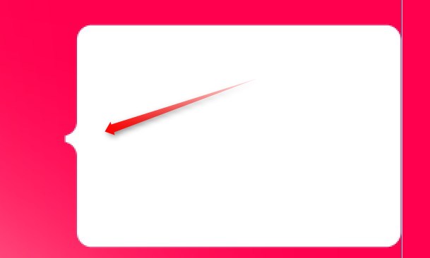
制作圆角很容易。但任何想法都是在不使用图像的情况下在左侧制作箭头。
是否可以使用
只有一个元素<p>....</p>
body {
  background: #ff004e;
  padding: 40px
}
p {
  background: white;
  -webkit-border-radius: 10px;
  -moz-border-radius: 10px;
  border-radius: 10px;
  width: 250px;
  height: 150px
}
<p></p>
7 个答案:
答案 0 :(得分:38)
像这样:
.arrow {
    border: solid 10px transparent;
    border-right-color: #FFF;
}
演示: http://jsfiddle.net/sparkup/edjdxjf2/
更新:
使用css属性:before
element:before {
    content: "";
    position: absolute;
    top: 50%;                         // half way down (vertical center).
    margin-top: -15px;                // adjust position, arrow has a height of 30px.
    left:-30px;
    border: solid 15px transparent;
    border-right-color: #FFF;
    z-index: 1;
}
演示:http://jsfiddle.net/sparkup/y89f1te0/
希望有所帮助
答案 1 :(得分:13)
Chris Coyier使用单个元素(以及之前/之后)对CSS内置的可能形状进行了精彩的综述: http://css-tricks.com/examples/ShapesOfCSS/
答案 2 :(得分:11)
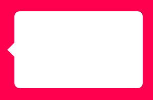
标准工具提示
如果你想要一个简单的箭头,那么你可以添加一个带有border-right的伪元素。
body {
    background:#ff004e;
    padding:40px;
}
p {
    background:white;
    border-radius: 10px;
    width:250px;
    height:150px;
    position: relative;
    display: inline-block;
}
p:before {
    content:"";
    position: absolute;
    height: 0px;
    width: 0px;
    top: 60px;
    left: -29px; /* 1px buffer for zooming problems while rendering*/
    border-width: 15px;
    border-color: transparent white transparent transparent;
    border-style: solid;
}
<p></p>
<强> FIDDLE 1
平边刀尖
如果您想要箭头的平边,请尝试以下操作:
body {
    background: #ff004e;
    padding:40px;
}
p {
    background:white;
    border-radius: 10px;
    width:250px;
    height:150px;
    position: relative;
    display: inline-block;
}
p:before {
    content:"";
    position: absolute;
    height: 45px;
    width: 16px; /* 1px buffer for zooming problems while rendering*/
    top: 50px;
    left: -15px;
    background: white;
}
p:after {
    content:"";
    position: absolute;
    height: 40px;
    width: 15px;
    border-radius: 0 40px 40px 0;
    top: 75px;
    left: -15px;
    background: #ff004e;
    box-shadow: 0 -45px 0 0 #ff004e;
}
<p></p>
<强> FIDDLE 2

答案 3 :(得分:3)
我的回答(没有扁平边缘), 添加了一些计算公式:
.mainBox {
    border: solid 1px #e0e0e0;
}

.mainBox:before {
    content:"";
    position: absolute;
    /*The right value must be calculated with: (top value of after) - (top value of before) = (right value of before) */
    /*example: (-4px) - (-7px) = 3px*/
    right: 72px;
    /*The `top` value must be identical to border-width*/
    top: -7px;
    width: 0;
    height: 0;
    border-style: solid;
    /*The `border-width` value must be identical to top*/
    border-width: 0 7px 7px 7px;
    /*The border color 3rd (#e0e0e0) value must be identical to its parent border color*/
    border-color: transparent transparent #e0e0e0 transparent;
    /*The (z-index of before) must at least one below the (z-index of after)*/
    /*Example: (z-index of before) < (z-index of after) or 9998 < 9999*/
    z-index:9998;
}

.mainBox:after {
    content:"";
    position: absolute;
    right: 75px;
    top: -4px; /*suppose to be identical to border-width*/
    width: 0;
    height: 0;
    border-style: solid;
    border-width: 0 4px 4px 4px;
    border-color: transparent transparent #fff transparent;
    z-index:9999;
}
基本规则是:
- 必须使用以下公式计算前右值: (
after的{{1}}) - (top的{{1}})=(before的{{1}})
示例:( - 4px) - ( - 7px)= 3px
top和before的{{1}}值必须与right相同。第3个边框颜色(示例中的#e0e0e0)值必须与其父边框颜色相同。
before的{{1}}必须至少有aftertop以下的border-width。
示例:(before的{{1}})&lt; (z-index的{{1}})或9998&lt; 9999。
结果:
答案 4 :(得分:3)
使用此在线工具,您可以在不输入大量代码的情况下完成此操作
答案 5 :(得分:0)
a.right{ border-style: dashed;
  border-color: transparent;
  border-width: 0.53em;
  display: -moz-inline-box;
  display: inline-block;
  font-size: 100px;
  height: 0;
  line-height: 0;
  position: relative;
  vertical-align: middle;
  width: 0; border-left-width: 1em;
  border-left-style: solid;
  border-left-color: #666;
  left: 0.25em; }
以上代码可用于右箭头。
答案 6 :(得分:-1)
如果你不想使用div,你可以使用span。
span#pointer{border:solid 10px transparent;border-right-color:#fff;position:absolute;margin:-85px 0 0 -20px;}
- 我写了这段代码,但我无法理解我的错误
- 我无法从一个代码实例的列表中删除 None 值,但我可以在另一个实例中。为什么它适用于一个细分市场而不适用于另一个细分市场?
- 是否有可能使 loadstring 不可能等于打印?卢阿
- java中的random.expovariate()
- Appscript 通过会议在 Google 日历中发送电子邮件和创建活动
- 为什么我的 Onclick 箭头功能在 React 中不起作用?
- 在此代码中是否有使用“this”的替代方法?
- 在 SQL Server 和 PostgreSQL 上查询,我如何从第一个表获得第二个表的可视化
- 每千个数字得到
- 更新了城市边界 KML 文件的来源?