如何创建具有渐变颜色的 3D 按钮 - React Native?
在 React Native 中,您将如何构建如下所示的按钮?

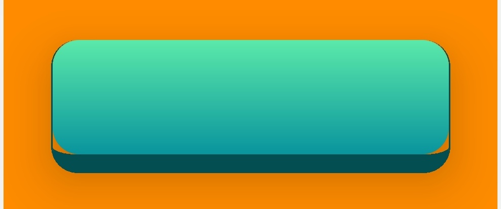
我已经做到了这一点:
但是边界存在问题。如您所见,边界半径和线性渐变组件之间存在间隙。这似乎是使用 LinearGradient 引起的问题,因为如果将 Linear Gradient 组件替换为按钮组件,则它不存在。
import React, { useState} from "react";
import {ImageBackground, StyleSheet, View, Text, TouchableOpacity } from "react-native";
import { LinearGradient } from 'expo-linear-gradient';

const styles = StyleSheet.create({
  container: {
         flex: 1,
  flexDirection: "column"


  },
   marginContainer: {
         flex: 1,
  flexDirection: "column",
  margin:20

  },


   buttonContainer:{

   flex:3,
   justifyContent: 'center',
   alignContent: "center",
   alignItems:"center"
   },

   modeButton:{

   width:300,
   height:100,

   borderRadius:20,
   borderRightWidth: 1,
   borderLeftWidth:1,
  borderBottomWidth: 14,
      borderColor: '#024e51',
      elevation:30,
     shadowColor: 'rgba(0, 0, 0, 0.4)',
    shadowOpacity: 0.8,
    elevation: 30,
    shadowRadius: 15 ,
    shadowOffset : { width: 1, height: 13},

   },
   pressableArea:{
   flexDirection:"row",
   justifyContent: 'center',
    alignItems: 'center',
   width:"100%",
   height:"100%"

   }


});


function SelectModeScreen() {

return(
<View style={styles.container}>

    <View style={styles.marginContainer}>

      <View style={[styles.buttonContainer,{  backgroundColor: "darkorange" }]} >
      <LinearGradient  colors={['#5be9aa',  '#09949d']} style={styles.modeButton}>
      <TouchableOpacity style={styles.pressableArea}   >

        </TouchableOpacity>
        </ LinearGradient>
      </View>


</View>
</View>
)
}```
2 个答案:
答案 0 :(得分:1)
这是工作示例:Expo Snack

import React, { useState } from 'react';
import {
  ImageBackground,
  StyleSheet,
  View,
  Text,
  TouchableOpacity,
} from 'react-native';
import { LinearGradient } from 'expo-linear-gradient';

const styles = StyleSheet.create({
  container: {
    flex: 1,
    flexDirection: 'column',
    justifyContent: 'center',
    alignItems: 'center',
  },
  buttonGrad: {
    height: 50,
    width: 200,
    borderRadius: 10,
    position: 'absolute',
    bottom: 5,
  },
  buttonParent: {
    height: 50,
    width: 200,
    borderRadius: 10,
    backgroundColor: '#024e51',
  },
});

function SelectModeScreen() {
  return (
    <View style={styles.container}>
      <TouchableOpacity onPress={() => console.log('btn pressed')}>
        <View style={styles.buttonParent}>
          <LinearGradient
            colors={['#5be9aa', '#09949d']}
            style={styles.buttonGrad}></LinearGradient>
        </View>
      </TouchableOpacity>
    </View>
  );
}

export default SelectModeScreen;
答案 1 :(得分:0)
如果要在按钮周围添加阴影,请将下面的样式属性添加到上面的答案 buttonParent 样式
...
buttonParent: {
       ...
        shadowColor: 'black',
        shadowOpacity: 1,
        shadowOffset: {width: 2, height: 2},
        shadowRadius: 10,
        elevation: 8,
}
通过此属性,您可以制作任何类型的高架视图
相关问题
最新问题
- 我写了这段代码,但我无法理解我的错误
- 我无法从一个代码实例的列表中删除 None 值,但我可以在另一个实例中。为什么它适用于一个细分市场而不适用于另一个细分市场?
- 是否有可能使 loadstring 不可能等于打印?卢阿
- java中的random.expovariate()
- Appscript 通过会议在 Google 日历中发送电子邮件和创建活动
- 为什么我的 Onclick 箭头功能在 React 中不起作用?
- 在此代码中是否有使用“this”的替代方法?
- 在 SQL Server 和 PostgreSQL 上查询,我如何从第一个表获得第二个表的可视化
- 每千个数字得到
- 更新了城市边界 KML 文件的来源?