е¶ВдљХе∞Ж div дЄОзИґ div еѓєйљРпЉЯ
еБЗиЃЊжИСдїђжЬЙ 4 жђ°жљЬж∞ігАВ зђђдЄАдЄ™ div жШѓе§ЦйГ® divгАВ жИСжГ≥еИЫеїЇдЄАдЄ™ HTML зђђдЇМдЄ™ div е§Іе∞Пй¶ЦеЕИжШѓ 50% еєґдЄФеЬ®зђђдЄАдЄ™ div зЪДдЄ≠йЧіеЇХйГ®гАВ зђђдЄЙдЄ™ div е§Іе∞ПдЄЇ 50% зІТпЉМдљНдЇОзђђдЇМдЄ™ div зЪДдЄ≠йЧіеЈ¶дЊІгАВ зђђеЫЫдЄ™ div е§Іе∞ПдЄЇзђђдЄЙдЄ™ div зЪД 50%пЉМеєґдљНдЇОзђђдЄЙдЄ™ div зЪДдЄ≠йЧій°ґйГ®гАВ
жИСиѓ•жАОдєИеБЪпЉЯ
4 дЄ™з≠Фж°И:
з≠Фж°И 0 :(еЊЧеИЖпЉЪ0)
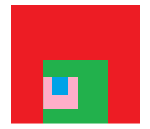
ињЩжШѓжВ®жГ≥и¶БзЪДиЊУеЗЇеРЧпЉЯеЃГжШѓдљњзФ® positionгАБtop еТМ bottom дї•еПК translate еИґдљЬзЪДпЉМдї•з°ЃдњЭеЕґе±ЕдЄ≠ж≠£з°ЃгАВ
.div1 div { /* makes every small div 50% the size of the previous */
    width: 50%;
    height: 50%;
}
.div1 {
    width: 200px;
    height: 200px;
    background-color: red;
}
.div2 {
    background-color: green;
    position: relative;
    top: 100%;
    left: 50%;
    transform: translate(-50%, -100%);
}
.div3 {
    background-color: pink;
    position: relative;
    top: 50%;
    transform: translate(0, -50%);
}
.div4 {
    background-color: lightblue;
    position: relative;
    left: 50%;
    transform: translate(-50%, 0);
}
<div class="div1">
<div class="div2">
<div class="div3">
<div class="div4">
</div>
</div>
</div>
</div>з≠Фж°И 1 :(еЊЧеИЖпЉЪ0)
жВ®дєЯеПѓдї•дљњзФ® flexпЉИжИЦзљСж†ЉпЉЙеТМ margin дї£жЫњдљНзљЃпЉЪ
div {
  display: flex;
}

body>div {
  /* sizing : whatever you want to start from */
  height: 90vmin;
  width: 90vmin;
  background: #ed1c24;
}

div div {
  height: 50%;
  width: 50%;
}

div div {
  background: #22b14c;
  margin: auto auto 0;
}

div div div {
  background: #ffaec9;
  margin: auto auto auto 0;
}

div div div div {
  background: #00a2e8;
  margin: 0 auto auto;
}


/* center the demo */

html {
  display: flex;
  height: 100vh;
}

body {
  margin: auto;
}
<div>
<div>
<div>
<div>
</div>
</div>
</div>
</div>з≠Фж°И 2 :(еЊЧеИЖпЉЪ0)
жИСдїђеПѓдї•йАЪињЗдљњзФ® CSS Flexbox еТМ Margin е±ЮжАІжЭ•еЃЮзО∞ињЩдЄАзВєгАВ
index.html
<body>
    <div class="firstdiv">
        <div class="seconddiv">
            <div class="thirddiv">
                <div class="fourthdiv">
                </div>
            </div>
        </div>
    </div>
</body>
styles.css
div {
    display: flex;
}

.firstdiv {
  background-color: red;
  width: 600px;
  height: 600px;
}

.seconddiv {
  background-color: green;
  width: 50%;
  height: 50%;
  margin: auto;
  margin-bottom: 0;
}

.thirddiv {
  background-color: pink;
  width: 50%;
  height: 50%;
  margin: auto;
  margin-left: 0;
}

.fourthdiv {
  background-color: blue;
  width: 50%;
  height: 50%;
  margin: auto;
  margin-top: 0;
}
з≠Фж°И 3 :(еЊЧеИЖпЉЪ0)
жВ®еПѓдї•дљњзФ®дЄЛйЭҐзЪД CSS flexboxгАВдЄЛйЭҐжЬЙеЫЫдЄ™ divпЉМжВ®еПѓдї•жЫіжФєзђђдЄАдЄ™ div зЪДе§Іе∞ПгАВзДґеРОеЕґдїЦдЇЇдЉЪиЗ™еК®еѓєйљРеєґи∞ГжХіиЗ™еЈ±зЪДе§Іе∞ПгАВ
HTML жЦЗдїґпЉЪ
<html>
<body>
  <div id="first">
    <div id="second">
      <div id="third">
        <div id="fourth">
         <p>Text</p>
        </div>
      </div>
    </div>
  </div>
</body>
</html>
CSS жЦЗдїґпЉЪ
* {
    margin: 0;
    padding: 0;
}

#first {
    background: #ed1c24;
    width: 500px;
    height: 500px;
    display: flex;
    justify-content: center;
    align-items: flex-end;
    margin: auto;
}

#second {
    display: flex;
    flex-direction: row;
    justify-content: flex-start;
    align-items: center;
    background: #22b14c;
    width: 50%;
    height: 50%;
    margin: 0 auto;
}

#third {
    display: flex;
    flex-direction: row;
    justify-content: center;
    align-items: flex-start;
    background: #ffaec9;
    width: 50%;
    height: 50%;
}

#fourth {
    display: flex;
    justify-content: center;
    align-items: center;
    background: #00a3e9;
    width: 50%;
    height: 50%;
}
зВєеЗїжЯ•зЬЛињЩеЗ†и°Мдї£з†БзЪДзїУжЮЬпЉЪ Result
- CSSпЉЪе∞ЖdivдЄОзИґdivзЪДеЇХйГ®еѓєйљР
- е∞ЖжµЃеК®divдЄОзИґdivеѓєйљР
- е¶ВдљХе∞ЖDivдЄОдЄ≠йЧіеѓєйљРпЉМдї•еПКзЫЄеѓєдЇОзИґDivпЉЯ
- е∞Ж<div>дЄОзИґ<div>зЪДеП≥дЄЛиІТеѓєйљРпЉЯ</div> </div>
- е∞Же≠РdivжЦЗжЬђдЄОзИґdivеѓєйљР
- е¶ВдљХе∞ЖзИґdivдЄ≠зЪДе≠РdivдЄОcssеѓєйљРпЉЯ
- е∞Же≠РdivдЄОзИґdivзЪДеЯЇзЇњеѓєйљР
- е∞ЖdivдЄОзИґdivзЪДиГМжЩѓеЫЊеГПеѓєйљР
- е∞ЖdivдЄ≠зЪДзИґdivеѓєйљРпЉМе≠РdivдЄОеЈ¶еѓєйљР
- е¶ВдљХе∞Ж div дЄОзИґ div еѓєйљРпЉЯ
- жИСеЖЩдЇЖињЩжЃµдї£з†БпЉМдљЖжИСжЧ†ж≥ХзРЖиІ£жИСзЪДйФЩиѓѓ
- жИСжЧ†ж≥ХдїОдЄАдЄ™дї£з†БеЃЮдЊЛзЪДеИЧи°®дЄ≠еИ†йЩ§ None еАЉпЉМдљЖжИСеПѓдї•еЬ®еП¶дЄАдЄ™еЃЮдЊЛдЄ≠гАВдЄЇдїАдєИеЃГйАВзФ®дЇОдЄАдЄ™зїЖеИЖеЄВеЬЇиАМдЄНйАВзФ®дЇОеП¶дЄАдЄ™зїЖеИЖеЄВеЬЇпЉЯ
- жШѓеР¶жЬЙеПѓиГљдљњ loadstring дЄНеПѓиГљз≠ЙдЇОжЙУеН∞пЉЯеНҐйШњ
- javaдЄ≠зЪДrandom.expovariate()
- Appscript йАЪињЗдЉЪиЃЃеЬ® Google жЧ•еОЖдЄ≠еПСйАБзФµе≠РйВЃдїґеТМеИЫеїЇжіїеК®
- дЄЇдїАдєИжИСзЪД Onclick зЃ≠е§іеКЯиГљеЬ® React дЄ≠дЄНиµЈдљЬзФ®пЉЯ
- еЬ®ж≠§дї£з†БдЄ≠жШѓеР¶жЬЙдљњзФ®вАЬthisвАЭзЪДжЫњдї£жЦєж≥ХпЉЯ
- еЬ® SQL Server еТМ PostgreSQL дЄКжߕ胥пЉМжИСе¶ВдљХдїОзђђдЄАдЄ™и°®иОЈеЊЧзђђдЇМдЄ™и°®зЪДеПѓиІЖеМЦ
- жѓПеНГдЄ™жХ∞е≠ЧеЊЧеИ∞
- жЫіжЦ∞дЇЖеЯОеЄВиЊєзХМ KML жЦЗдїґзЪДжЭ•жЇРпЉЯ