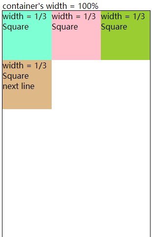
下图如何实现布局?
我将div分为两个部分,并在每个部分中使用Flex Box实现。
<!--My Trials-->
<body>
  <div>
    <div class="container1" style="display: flex;">
      <div class="item1" style="flex:1;background-color: yellowgreen;">1</div>
      <div class="item1" style="flex:1;background-color: lightseagreen;">2</div>
      <div class="item1" style="flex:1;background-color: palevioletred">3</div>
    </div>
    <div class="container2" style="display: flex;">
      <div class="item2" style="flex:1;background-color: lightskyblue;">4</div>
      <div class="item2" style="flex:2;visibility: hidden;">5</div><!-- hide the 5th div -->
    </div>
  </div>
</body>
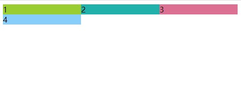
我想知道如何将每个div变成一个正方形。
而且,在没有第5师的帮助下,是否还能实现布局?
1 个答案:
答案 0 :(得分:0)
.container {
    display: flex;
    flex-wrap: wrap;
}

.item1 {
    height: 100px;
    width: 33%;
    background-color: lightblue;
    color: black;
}

.item2 {
    height: 100px;
    width: 33%;
    background-color: lawngreen;
    color: black;
}

.item3 {
    height: 100px;
    width: 33%;
    background-color: pink;
    color: black;
}

.item4 {
    height: 100px;
    width: 33%;
    background-color: orange;
    color: black;
}
<body>
<div class="container">
<div class="item1">This is square 1</div>
<div class="item2">This is square 2</div>
<div class="item3">This is square 3</div>
<div class="item4">This is square 4</div>
</div>
</body>
flex-wrap属性允许元素在当前行没有更多空间时移动到下一行。使其完全响应。并且width属性设置为始终占据视口窗口的33%。
让我知道是否可行,或者您是否需要任何帮助。
相关问题
最新问题
- 我写了这段代码,但我无法理解我的错误
- 我无法从一个代码实例的列表中删除 None 值,但我可以在另一个实例中。为什么它适用于一个细分市场而不适用于另一个细分市场?
- 是否有可能使 loadstring 不可能等于打印?卢阿
- java中的random.expovariate()
- Appscript 通过会议在 Google 日历中发送电子邮件和创建活动
- 为什么我的 Onclick 箭头功能在 React 中不起作用?
- 在此代码中是否有使用“this”的替代方法?
- 在 SQL Server 和 PostgreSQL 上查询,我如何从第一个表获得第二个表的可视化
- 每千个数字得到
- 更新了城市边界 KML 文件的来源?