创建弯曲的底部导航(在实施之后)
如何在React Native中实现呢?
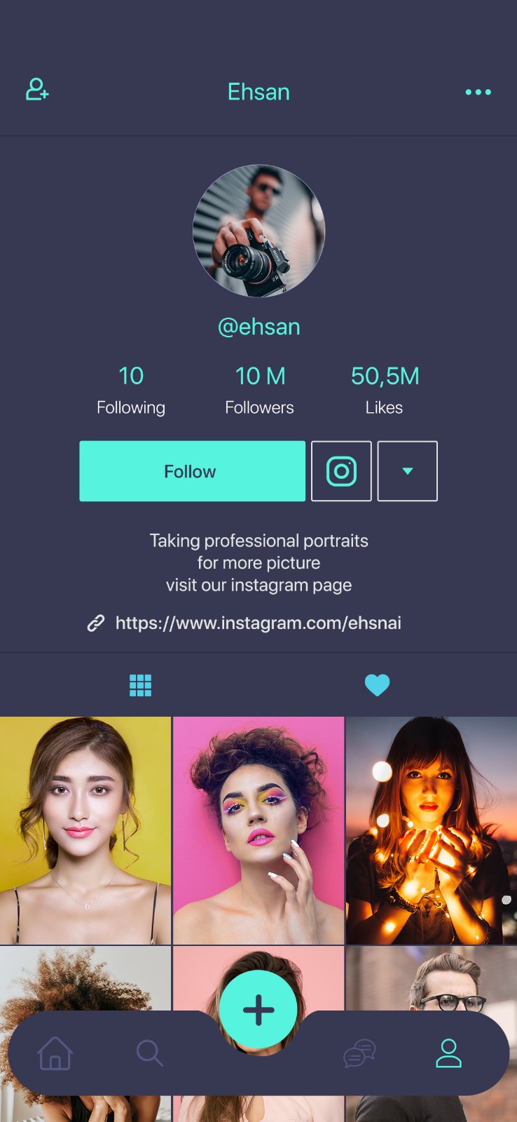
到目前为止,我已经有了这个,我想实现中间曲线。我不知道用透明视图来处理它还是完全切换到SVG
这是tabBar组件
/* eslint-disable react/prop-types */
import React, { Component } from 'react'
import { TouchableOpacity, Text, StyleSheet, View } from 'react-native'
import { Colors } from 'App/Theme'

export default class TabBar extends Component {
  render() {
    let {
      renderIcon,
      getLabelText,
      activeTintColor,
      inactiveTintColor,
      onTabPress,
      onTabLongPress,
      getAccessibilityLabel,
      navigation,
      showLabel,
    } = this.props

    let { routes, index: activeRouteIndex } = navigation.state

    return (
      <View style={styles.tabBar}>
        {routes.map((route, routeIndex) => {
          let isRouteActive = routeIndex === activeRouteIndex
          let tintColor = isRouteActive ? activeTintColor : inactiveTintColor

          return (
            <TouchableOpacity
              key={routeIndex}
              style={styles.tab}
              onPress={() => {
                onTabPress({ route })
              }}
              onLongPress={() => {
                onTabLongPress({ route })
              }}
              accessibilityLabel={getAccessibilityLabel({ route })}
            >
              {renderIcon({ route, focused: isRouteActive, tintColor })}
              {showLabel ? <Text>{getLabelText({ route })}</Text> : null}
            </TouchableOpacity>
          )
        })}
      </View>
    )
  }
}

const styles = StyleSheet.create({
  tab: {
    alignItems: 'center',
    flex: 1,
    justifyContent: 'center',
  },
  tabBar: {
    alignSelf: 'center',
    backgroundColor: Colors.primary,
    borderRadius: 50,
    bottom: 10,
    elevation: 2,
    flexDirection: 'row',
    height: 65,
    position: 'absolute',
    width: '95%',
  },
  infinity: {
    width: 80,
    height: 100,
  },
  infinityBefore: {
    position: 'absolute',
    top: 0,
    left: 0,
    width: 0,
    height: 0,
    borderWidth: 20,
    borderColor: 'red',
    borderStyle: 'solid',
    borderTopLeftRadius: 50,
    borderTopRightRadius: 50,
    borderBottomRightRadius: 50,
    borderBottomLeftRadius: 0,
    transform: [{ rotate: '-135deg' }],
  },
  infinityAfter: {
    position: 'absolute',
    top: 0,
    right: 0,
    width: 0,
    height: 0,
    borderWidth: 20,
    borderColor: 'red',
    borderStyle: 'solid',
    borderTopLeftRadius: 50,
    borderTopRightRadius: 0,
    borderBottomRightRadius: 50,
    borderBottomLeftRadius: 50,
    transform: [{ rotate: '-135deg' }],
  },
})
4 个答案:
答案 0 :(得分:2)
这是一个演示:https://snack.expo.io/@nomi9995/cf371e
您需要使用react-native-svg
yarn add react-native-svg
import React, { Component } from "react";
import {
  Text,
  StyleSheet,
  View,
  Dimensions,
  TouchableHighlight,
} from "react-native";
import Svg, { Circle, Path } from "react-native-svg";

const tabs = [1, 2, 3, 4, 5];
export default class App extends Component {
  constructor(props) {
    super(props);
    this.state = {
      pathX: "357",
      pathY: "675",
      pathA: "689",
      pathB: "706",
    };
  }
  render() {
    return (
      <View style={[styles.container]}>
        <View style={[styles.content]}>
          <View style={styles.subContent}>
            {tabs.map((_tabs, i) => {
              return (
                <TouchableHighlight
                  key={i}
                  underlayColor={"transparent"}
                  onPress={() => console.log("onPress")}
                >
                  <View>
                  </View>
                </TouchableHighlight>
              );
            })}
          </View>
          <Svg
            version="1.1"
            id="bottom-bar"
            x="0px"
            y="0px"
            width="100%"
            height="100"
            viewBox="0 0 1092 260"
            space="preserve"
          >
            <Path
              fill={"#373A50"}
              stroke={"#373A50"}
              d={`M30,60h${this.state.pathX}.3c17.2,0,31,14.4,30,31.6c-0.2,2.7-0.3,5.5-0.3,8.2c0,71.2,58.1,129.6,129.4,130c72.1,0.3,130.6-58,130.6-130c0-2.7-0.1-5.4-0.2-8.1C${this.state.pathY}.7,74.5,${this.state.pathA}.5,60,${this.state.pathB}.7,60H1062c16.6,0,30,13.4,30,30v94c0,42-34,76-76,76H76c-42,0-76-34-76-76V90C0,73.4,13.4,60,30,60z`}
            />
            <Circle
              fill={"#7EE6D2"}
              stroke={"#7EE6D2"}
              cx="546"
              cy="100"
              r="100"
            />
          </Svg>
        </View>
      </View>
    );
  }
}

const styles = StyleSheet.create({
  container: {
    flex: 1,
    overflow: "hidden",
  },
  content: {
    flexDirection: "column",
    zIndex: 0,
    width: Dimensions.get("window").width - 30,
    marginBottom: "4%",
    left: "4%",
    right: "4%",
    position: "absolute",
    bottom: "1%",
  },
  subContent: {
    flexDirection: "row",
    marginLeft: 15,
    marginRight: 15,
    marginBottom: 10,
    zIndex: 1,
    position: "absolute",
    bottom: 5,
  }
});
我希望这会对您有所帮助。
答案 1 :(得分:2)
根据您的要求,这里有 2 个解决方案。
如果您想要这种类型的设计而无需选择,那么此代码将帮助您: https://github.com/alex-melnyk/clipped-tabbar
如果您需要在每个选项卡上进行选择,那么这里有其他简单的库供您选择: https://github.com/Jm-Zion/rn-wave-bottom-bar
答案 2 :(得分:0)
仅使用<View/>个组件就可以做到这一点并不明显。我将TabBar拆分为具有三个子视图的弹性行容器,并创建一个SVG,该SVG具有填充的倒置半径,用于中心子视图。要渲染SVG,请使用react-native-svg。请参见下面的粗略布局:
...

import { SvgXml } from 'react-native-svg';
import TabCenterSvg from ‘assets/my-svg.svg’

export default class TabBar extends Component {
    render() {
        return (
            <View style={styles.tabBar}>
                <View style={styles.leftContainer}>
                    {/* Left Buttons */}
                </View>
                <View style={styles.centerContainer}>
                    <View style={styles.centerInnerTopContainer}>
                        {/* Add Button */}
                    </View>
                    <View style={styles.centerInnerBottomContainer}>
                        <SvgXml xml={TabCenterSvg} />
                    </View>
                </View>
                <View style={styles.rightContainer}>
                    {/* Right Icons */}
                </View>
            </View>
        )
    }
}

const styles = StyleSheet.create({
    tabBar: {
        alignSelf: 'center',
        borderRadius: 50,
        bottom: 10,
        elevation: 2,
        flexDirection: 'row',
        height: 65,
        position: 'absolute',
        width: '95%',
    },
    leftContainer: {
        flex: 1,
        flexDirection: 'row',
        borderBottomLeftRadius: 50,
        borderTopLeftRadius: 50,
        borderTopRightRadius: 50,
        backgroundColor: Colors.primary,
    },
    centerContainer: {
        flex: 1,
        flexDirection: 'column',
    },
    centerInnerTopContainer: {
        flex: 1,
    },
    centerInnerBottomContainer: {
        flex: 1,
    },
    rightContainer: {
        flex: 1,
        flexDirection: 'row',
        borderTopLeftRadius: 50,
        borderTopRightRadius: 50,
        borderBottomRightRadius: 50,
        backgroundColor: Colors.primary,
    },
})
答案 3 :(得分:0)
使用该库的代码并根据您的UI进行自定义
https://www.npmjs.com/package/curved-bottom-navigation-bar
注意:我不建议您使用此库,因为每周下载量较低。 您不必使用整个库,而可以使用其代码。
相关问题
最新问题
- 我写了这段代码,但我无法理解我的错误
- 我无法从一个代码实例的列表中删除 None 值,但我可以在另一个实例中。为什么它适用于一个细分市场而不适用于另一个细分市场?
- 是否有可能使 loadstring 不可能等于打印?卢阿
- java中的random.expovariate()
- Appscript 通过会议在 Google 日历中发送电子邮件和创建活动
- 为什么我的 Onclick 箭头功能在 React 中不起作用?
- 在此代码中是否有使用“this”的替代方法?
- 在 SQL Server 和 PostgreSQL 上查询,我如何从第一个表获得第二个表的可视化
- 每千个数字得到
- 更新了城市边界 KML 文件的来源?