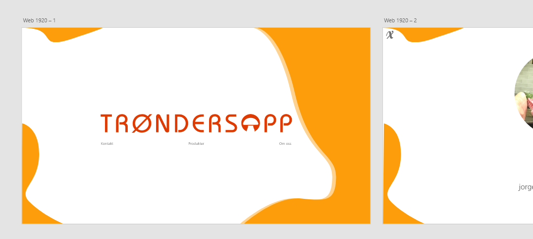
如何实现这样的设计风格?
我知道标题是模糊的。我不知道如何更好地制定标题,因为我不知道设计样式的名称。
此设计“样式”的名称是什么,如何使用css和html达到效果?
我试图用HTML和CSS重新创建设计。这是代码
* {
  margin: 0;
  padding: 0;
  box-sizing: 0;
}

/*BG*/

main,
.container {
  height: 100vh;
  width: 100vw;
}

body {
  overflow: hidden;
}

#left-top,
#left-bottom,
#right {
  position: absolute;
  z-index: -10;
}

#left-top {
  left: 0;
  top: 0;
}

#left-bottom {
  left: 0;
  bottom: 0;
  transform: translate(-0.5vw);
}

#right {
  right: 0;
  top: 0;
  bottom: 0;
  transform: translate(10vw);
}
.container {
  display: flex;
  justify-content: center;
  align-items: center;
  flex-direction: column;

  max-height: 100vh;
  max-width: 100vw;

  border: 1vh solid lime;
}

.logo {
  max-width: 50%;

  display: flex;
  justify-content: center;
  align-items: center;
}

.logo img {
  width: 80vw;
  height: inherit;
}

.links {
}
<!DOCTYPE html>
<html lang="en">
<head>
<meta charset="UTF-8" />
<meta name="viewport" content="width=device-width, initial-scale=1.0" />
<title>Document</title>
<link rel="stylesheet" href="style.css" />
<link rel="stylesheet" href="index.css" />
</head>
<body>
<main>
<div class="container">
<img id="left-top" src="https://picoolio.net/images/2020/06/10/Path-52825c75a57b036c8.png" alt="" />
<img id="left-bottom" src="https://picoolio.net/images/2020/06/10/Path-486011727790f3e3d.png" alt="" />
<img id="right" src="https://i.ibb.co/WPqF1dV/Component-4-1.png" alt="" />
<div class="logo">
<img src="https://picoolio.net/images/2020/06/10/Trondersopp_LOGO_B1ac81c93ec7cb89e0.png" alt="Trondersopp_LOGO_B1ac81c93ec7cb89e0.png" border="0" />
</div>
<div class="links">
<ul>
<li>
<a href="">Kontakt</a>
</li>
<li>
<a href="">Produkter</a>
</li>
<li>
<a href="">om oss</a>
</li>
</ul>
</div>
</div>
</main>
<script src="main.js"></script>
</body>
</html>
每当我缩放绝对位置时,背景片段就会像这样移位。
实现此设计的最佳方法是什么,样式的名称是什么?
1 个答案:
答案 0 :(得分:1)
* {
  margin: 0;
  padding: 0;
  box-sizing: 0;
}

/*BG*/

main,
.container {
  height: 100vh;
  width: 100vw;
}

body {
  overflow: hidden;
}

#left-top,
#left-bottom,
#right {
  position: absolute;
  z-index: -10;
}

#left-top {
  left: 0;
  top: 0;
  width: 20vw;
}

#left-bottom {
  left: 0;
  bottom: 0;
  height: 50vh;
}

#right {
  right: 0;
  top: 0;
  bottom: 0;
  height: 100vh;
}
.container {
  display: flex;
  justify-content: center;
  align-items: center;
  flex-direction: column;

  max-height: 100vh;
  max-width: 100vw;
}

.logo {
  max-width: 70vw;

  display: flex;
  justify-content: center;
  align-items: center;
}

.logo img {
  top: 45vh;
  left: 50%;
  transform: translate(-50%, -50%);
  position: absolute;
  width: 100%;
  height: inherit;
  z-index: -10;
}

.links {
  margin: 51vh auto auto 7vw;
  width: 110vw;
  display: grid;
  grid-template-columns: auto auto auto auto;
  grid-column-gap: 1vw;
  grid-row-gap: 1vw;
}

.link-text {
  width: 100%;
  text-align: center;
}

.link-text a {
  text-decoration: none;
  color: #777;
  font-size: 1.25vw;
  font-family: helvetica;
}
<!DOCTYPE html>
<html lang="en">
<head>
<meta charset="UTF-8" />
<meta name="viewport" content="width=device-width, initial-scale=1.0" />
<title>Document</title>
<link rel="stylesheet" href="style.css" />
<link rel="stylesheet" href="index.css" />
</head>
<body>
<main>
<div class="container">
<img id="left-top" src="https://picoolio.net/images/2020/06/10/Path-52825c75a57b036c8.png" alt="" />
<img id="left-bottom" src="https://picoolio.net/images/2020/06/10/Path-486011727790f3e3d.png" alt="" />
<img id="right" src="https://i.ibb.co/WPqF1dV/Component-4-1.png" alt="" />
<div class="logo">
<img src="https://picoolio.net/images/2020/06/10/Trondersopp_LOGO_B1ac81c93ec7cb89e0.png" alt="Trondersopp_LOGO_B1ac81c93ec7cb89e0.png" border="0" />
</div>
<div class="links">
<div class="link-text"><a href="">Kontakt</a></div>
<div class="link-text"><a href="">Produkter</a></div>
<div class="link-text"><a href="">om oss</a></div>
</div>
</div>
</main>
<script src="main.js"></script>
</body>
</html>
在上面的代码中,我更改了<div>标签中的图像尺寸和链接以实现该设计...您可以直接复制并粘贴您的工作代码,因为我认为这就是您想要看到的在屏幕上。
说明
1-我首先为您的图像添加了vw和vh尺寸,从而使它们根据视口做出响应...
2-其次,我为徽标图像指定了一个z索引,并在指定绝对位置后借助左和顶部根据您的需要对其进行了定位。
3-第三,我对链接使用css网格布局,但这不是必需的,因为您也可以使用其他方法。 link for info on cs grids
4-我使用CSS(主要是链接部分)设置了一些样式,您可以在代码中进行浏览...
以上只是简要概述。
相关问题
最新问题
- 我写了这段代码,但我无法理解我的错误
- 我无法从一个代码实例的列表中删除 None 值,但我可以在另一个实例中。为什么它适用于一个细分市场而不适用于另一个细分市场?
- 是否有可能使 loadstring 不可能等于打印?卢阿
- java中的random.expovariate()
- Appscript 通过会议在 Google 日历中发送电子邮件和创建活动
- 为什么我的 Onclick 箭头功能在 React 中不起作用?
- 在此代码中是否有使用“this”的替代方法?
- 在 SQL Server 和 PostgreSQL 上查询,我如何从第一个表获得第二个表的可视化
- 每千个数字得到
- 更新了城市边界 KML 文件的来源?