如何创建带有弯曲边框的三角形?

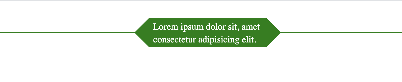 我想使用CSS而不是图像来实现这种形状,但是我得到了绿色的形状,并且我无法使所有背景透明!
#arrowbox:before {
    right: 100%;
    top: 50%;
    border: solid transparent;
    content: " ";
    height: 0;
    width: 0;
    position: absolute;
    pointer-events: none;
    border-color: rgba(0, 128, 0, 0);
    border-right-color: #008000;
    border-width: 25px;
    margin-top: -25px;
}
2 个答案:
答案 0 :(得分:3)
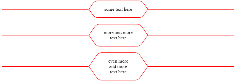
您可以通过一些透视和旋转来做到这一点:
.box {
  margin:20px;
  padding:20px calc(50% - 100px); /* this will fix the max width to 2x100px */
  /* the horizontal lines (one on each side)*/
  background:
    linear-gradient(red,red) left,
    linear-gradient(red,red) right;
  background-size:calc(50% - 100px) 2px;
  background-repeat:no-repeat;
  /* */
  text-align:center;
  position:relative;
}
.box::before,
.box::after{
  content:"";
  position:absolute;
  top:-10px; /* lower than 0 to avoid the overlap due to rotation */
  /* same as the padding */
  left:calc(50% - 100px);
  right:calc(50% - 100px);
  /* */
  bottom:50%;
  border:3px solid red;
  border-bottom:none;
  border-radius:15px 15px 0 0;
  /* adjust here to control the shape  */
  transform:var(--s,scaley(1)) perspective(40px) rotateX(25deg);
  /* */
  transform-origin:bottom;
}
.box::after {
  --s:scaley(-1);
}
<div class="box"> some text here</div>
<div class="box"> more and more <br> text here</div>
<div class="box"> even more <br> and more <br> text here</div>
具有偏斜变换的另一个想法:
.box {
  margin:20px;
  padding:20px calc(50% - 100px); /* this will fix the max width to 2x100px */
  /* the horizontal lines (one on each side)*/
  background:
    linear-gradient(red,red) left,
    linear-gradient(red,red) right;
  background-size:calc(50% - 100px) 2px;
  background-repeat:no-repeat;
  /* */
  text-align:center;
  position:relative;
}
.box::before,
.box::after,
.box span::before,
.box span::after{
  content:"";
  position:absolute;
  top:0;
  left:calc(50% - 100px);
  right:50%;
  bottom:50%;
  border:2px solid red;
  border-bottom:none;
  border-right:none;
  border-radius:10px 0 0 0;
  transform:var(--s,scaleX(1)) skew(-35deg);
  transform-origin:right bottom;
}
.box::after {
  --s:scalex(-1);
}
.box span::before {
  --s:scaleY(-1);
}
.box span::after {
  --s:scale(-1);
}
<div class="box"><span></span> some text here</div>
<div class="box"><span></span> more and more <br> text here</div>
<div class="box"><span></span> even more <br> and more <br> text here</div>
答案 1 :(得分:0)
我最好的(目前...)
.corn6 {
  border-top: 1px solid darkblue;
  border-bottom: 1px solid darkblue;
  width: 200px;
  height: 28px;
  line-height: 28px;
  text-align: center;
  position: relative;
  margin-left: 30px;
}
.corn6::before,
.corn6::after {
  display: block;
  position: absolute;
  top:0;
  width: 20px;
  height: 20px;
  border-top: 1px solid darkblue;
  border-right: 1px solid darkblue;
  content:'';
}
.corn6::before {
  left: 4px;
  transform: translateX(-50%) rotate(225deg) translateY(-5px)
}
.corn6::after {
  right: -4px;
  transform: translateX(50%) rotate(45deg) translateY(5px)
}
<div class="corn6"> text </div>
相关问题
最新问题
- 我写了这段代码,但我无法理解我的错误
- 我无法从一个代码实例的列表中删除 None 值,但我可以在另一个实例中。为什么它适用于一个细分市场而不适用于另一个细分市场?
- 是否有可能使 loadstring 不可能等于打印?卢阿
- java中的random.expovariate()
- Appscript 通过会议在 Google 日历中发送电子邮件和创建活动
- 为什么我的 Onclick 箭头功能在 React 中不起作用?
- 在此代码中是否有使用“this”的替代方法?
- 在 SQL Server 和 PostgreSQL 上查询,我如何从第一个表获得第二个表的可视化
- 每千个数字得到
- 更新了城市边界 KML 文件的来源?