有条件地移动饼图中的单个数据标签的位置
以下示例代码将生成我将用作示例的甜甜圈图:
import matplotlib.pyplot as plt
%matplotlib inline

# Following should supposedly set the font correctly:
plt.rcParams['font.family'] = 'sans-serif'
plt.rcParams['font.sans-serif'] = ['Muli'] + plt.rcParams['font.sans-serif']
plt.rcParams['font.weight'] = 'extra bold'

size_of_groups=[12,11,30,0.3]

colors = ['#a1daaa','#bbbbb4','#444511','#1afff2']

import matplotlib as mpl
mpl.rcParams['text.color'] = '#273859'

# Create a pieplot
my_pie,texts,_ = plt.pie(size_of_groups,radius = 1.2,colors=colors,autopct="%.1f%%",
textprops = {'color':'w',
             'size':15  #, 'weight':"extra bold"
            }, pctdistance=0.75, labeldistance=0.7) #pctdistance and labeldistance change label positions.
labels=['High','Low','Normal','NA']
plt.legend(my_pie,labels,loc='lower center',ncol=2,bbox_to_anchor=(0.5, -0.2))
plt.setp(my_pie, width=0.6, edgecolor='white')
fig1 = plt.gcf()
fig1.show()
以上输出此:
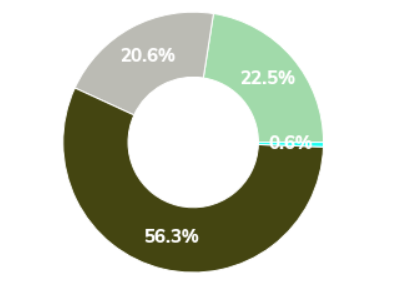
通常,这很棒。终于,我得到了一个漂亮的甜甜圈图!
但是,还有最后一件事需要解决-当甜甜圈图的部分非常小(例如0.6%)时,我需要将标签移出图表,并可能将颜色改为黑色。
我设法使用plt.text对条形图进行了类似的操作,但我认为对于饼形图根本不可行。我认为以前肯定有人已经解决了类似的问题,但是我无法轻易地得到任何体面的解决方案。
2 个答案:
答案 0 :(得分:1)
这是一种用于移动小于某些给定数量(在代码示例中为5度)的补丁的所有百分比文本的方法。请注意,当有多个彼此靠近的小块时,这也会失败。
import matplotlib.pyplot as plt
import matplotlib as mpl
import numpy as np

size_of_groups = [12, 11, 30, 0.3]
colors = ['#a1daaa', '#bbbbb4', '#444511', '#1afff2']
my_pie, texts, pct_txts = plt.pie(size_of_groups, radius=1.2, colors=colors, autopct="%.1f%%",
                                  textprops={'color': 'w', 'size': 15}, pctdistance=0.75,
                                  labeldistance=0.7)
labels = ['High', 'Low', 'Normal', 'NA']
plt.legend(my_pie, labels, loc='lower center', ncol=2, bbox_to_anchor=(0.5, -0.2))
plt.setp(my_pie, width=0.6, edgecolor='white')

for patch, txt in zip(my_pie, pct_txts):
    if (patch.theta2 - patch.theta1) <= 5:
        # the angle at which the text is normally located
        angle = (patch.theta2 + patch.theta1) / 2.
        # new distance to the pie center
        x = patch.r * 1.2 * np.cos(angle * np.pi / 180)
        y = patch.r * 1.2 * np.sin(angle * np.pi / 180)
        # move text to new position
        txt.set_position((x, y))
        txt.set_color('black')
plt.tight_layout()
plt.show()

答案 1 :(得分:1)
我尝试通过针对给定ImportanceOfBeingErnest的另一个问题来调整here的解决方案。由于某些原因,百分号未在我的系统中显示,但您可以找出原因
rad = 1.2 # Define a radius variable for later use

my_pie, texts, autotexts = plt.pie(size_of_groups, radius=rad, colors=colors, autopct="%.1f%%",
                     pctdistance=0.75, labeldistance=0.7, textprops={'color':'white', 'size':20})

# Rest of the code

cx, cy = 0, 0 # Center of the pie chart

for t in autotexts:
    x, y = t.get_position()
    text = t.get_text()

    if float(text.strip('%')) < 1: # Here 1 is the target threshold percentage
        angle = np.arctan2(y-cy, x-cx)
        xt, yt = 1.1*rad*np.cos(angle)+cx, 1.1*rad*np.sin(angle)+cy
        t.set_color("k")
        t.set_position((xt,yt))

相关问题
最新问题
- 我写了这段代码,但我无法理解我的错误
- 我无法从一个代码实例的列表中删除 None 值,但我可以在另一个实例中。为什么它适用于一个细分市场而不适用于另一个细分市场?
- 是否有可能使 loadstring 不可能等于打印?卢阿
- java中的random.expovariate()
- Appscript 通过会议在 Google 日历中发送电子邮件和创建活动
- 为什么我的 Onclick 箭头功能在 React 中不起作用?
- 在此代码中是否有使用“this”的替代方法?
- 在 SQL Server 和 PostgreSQL 上查询,我如何从第一个表获得第二个表的可视化
- 每千个数字得到
- 更新了城市边界 KML 文件的来源?