粘性thead边框消失
在设置html和css的excel样式表时,我发现表头的边框看起来很奇怪。
代码如下:
table {
  border-collapse: collapse;
  position: relative;
}

tr:nth-child(even) {
  background-color: lightgray;
}

th {
  background-color: lightblue;
  position: sticky;
  top: 0;
}

th,
td {
  border: 1px solid black;
  padding: 10px 20px;
}
<table>
<thead>
<tr>
<th>Column 1</th>
<th>Column 2</th>
</tr>
</thead>
<tbody>
<tr>
<td>Row 1</td>
<td>Row 1</td>
</tr>
<tr>
<td>Row 2</td>
<td>Row 2</td>
</tr>
</tbody>
</table>
JSFiddle:https://jsfiddle.net/cpotdevin/5j3ah247/
以下图像显示了它在三种不同浏览器中的外观。
Chrome浏览器:
粘性行上的上下边框消失。
Firefox:
所有内部边界都消失了。
Safari:
与chrome中相同。

我还尝试过不使用border-collapse: collapse;,而是使用cellspacing=0上的table属性,但这会使内部边框看起来比我想要的粗。

JSFiddle:https://jsfiddle.net/cpotdevin/wxvn1crL/
该如何解决?我希望边框始终像桌面未进入粘性状态时的样子一样。

编辑
如@ JonMac1374所指出的,here这个问题已经得到回答。
3 个答案:
答案 0 :(得分:0)
border-collapse: collapse将删除重叠的边框之一。如果您真的不喜欢粗边框效果,则可以创建2个表,一个用于<thead>,另一个用于tbody并设置td{border-top: 0px !important;}:
tr:nth-child(even) {
  background-color: lightgray;
}
table{
  border-collapse: collapse;
}
.title {
  background-color: lightblue;
  position: sticky;
  top: 0;

}

th,
td {
  border: 1px solid black;
  padding: 10px 20px;
}
td{
  border-top: 0px !important;
}
<table cellspacing="0" width="500" class="title">
<thead>
<tr>
<th>Column 1</th>
<th>Column 2</th>
</tr>
</thead>
</table>
<table cellspacing="0" width="500">
<tbody>
<tr>
<td>Row 1</td>
<td>Row 1</td>
</tr>
<tr>
<td>Row 2</td>
<td>Row 2</td>
</tr>
</tbody>
</table>
结果:

答案 1 :(得分:0)
您需要使用border-collapse:分开并仅设置底部和左侧边框。
可以将表格的边缘定位为填充缺失的边框,如下所示:
table {
  position: relative;
  border-collapse: separate;
}

tr:nth-child(even) {
  background-color: lightgray;
}

th {
  background-color: lightblue;
  position: sticky;
  top: 0;
}

th, td{
  border-color:black;
  border-style:solid;
  border-width:0 0 1px 1px;
  padding: 10px 20px;
}

th{
  border-top-width:1px;
}

th:last-child, td:last-child
{
  border-right-width:1px;
}

tr:last-child td{
  border-bottom-width:1px;
}
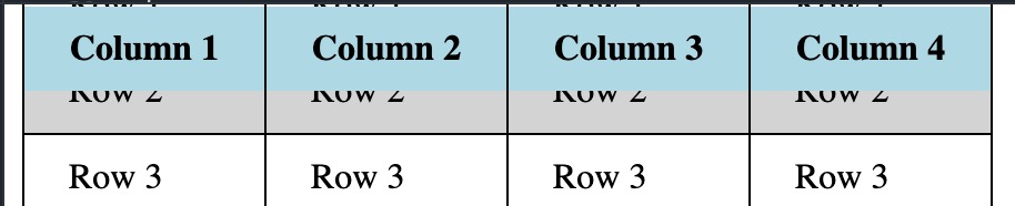
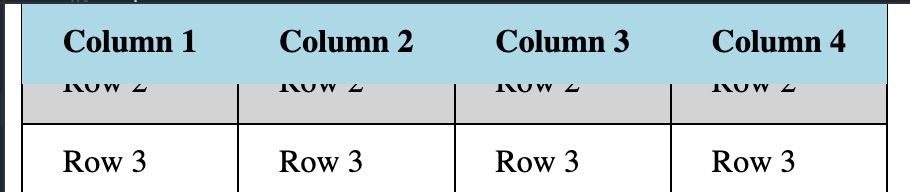
答案 2 :(得分:0)
一个变通办法可能是个阴影:
测试了当今最新的Chrome和Firefox的宽度
https://jsfiddle.net/4npw6q5j/或下面的演示可以进行检查,发表评论并查看是否可以代替您。
table {
  position: relative;
}

tr:nth-child(even) {
  background-color: lightgray;
}

th {
  background-color: lightblue;
  position: sticky;
  top: 0;box-shadow:0 1px
}

th,
td {
  border: 1px solid black;
  padding: 10px 20px;
}
<table cellspacing=0>
<thead>
<tr>
<th>Column 1</th>
<th>Column 2</th>
<th>Column 3</th>
<th>Column 4</th>
</tr>
</thead>
<tbody>
<tr>
<td>Row 1</td>
<td>Row 1</td>
<td>Row 1</td>
<td>Row 1</td>
</tr>
<tr>
<td>Row 2</td>
<td>Row 2</td>
<td>Row 2</td>
<td>Row 2</td>
</tr>
<tr>
<td>Row 3</td>
<td>Row 3</td>
<td>Row 3</td>
<td>Row 3</td>
</tr>
<tr>
<td>Row 4</td>
<td>Row 4</td>
<td>Row 4</td>
<td>Row 4</td>
</tr>
<tr>
<td>Row 5</td>
<td>Row 5</td>
<td>Row 5</td>
<td>Row 5</td>
</tr>
<tr>
<td>Row 6</td>
<td>Row 6</td>
<td>Row 6</td>
<td>Row 6</td>
</tr>
<tr>
<td>Row 7</td>
<td>Row 7</td>
<td>Row 7</td>
<td>Row 7</td>
</tr>
</tbody>
</table>
<br />
<br />
<br />
<br />
<br />
<br />
<br />
<br />
<br />
<br />
<br />
<br />
<br />
<br />
<br />
<br />
<br />
<br />
<br />
<br />
<br />
<br />
<br />
<br />
<br />
相关问题
最新问题
- 我写了这段代码,但我无法理解我的错误
- 我无法从一个代码实例的列表中删除 None 值,但我可以在另一个实例中。为什么它适用于一个细分市场而不适用于另一个细分市场?
- 是否有可能使 loadstring 不可能等于打印?卢阿
- java中的random.expovariate()
- Appscript 通过会议在 Google 日历中发送电子邮件和创建活动
- 为什么我的 Onclick 箭头功能在 React 中不起作用?
- 在此代码中是否有使用“this”的替代方法?
- 在 SQL Server 和 PostgreSQL 上查询,我如何从第一个表获得第二个表的可视化
- 每千个数字得到
- 更新了城市边界 KML 文件的来源?