图像Z索引悬停多个SVG多边形
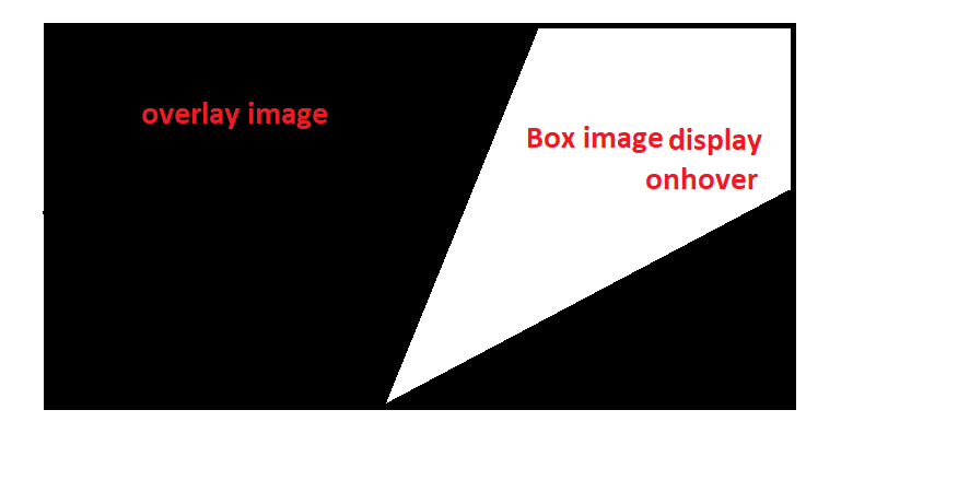
我正在研究SVG,这里的概念是我有两个彼此.overlap的图像,并使用svg多边形制作了五个不同的三角形。我的目标是实现第一次覆盖完整的图像显示,并且当悬停在三角形上时,需要显示背景.box框图像。
这是我提供覆盖图像之前的初始代码。
.box {
  position: relative;
  background-image: url('https://picsum.photos/id/1/1000/800');
  background-repeat: no-repeat;
  width: 100%;
  height: 600px;
  background-size: cover;
}

polygon {
  stroke-width: 1;
  stroke: red;
  fill: #ffffff;
}

polygon:hover {
  fill: transparent;
}
<div class="box">
<svg viewbox="0 0 200 100">
<polygon points="0,100 100,100 0,50 "
style="stroke:#000000;"/>
<polygon points="0,50 100,100 50,00 0,0 "
style="stroke:#000000;"/>
<polygon points="100,100 50,00 150,0"
style="stroke:#000000;"/>
<polygon points="100,100 200,50 200,0 150,0"
style="stroke:#000000;"/>
<polygon points="100,100 200,100, 200,50"
style="stroke:#000000;"/>
</svg>
</div>
现在,我添加了叠加图像,该图像必须位于.box图像和polygons形状上方。现在,悬停我想以当前的多边形形状显示.box图片
代码在这里
.box {
position: relative;
background-image: url('https://picsum.photos/id/1/1000/800');
background-repeat: no-repeat;
width: 100%;
height: 600px;
background-size: cover;
}
polygon {
stroke-width: 1;
stroke: red;
fill: #ffffff;
}
polygon:hover {
fill: transparent;
}
.overlay:hover polygon {
z-index: 100;
}
.overlay {
position: absolute;
background-image: url('https://picsum.photos/id/118/1000/800');
background-repeat: no-repeat;
width: 100%;
height: 600px;
background-size: cover;
z-index: 10;
}<div class="overlay"></div>
<div class="box">
  <svg viewbox="0 0 200 100">
		<polygon points="0,100 100,100 0,50 "
			    style="stroke:#000000;"/>
		<polygon points="0,50 100,100 50,00 0,0 "
			    style="stroke:#000000;"/>
		<polygon points="100,100 50,00 150,0"
			    style="stroke:#000000;"/>
		<polygon points="100,100 200,50 200,0 150,0"
			    style="stroke:#000000;"/>
		<polygon points="100,100 200,100, 200,50"
			    style="stroke:#000000;"/>
	</svg>
</div>
有人能帮我解决这个问题吗,我们需要调整div和多边形填充的z索引。
3 个答案:
答案 0 :(得分:2)
我会像下面那样调整my previous answer的代码:
.box {
width:450px;
height:250px;
position:relative;
overflow:hidden;
z-index:0;
background:url(https://picsum.photos/id/13/1000/800) center/cover;
}
.box > div {
position:absolute;
top:0;
left:0;
right:0;
bottom:0;
background-size:cover;
background-position:center;
opacity:0;
}
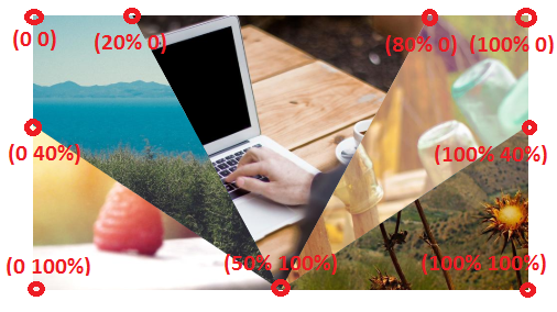
.box > div:nth-child(1) {
clip-path:polygon(20% 0,80% 0, 50% 100%);
}
.box > div:nth-child(2) {
clip-path:polygon(0 0, 20% 0,50% 100%,0 40%);
}
.box > div:nth-child(3) {
clip-path:polygon(100% 0,80% 0,50% 100%,100% 40%);
}
.box > div:nth-child(4) {
clip-path:polygon(0 100%,50% 100%,0 40%);
}
.box > div:nth-child(5) {
clip-path:polygon(100% 100%,50% 100%,100% 40%);
}
.box > div:hover {
opacity:1;
}<div class="box">
<div style="background-image:url(https://picsum.photos/id/1/1000/800)"></div>
<div style="background-image:url(https://picsum.photos/id/10/1000/800)"></div>
<div style="background-image:url(https://picsum.photos/id/90/1000/800)"></div>
<div style="background-image:url(https://picsum.photos/id/102/1000/800)"></div>
<div style="background-image:url(https://picsum.photos/id/118/1000/800)"></div>
</div>
以下是向您展示clip-path
具有相同图像:
.box {
  width:450px;
  height:250px;
  position:relative;
  overflow:hidden;
  z-index:0;
  background:url(https://picsum.photos/id/13/1000/800) center/cover;
}
.box > div {
  position:absolute;
  top:0;
  left:0;
  right:0;
  bottom:0;
  background-image:url(https://picsum.photos/id/118/1000/800);
  background-size:cover;
  background-position:center;
  opacity:0;
}
.box > div:nth-child(1) {
  clip-path:polygon(20% 0,80% 0, 50% 100%);
}
.box > div:nth-child(2) {
  clip-path:polygon(0 0, 20% 0,50% 100%,0 40%);
}
.box > div:nth-child(3) {
  clip-path:polygon(100% 0,80% 0,50% 100%,100% 40%);
}

.box > div:nth-child(4) {
  clip-path:polygon(0 100%,50% 100%,0 40%);
}
.box > div:nth-child(5) {
  clip-path:polygon(100% 100%,50% 100%,100% 40%);
}

.box > div:hover {
   opacity:1;
}
<div class="box">
<div ></div>
<div ></div>
<div ></div>
<div ></div>
<div ></div>
</div>
答案 1 :(得分:2)
Temani's CSS only solution很不错,但是请注意,它是still not supported in Safari nor in IE/Edge。
对于这些浏览器,您需要回退到SVG,后者还实现了<clipPath>元素。
.overlay {
  background-image: url('https://picsum.photos/id/118/1000/800');
  background-repeat: no-repeat;
  background-size: cover;
}
.overlay use {
  opacity: 0;
}
.overlay use:hover {
  opacity: 1;
}
<svg class="overlay" viewBox="0 0 200 100">
<defs>
<clipPath id='clip-1'>
<polygon points="0,100 100,100 0,50"/>
</clipPath>
<clipPath id='clip-2'>
<polygon points="0,50 100,100 50,00 0,0"/>
</clipPath>
<clipPath id='clip-3'>
<polygon points="100,100 50,00 150,0"/>
</clipPath>
<clipPath id='clip-4'>
<polygon points="100,100 200,50 200,0 150,0"/>
</clipPath>
<clipPath id='clip-5'>
<polygon points="100,100 200,100, 200,50"/>
</clipPath>
<image id="img" x="0" y="0" width="200" height="100" preserveAspectRatio="xMidYMid slice"
xlink:href="https://picsum.photos/id/1/1000/800" />
</defs>
<use xlink:href="#img" clip-path="url(#clip-1)"/>
<use xlink:href="#img" clip-path="url(#clip-2)"/>
<use xlink:href="#img" clip-path="url(#clip-3)"/>
<use xlink:href="#img" clip-path="url(#clip-4)"/>
<use xlink:href="#img" clip-path="url(#clip-5)"/>
</svg>
<div class="box"></div>
所以,是的,它比较冗长,但是它应该在IE9以后的所有浏览器中都能工作。
答案 2 :(得分:0)
如果您希望svg出现在其父div上方,则可以更改svg元素的属性,如下所示:
    //Bodyparser Middleware
    app.use(express.json())
   /*~~~~~~~~~~~~~~~~~~~~~~~~~~~~~~~~~*/
   /*necessary for expanding .box div and svg*/
   /*~~~~~~~~~~~~~~~~~~~~~~~~~~~~~~~~~*/
   html,body{
    width:100%;
    height:100%;
   }

   .box {
      width:100%;
      height:100%;

      position: relative;
      background-image: url('https://picsum.photos/id/1/1000/800');
      background-repeat: no-repeat;
      width: 100%;

      /*~~~~~~~~~~~~~~~~~~~~~~~~~~~~~~~~~*/
      /*I CHANGED HEIGHT TO 100% FOR BOX AS IT WASNT SPANNING THE ENTIRE PAGE - in turn, the "overlay"
      div's background image could be seen...*/
      /*~~~~~~~~~~~~~~~~~~~~~~~~~~~~~~~~~*/
      height: 100%;
      background-size: cover;
    }

    /*~~~~~~~~~~~~~~~~~~~~~~~~~~~~~~~~~*/
    /*position the svg element relative to its parent so it can be moved up with z-index*/
    /*~~~~~~~~~~~~~~~~~~~~~~~~~~~~~~~~~*/
    svg{
      position:relative;
      z-index:999;
    }

    polygon {
      stroke-width: 1;
      stroke: red;
      fill: #ffffff;
    }

    polygon:hover {
      fill: transparent;
    }

    .overlay:hover polygon {
      z-index: 100;
    }

    .overlay {
      position: absolute;
      background-image: url('https://picsum.photos/id/118/1000/800');
      background-repeat: no-repeat;
      width: 100%;
      height: 100%;
      background-size: cover;
      z-index: 10;
    }
相关问题
最新问题
- 我写了这段代码,但我无法理解我的错误
- 我无法从一个代码实例的列表中删除 None 值,但我可以在另一个实例中。为什么它适用于一个细分市场而不适用于另一个细分市场?
- 是否有可能使 loadstring 不可能等于打印?卢阿
- java中的random.expovariate()
- Appscript 通过会议在 Google 日历中发送电子邮件和创建活动
- 为什么我的 Onclick 箭头功能在 React 中不起作用?
- 在此代码中是否有使用“this”的替代方法?
- 在 SQL Server 和 PostgreSQL 上查询,我如何从第一个表获得第二个表的可视化
- 每千个数字得到
- 更新了城市边界 KML 文件的来源?