舍入按钮的背景图像
将鼠标悬停在按钮上时,我必须具有圆形的“增长”效果。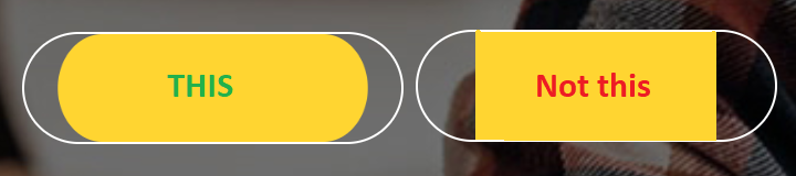 请参阅此链接以获取有关我如何需要按钮的参考。
http://demo1.wpopal.com/corpec/home-4/
请参阅此链接以获取有关我如何需要按钮的参考。
http://demo1.wpopal.com/corpec/home-4/
目前,悬停时我已经达到了“不是这个”效果;尽管我的老板希望这种影响能四舍五入。
我在“ not this”按钮上使用了以下css来实现增长的效果,尽管我需要将边缘修圆。
.Custom-Button a {
  position: relative;
  display: inline-block;
  padding: 15px 70px;
  border: 1px solid #fdc900 !important;
  color: white;
  font-size: 30px;
  font-family: arial;
  background-image: linear-gradient(#fdc900, #fdc900);
  background-position: 50% 50%;
  background-repeat: no-repeat;
  background-size: 0% 100%;
  transition: background-size .5s, color .5s;
}

.Custom-Button a:hover {
  background-size: 100% 100%;
  color: black;
}
<div class="Custom-Button">
<a href="#">BUTTON</a>
</div>
我只允许使用CSS来达到以下效果,并且已经花了一天的时间尝试使它起作用。
2 个答案:
答案 0 :(得分:3)
为按钮应用伪元素即可解决!希望对您有所帮助!
.Custom-Button{
  position: relative;
  display: inline-block;
  padding: 15px 70px;
  border: 1px solid #fdc900 !important;
  color: white;
  font-size: 30px;
  font-family: arial;
  border-radius:50px;
  position:relative;
}
.Custom-Button a{
z-index:99;
text-decoration:none;
transition:color 1s;
}
.Custom-Button:hover:after{
  width:100%;
}
.Custom-Button:hover a{
  color:black;
}
.Custom-Button:after{
  width:0%;
  transition: width 1s;
  height:100%;
  z-index:-1;
  content:"";
  position:absolute;
   border-radius:50px;
  top:0;
  left:50%;
  transform:translateX(-50%);
    background-image: linear-gradient(#fdc900, #fdc900);
}
<div class="Custom-Button">
<a href="#">BUTTON</a>
</div>
答案 1 :(得分:0)
您可以通过结合z-index以及基础元素的位置和宽度的过渡来实现此效果:
悬停时,filler的子项将从
position: absolute; left: 50%;
到
position: absolute; left: 0;
同时将尺寸从width: 0;调整为width: 100%;
这将为您带来“从中间生长”所需的效果
还需要将边界半径应用于不断增长的元素
a {
  position: relative;
  display: inline-block;
  padding: 15px 70px;
  border: 1px solid #fdc900 !important;
  color: black;
  font-size: 30px;
  font-family: arial;
  border-radius: 32px;
}

.text {
  position: relative;
  z-index: 2000;
}

.filler {
  position: absolute;
  z-index: 1000;
  top: 0;
  left: 50%;
  width: 0;
  height: 100%;
  border-radius: 32px;
  /* half of <a> height */
  background-color: #fdc900;
  transition: width .5s, color .5s, left .5s;
}

a:hover .filler {
  z-index: 500;
  width: 100%;
  left: 0;
  color: black;
}

a:hover .text {
  color: white;
}
<a href="#">
<div class="text">
BUTTON
</div>
<div class="filler">
</div>
</a>
相关问题
最新问题
- 我写了这段代码,但我无法理解我的错误
- 我无法从一个代码实例的列表中删除 None 值,但我可以在另一个实例中。为什么它适用于一个细分市场而不适用于另一个细分市场?
- 是否有可能使 loadstring 不可能等于打印?卢阿
- java中的random.expovariate()
- Appscript 通过会议在 Google 日历中发送电子邮件和创建活动
- 为什么我的 Onclick 箭头功能在 React 中不起作用?
- 在此代码中是否有使用“this”的替代方法?
- 在 SQL Server 和 PostgreSQL 上查询,我如何从第一个表获得第二个表的可视化
- 每千个数字得到
- 更新了城市边界 KML 文件的来源?