如何在React material-ui Tab组件中删除焦点突出显示?
我正在使用react Material-ui库中的Tab组件。当Tab元素处于焦点位置时,该选项卡将在左右边框上显示此怪异的轮廓。
有什么方法可以删除此活动/焦点轮廓?
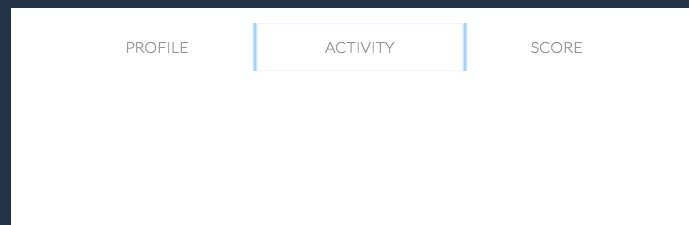
下面是有关焦点样式奇怪的图像
我的代码如下:
import { Fragment } from 'react';
import styled from 'styled-components'
import Card from 'components/Elements/Card';
import CardItem from 'components/Elements/CardItem';
import CreateAccountForm from 'components/Forms/CreateAccount/container';
import { withTheme } from 'styled-components';
import { Container, Row, Col } from 'styled-bootstrap-grid';
import { pure } from 'recompact';

import Tabs from '@material-ui/core/Tabs';
import Tab from '@material-ui/core/Tab';
import { withStyles } from '@material-ui/core/styles';
import AppBar from '@material-ui/core/AppBar';

import OpenModalButton from 'components/Modal/OpenModalButton/container';

const styles = theme => ({
  indicator: {
    backgroundColor: "red",
    border: '5px solid blue !important',
    '&:active': {
      outline: 'none',
    },
    '&:focus': {
      outline: 'none',
    }
  },
  selected: {
    backgroundColor: 'blue',
  },
  wrapper: {
    border: '5px solid blue',
  }
});

import { LogoElement } from 'components/Elements/Icons';

const StyledCard = styled(withTheme(Card))`
  border: 15px solid ${ props => props.theme.colors.blue[3]};
  text-align: left;
  border-radius: 3px;
  padding-top: ${ props => props.theme.spacer[2]};
  padding-bottom: ${ props => props.theme.spacer[2]};
  position: relative;
  width: 98%;
  max-width: 1250px;
  min-height: 600px;
  display: flex;
  align-items: flex-start;

  h5 {
    color: ${ ({ theme }) => theme.colors.orange[3]};
  }
`;

const CloseButton = styled.a`
  transform: rotate(45deg);
  font-size: 50px !important;
  border: none !important;
  position: absolute;
  top: -20px;
  right: 5px;
  color: ${ props => props.theme.colors.blue[3]} !important;
  font-weight: 200 !important;
  &:hover{
    text-decoration: none;
  }
`;

const LogoContainer = styled.div`
  position: absolute;
  top: 10px;
  left: 15px;
  width: 45px;
  height: 100%;

  svg, path, g, polygon, rect {
    fill: ${ props => props.theme.colors.orange[1]} !important;
  }
`;

const Renderer = ({ handleClose, className, classes, handleTabChangeClick }) => {
  return (
    <StyledCard>
      <CloseButton href="#" onClick={handleClose}>+</CloseButton>
      <CardItem>
        <Container>
          <Row>
            <Col>
              <Tabs
              variant="fullWidth"
              onChange={handleTabChangeClick}
              >
                <Tab label="Profile" />
                <Tab label="Activity" />
                <Tab label="Score" />
                <Tab label="Edit" />
              </Tabs>
            </Col>
          </Row>
        </Container>
      </CardItem>
    </StyledCard>
  );
};

export default withStyles(styles)(Renderer);
2 个答案:
答案 0 :(得分:2)
您必须重写Mui-selected类。
    '&.Mui-selected': {
      outline: 'none',
    }
有关为Tab定义的类,请参见https://material-ui.com/api/tab/#css。
答案 1 :(得分:1)
我有同样的问题。尝试更改:
    '&:active': {
      outline: 'none',
    },
收件人:
    '&:hover': {
      outline: 'none',
    },
我使用样式化组件来覆盖material-ui样式,因此我的设置有些不同,但是解决方案应该相同。
相关问题
最新问题
- 我写了这段代码,但我无法理解我的错误
- 我无法从一个代码实例的列表中删除 None 值,但我可以在另一个实例中。为什么它适用于一个细分市场而不适用于另一个细分市场?
- 是否有可能使 loadstring 不可能等于打印?卢阿
- java中的random.expovariate()
- Appscript 通过会议在 Google 日历中发送电子邮件和创建活动
- 为什么我的 Onclick 箭头功能在 React 中不起作用?
- 在此代码中是否有使用“this”的替代方法?
- 在 SQL Server 和 PostgreSQL 上查询,我如何从第一个表获得第二个表的可视化
- 每千个数字得到
- 更新了城市边界 KML 文件的来源?