在相邻的flexbox容器中垂直对齐内容
我有多个物品,例如卡片。这些卡需要水平堆叠,并且高度必须相同。这对我来说正在发生。
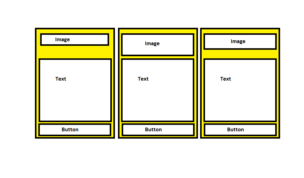
每张卡都有一个图像,文本和一个按钮。每张卡的图像和文本应取任何一张卡的最大高度,以使它们正确对齐。对我来说这不是真的。
如果图像和文本正确对齐,则该按钮将始终在底部的每张卡中对齐。
我一直在关注this tutorial,但我有多张卡,只在这里放了三张。另外,第三张卡片的图像高度也通过CSS设置。
.partner-cards * {
  box-sizing: border-box;
}

.partner-cards {
  display: flex;
  flex-wrap: wrap;
}

.partner-card {
  display: flex;
  flex: 1 0 20%;
  border-radius: 0;
  text-align: center;
  border: 3px solid blue;
  padding: 5px;/*3rem;*/
  margin-bottom: 3rem;
  max-width: 20%;
  margin: 5px;
}

.partner-card-content {
  display: flex;
  flex-direction: column;
}
/*
.card-content .image-container img {

  margin: 0;
  padding: 0;
}
*/
.partner-card-content .partner-image-container {
  border: 1px solid green;
  padding: 0;
  margin: 0;
  min-height: 11rem;
                display: flex;
                vertical-align: middle;
                align-items: center;
                justify-content: center;
                max-width: 100%;
}

.partner-card-content p /*, .card-content .image-container*/
{
  flex: 1 0 auto;
  border: 1px solid red;
}

.partner-card-content img.third-image {
  height: 5.5rem !important;
}
/*
p {
  font-size: 16px;
line-height: 26px;
font-family: Averta-Regular,Arial,Helvetica,sans-serif;
margin-bottom: 2.5rem;
margin-top: 0;
}*/
<div class="partner-cards">
<div class="partner-card">
<div class="partner-card-content">
<div class="partner-image-container">
<img src="https://via.placeholder.com/100x40" alt="">
</div>
<p>Lorem Ipsum is simply dummy text of the printing and typesetting industry. Lorem Ipsum has been the industry's standard dummy text ever since the 1500s.</p>
<a class="primary-button" href="#">View XXX XXX XXX Offer</a>
</div>
</div>
<div class="partner-card">
<div class="partner-card-content">
<div class="partner-image-container">
<img src="https://via.placeholder.com/50x150" alt="">
</div>
<p>Lorem Ipsum is simply dummy text of the printing and typesetting industry. Lorem Ipsum has been the industry's standard dummy text ever since the 1500s. Lorem Ipsum is simply dummy text of the printing and typesetting industry. Lorem Ipsum has been
the industry's standard dummy text ever since the 1500s.</p>
<a class="primary-button" href="#">View YYY Offer</a>
</div>
</div>
<div class="partner-card">
<div class="partner-card-content">
<div class="partner-image-container">
<img src="https://via.placeholder.com/120x100" class="third-image" alt="">
</div>
<p>Lorem Ipsum is simply dummy text of the printing and typesetting industry. Lorem Ipsum has been the industry's standard dummy text ever since the 1500s. Lorem Ipsum is simply dummy text of the printing and typesetting industry. Lorem Ipsum has been
the industry's standard dummy text ever since the 1500s. Lorem Ipsum is simply dummy text of the printing and typesetting industry. </p>
<a class="primary-button" href="#">View ZZZ Offer</a>
</div>
</div>
<div class="partner-card">
<div class="partner-card-content">
<div class="partner-image-container">
<img src="https://via.placeholder.com/50x100" alt="">
</div>
<p>Lorem Ipsum is simply dummy text of the printing and typesetting industry. Lorem Ipsum has been the industry's standard dummy text ever since the 1500s. Lorem Ipsum is simply dummy text of the printing and typesetting industry. Lorem Ipsum has been
the industry's standard dummy text ever since the 1500s. Lorem Ipsum is simply dummy text of the printing and typesetting industry. Lorem Ipsum has been the industry's standard dummy text ever since the 1500s</p>
<a class="primary-button" href="#">View ABC Offer</a>
</div>
</div>
</div>
应如何显示:
代码笔上的教程图像正确对齐了h2,文本和链接:
1 个答案:
答案 0 :(得分:1)
TL; DR
在CSS中无法在相邻的flexbox中对齐flexbox项。您真的需要sub-grids来通过卡片中各节的动态大小来解决此问题。
Flexbox场景
无论如何,假设您为james,hard,fun,circle,c0
caron,hard,agin,square,c1
设置了min-height,所以我想您可以为partner-image-container设置min-height或省略号< / em>将其保留在一行中。请参见下面的解决方案,其中添加了省略号:
a.partner-cards * {
box-sizing: border-box;
}
.partner-cards {
display: flex;
flex-wrap: wrap;
}
.partner-card {
display: flex;
flex: 1 0 20%;
border-radius: 0;
text-align: center;
border: 3px solid blue;
padding: 5px;/*3rem;*/
margin-bottom: 3rem;
max-width: 20%;
margin: 5px;
}
.partner-card-content {
display: flex;
flex-direction: column;
min-width: 0; /* ADDED */
}
/*
.card-content .image-container img {
margin: 0;
padding: 0;
}
*/
.partner-card-content .partner-image-container {
border: 1px solid green;
padding: 0;
margin: 0;
min-height: 11rem;
display: flex;
vertical-align: middle;
align-items: center;
justify-content: center;
max-width: 100%;
}
.partner-card-content p/*, .card-content .image-container*/ {
flex: 1 0 auto;
border: 1px solid red;
}
.partner-card-content img.third-image {
height: 5.5rem !important;
}
/*
p {
font-size: 16px;
line-height: 26px;
font-family: Averta-Regular,Arial,Helvetica,sans-serif;
margin-bottom: 2.5rem;
margin-top: 0;
}*/
.primary-button { /* ADDED */
text-overflow: ellipsis;
overflow: hidden;
white-space: nowrap;
}
请注意,您必须将<div class="partner-cards">
<div class="partner-card">
<div class="partner-card-content">
<div class="partner-image-container">
<img src="https://via.placeholder.com/100x40" alt="">
</div>
<p>Lorem Ipsum is simply dummy text of the printing and typesetting industry. Lorem Ipsum has been the industry's standard dummy text ever since the 1500s.</p>
<a class="primary-button" href="#">View XXX XXX XXX Offer</a>
</div>
</div>
<div class="partner-card">
<div class="partner-card-content">
<div class="partner-image-container">
<img src="https://via.placeholder.com/50x150" alt="">
</div>
<p>Lorem Ipsum is simply dummy text of the printing and typesetting industry. Lorem Ipsum has been the industry's standard dummy text ever since the 1500s. Lorem Ipsum is simply dummy text of the printing and typesetting industry. Lorem Ipsum has been
the industry's standard dummy text ever since the 1500s.</p>
<a class="primary-button" href="#">View YYY Offer</a>
</div>
</div>
<div class="partner-card">
<div class="partner-card-content">
<div class="partner-image-container">
<img src="https://via.placeholder.com/120x100" class="third-image" alt="">
</div>
<p>Lorem Ipsum is simply dummy text of the printing and typesetting industry. Lorem Ipsum has been the industry's standard dummy text ever since the 1500s. Lorem Ipsum is simply dummy text of the printing and typesetting industry. Lorem Ipsum has been
the industry's standard dummy text ever since the 1500s. Lorem Ipsum is simply dummy text of the printing and typesetting industry. </p>
<a class="primary-button" href="#">View ZZZ Offer</a>
</div>
</div>
<div class="partner-card">
<div class="partner-card-content">
<div class="partner-image-container">
<img src="https://via.placeholder.com/50x100" alt="">
</div>
<p>Lorem Ipsum is simply dummy text of the printing and typesetting industry. Lorem Ipsum has been the industry's standard dummy text ever since the 1500s. Lorem Ipsum is simply dummy text of the printing and typesetting industry. Lorem Ipsum has been
the industry's standard dummy text ever since the 1500s. Lorem Ipsum is simply dummy text of the printing and typesetting industry. Lorem Ipsum has been the industry's standard dummy text ever since the 1500s</p>
<a class="primary-button" href="#">View ABC Offer</a>
</div>
</div>
</div>添加到min-width: 0中,以覆盖 flex轴上flexbox的默认partner-card-content默认设置min-width: auto < / em>。您可以在下面看到这种行为的一些示例:
CSS网格场景
您可以使用CSS Grid Layout以不同的方式执行此操作-例如,考虑连续放置3张卡。此工程适用于每个卡片部分的动态高度-参见下面的演示:
.partner-cards * {
  box-sizing: border-box;
}

.partner-cards {
  display: grid;
  grid-template-columns: 1fr 1fr 1fr;
  grid-template-rows: auto 1fr auto;
  grid-auto-flow: column;
  grid-column-gap: 10px;
}

.partner-card, .partner-card-content {
  display: contents;
}

.partner-card-content .partner-image-container {
  border: 1px solid green;
  display: flex;
  align-items: center;
  justify-content: center;
  max-width: 100%;
}

.partner-card-content p {
  border: 1px solid red;
  margin: 0;
}

.partner-card-content a {
  border: 1px solid;
}
<div class="partner-cards">
<div class="partner-card">
<div class="partner-card-content">
<div class="partner-image-container">
<img src="https://via.placeholder.com/100x40" alt="">
</div>
<p>Lorem Ipsum is simply dummy text of the printing and typesetting industry. Lorem Ipsum has been the industry's standard dummy text ever since the 1500s.</p>
<a class="primary-button" href="#">View XXX XXX XXX Offer</a>
</div>
</div>
<div class="partner-card">
<div class="partner-card-content">
<div class="partner-image-container">
<img src="https://via.placeholder.com/50x150" alt="">
</div>
<p>Lorem Ipsum is simply dummy text of the printing and typesetting industry. Lorem Ipsum has been the industry's standard dummy text ever since the 1500s. Lorem Ipsum is simply dummy text of the printing and typesetting industry. Lorem Ipsum has been
the industry's standard dummy text ever since the 1500s.</p>
<a class="primary-button" href="#">View YYY Offer</a>
</div>
</div>
<div class="partner-card">
<div class="partner-card-content">
<div class="partner-image-container">
<img src="https://via.placeholder.com/120x100" class="third-image" alt="">
</div>
<p>Lorem Ipsum is simply dummy text of the printing and typesetting industry. Lorem Ipsum has been the industry's standard dummy text ever since the 1500s. Lorem Ipsum is simply dummy text of the printing and typesetting industry. Lorem Ipsum has been
the industry's standard dummy text ever since the 1500s. Lorem Ipsum is simply dummy text of the printing and typesetting industry. </p>
<a class="primary-button" href="#">View ZZZ Offer</a>
</div>
</div>
</div>
但是它又有局限性,因为您无法控制布局-您无法控制卡片,但是您正在处理这里的卡片内容不是很有用。请注意,我已经为partner-card和partner-card-content元素使用了display: contents。实施sub-grids后,我们将为这样的布局提供 complete 解决方案-也请参见以下讨论:
- 我写了这段代码,但我无法理解我的错误
- 我无法从一个代码实例的列表中删除 None 值,但我可以在另一个实例中。为什么它适用于一个细分市场而不适用于另一个细分市场?
- 是否有可能使 loadstring 不可能等于打印?卢阿
- java中的random.expovariate()
- Appscript 通过会议在 Google 日历中发送电子邮件和创建活动
- 为什么我的 Onclick 箭头功能在 React 中不起作用?
- 在此代码中是否有使用“this”的替代方法?
- 在 SQL Server 和 PostgreSQL 上查询,我如何从第一个表获得第二个表的可视化
- 每千个数字得到
- 更新了城市边界 KML 文件的来源?