div定位聊天消息
我想要以这样一种方式创建聊天组件,如果我显示其所有元素,它将类似于以下内容:
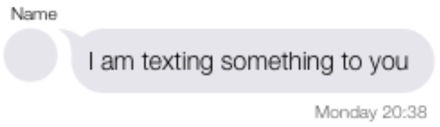
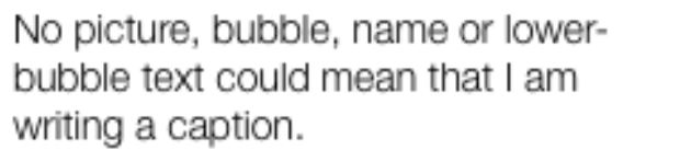
如果我删除了大多数元素,则会以这种方式显示消息:
但是我的代码有4个问题:
- 图片和气泡元素彼此不相邻
- 用更少的文字不会使气泡变短;
- 气泡中的文本不在其父div垂直居中,而是在上一个父容器中居中;
- 白天元素固定在右侧,而不是对准气泡的右侧。
我尝试了许多选项,但是接触CSS越多,创建的问题就越多。
关于如何获得预期结果的任何建议?
这是我的代码:
.container {
  position: relative;
  margin-left: 5%;
  max-width: 90%;
  height: auto;
}

.upper-text {
  width: 100%;
  color: black;
  font-size: 12px;
  line-height: 120%;
}

.message-container {
  width: auto;
}

.character-picture {
  width: 30px;
  height: 30px;
  background-color: aqua;
  display: inline-block;
}

.buble-wrapper {
  max-width: 75%;
  height: auto;
}

.speech-bubble {
  background-color: #f0f0f0;
  border-radius: 0 20px 20px 20px;
  width: auto;
  min-height: 40px;
}

.message {
  color: black;
  font-size: 16px;
  padding-left: 4%;
  padding-right: 4%;
  top: 50%;
  transform: translateY(-50%);
}

.lower-tex {
  color: black;
  font-size: 12px;
  line-height: 120%;
  text-align: right;
}
<div class="container">
<div class="upper-text">Name</div>
<div class="message-container">
<div class="character-picture"></div>
<div class="buble-wrapper">
<div class="speech-bubble">
<div class="message">text message</div>
</div>
</div>
</div>
<div class="lower-tex">Monday: 20:38</div>
</div>
3 个答案:
答案 0 :(得分:1)
这应该可以满足您的需求。有很多改进的空间,但这将使您入门。
我已经删除了一些您认为不必要的html,并更改了大小和放置某些元素的方式。
我建议您看一下CSS Flexbox和Grid,它们使您可以轻松进行复杂的布局。
.container {
  width: auto;
  max-width: 250px;
  display: inline-flex;
  flex-direction: column;
  justify-content: flex-start;
  align-items: flex-start;
}

.upper-text {
  color: black;
  font-size: 12px;
  align-self: flex-start;
  line-height: 1.5;
}

.message-container {
  display: flex;
  justify-content: flex-start;
  align-items: flex-start;
}

.character-picture {
  width: 30px;
  height: 30px;
  background-color: aqua;
  margin-right: 10px;
  border-radius: 15px;
  flex-shrink: 0;
}

.message {
  color: black;
  font-size: 16px;
  word-wrap: break-word;
  padding: 5px 10px;
  border-radius: 15px;
  background-color: #ccc;
  display: flex;
  align-items: center;
}

.lower-tex {
  color: black;
  font-size: 12px;
  align-self: flex-end;
  line-height: 2.5;
}
<div class="container">
<div class="upper-text">Name</div>
<div class="message-container">
<div class="character-picture"></div>
<div class="message">text message example wow this text wraps very well</div>
</div>
<div class="lower-tex">Monday: 20:38</div>
</div>
答案 1 :(得分:1)
如DoHn所述,您可以使用flex或grid来实现。 下面是使用网格的解决方案。 在此处complete-guide-grid
了解更多要获得浏览器支持,请检出https://caniuse.com/#search=grid
.container {
  display: grid;
  grid-template-columns: 30px auto;
  grid-gap: 2px 4px;
  width: 360px;
}

.upper-text {
  color: black;
  font-size: 12px;
  line-height: 120%;
  grid-column: 1 / 3;
  grid-row: 1;
}

.message-container {
  width: auto;
}

.character-picture {
  width: 30px;
  height: 30px;
  background-color: aqua;
  border-radius: 50%;
  grid-row: 2;
}

.speech-bubble {
  background-color: #f0f0f0;
  border-radius: 0 20px 20px 20px;
  grid-column: 2 / 3;
  grid-row: 2;
  justify-self: stretch;
  display: grid;
  padding: 10px;
}

.message {
  margin: auto 0;
}

.lower-text {
  color: black;
  font-size: 12px;
  line-height: 120%;
  justify-self: end;
  grid-column: 2 / 3;
  grid-row: 3;
}
<div class="container">
<div class="upper-text">Name</div>
<div class="character-picture"></div>
<div class="speech-bubble">
<div class="message">Lorem Ipsum is simply dummy text of the printing and typesetting industry. Lorem Ipsum has been the industry's standard dummy text ever since the 1500s, when an unknown printer took a galley o</div>
</div>
<div class="lower-text">Monday: 20:38</div>
</div>
答案 2 :(得分:0)
.container {
  width: 500px;
  height: 100px;
  padding: 10px;
}

.container .chat-log {
  width: 500px;
  height: 100px;
  margin-top: 20px;
}

.left-side {
  width: 20%;
  height: auto;
  float: left;
}

.right-side {
  width: 80%;
  height: auto;
  position: relative;
  left: -15px;
  float: right;
}

.text {
  font-size: 14px;
  text-align: center;
}

.thumbnail {
  width: 50px;
  height: 50px;
  background: #000;
  border-radius: 50%;
  clear: both;
  margin: 0 auto;
  position: relative;
}

.thumbnail span.caption {
  color: #fff;
  text-align: center;
  position: relative;
  margin: 0;
  padding: 0;
  top: 30%;
  left: 10%;
}

.msg {
  position: relative;
  width: auto;
  height: auto;
  text-align: justify;
  padding: 20px;
  background-color: #f0f0f0;
  border-radius: 0px 20px 20px;
}

.msg::before {
  content: " ";
  position: absolute;
  bottom: 79%;
  transform: rotate(90deg);
  left: -20px;
  border-width: 10px;
  border-style: solid;
  border-color: #f0f0f0 transparent transparent transparent;
}

.time{
  float: right;
  margin-right:10px;
  font-size: 12px;
}
<div class="container">
<div class="chat-log">
<div class="left-side">
<div class="text">
Name
</div>
<div class="thumbnail">
<span class="caption">image</span>
</div>
</div>
<div class="right-side">
<div class="msg">
Lorem ipsum dolor sit amet, consectetur adipisicing elit. Eum tempore inventore architecto a voluptatum ratione, sunt doloribus nobis iure debitis? Veniam.
</div>
<div class="time">Monday 5:13 PM</div>
</div>
</div>
</div>
我希望这会对您有所帮助。我不使用flexbox或网格使它变得简单。
最新问题
- 我写了这段代码,但我无法理解我的错误
- 我无法从一个代码实例的列表中删除 None 值,但我可以在另一个实例中。为什么它适用于一个细分市场而不适用于另一个细分市场?
- 是否有可能使 loadstring 不可能等于打印?卢阿
- java中的random.expovariate()
- Appscript 通过会议在 Google 日历中发送电子邮件和创建活动
- 为什么我的 Onclick 箭头功能在 React 中不起作用?
- 在此代码中是否有使用“this”的替代方法?
- 在 SQL Server 和 PostgreSQL 上查询,我如何从第一个表获得第二个表的可视化
- 每千个数字得到
- 更新了城市边界 KML 文件的来源?