CSS object-fitпјҡеҢ…еҗ«пјӣеңЁеёғеұҖдёӯдҝқжҢҒеҺҹе§ӢеӣҫеғҸе®ҪеәҰ
жҲ‘жӯЈеңЁе°қиҜ•дҪҝз”Ёobject-fit: containдҪҝжҲ‘зҡ„еӣҫеғҸеңЁжҹҗдәӣflexboxе®№еҷЁеҶ…е“Қеә”пјҢ并且еңЁи°ғж•ҙеӣҫеғҸзҡ„еӨ§е°Ҹж—¶пјҢеёғеұҖдјјд№ҺдҝқжҢҒеҺҹе§ӢеӣҫеғҸзҡ„еӨ§е°ҸпјҢд»ҺиҖҢеҜјиҮҙеҮәзҺ°ж»ҡеҠЁжқЎгҖӮ
дҪҝз”ЁChromeејҖеҸ‘е·Ҙе…·жЈҖжҹҘеӣҫеғҸзҡ„е®ҪеәҰпјҢжҳҫзӨәе®ҪеәҰд»Қ然дёә1024пјҲдҪҶжҳҜй«ҳеәҰе·ІйҖӮеҪ“еҮҸе°ҸпјүгҖӮ
пјҲжҲ‘д»ҺAuto Resize Image in CSS FlexBox Layout and keeping Aspect Ratio? йӮЈйҮҢиҺ·еҫ—дәҶеҗҜеҸ‘пјү
жҲ‘иҝҳзјәе°‘дёҖдәӣе…¶д»–CSSеұһжҖ§еҗ—пјҹ
JSFiddleпјҡhttps://jsfiddle.net/w6hgqf18/1/
html,
body {
  margin: 0;
  height: 100%;
}

.page {
  height: 100%;
  display: flex;
}

.main-container {
  flex: 1 1 0;
  display: flex;
  flex-direction: column;
}

.half-containers {
  flex: 0 1 50%;
  overflow: auto;
  box-sizing: border-box;
  border: 0.5px solid red;
  display: flex;
}

.page-header {
  flex: 0 0 auto;
  background-color: #dcdcdc;
}

.page-footer {
  flex: 0 0 auto;
  background-color: #dcdcdc;
}

img {
  object-fit: contain;
}
<div class="page">
<div class="main-container">
<div class="page-header">
This is a header
</div>
<div class="half-containers">
<img src='https://i.imgur.com/tqQvuFr.jpg' />
</div>
<div class="half-containers">
<img src='https://i.imgur.com/tqQvuFr.jpg' />
</div>
<div class="page-footer">
This is a footer
</div>
</div>
</div>
2 дёӘзӯ”жЎҲ:
зӯ”жЎҲ 0 :(еҫ—еҲҶпјҡ4)
жӮЁжӢҘжңүзҡ„жҳҜеҗҲд№ҺйҖ»иҫ‘зҡ„пјҢжӮЁеҸӘйңҖиҰҒдәҶи§Јobject-fitзҡ„е·ҘдҪңж–№ејҸеҚіеҸҜгҖӮи®©жҲ‘们д»ҺдёҖдёӘз®ҖеҚ•зҡ„дҫӢеӯҗејҖе§Ӣпјҡ
.box {
  width:300px;
  height:300px;
  border:1px solid;
}
img {
 width:100%;
 height:100%;
 object-fit:contain;
}
<div class="box">
<img src="https://picsum.photos/300/200?image=1069">
</div>
еҰӮжӮЁжүҖи§ҒпјҢжҲ‘дҪҝз”ЁдәҶ300x200жЎҶеҶ…жӢүдјёзҡ„300x300еӣҫеғҸпјҢеӣ жӯӨжү“з ҙдәҶе®ғзҡ„жҜ”дҫӢпјҢеҰӮжһңжӮЁжЈҖжҹҘеӣҫеғҸзҡ„е®ҪеәҰ/й«ҳеәҰпјҢжӮЁдјҡеҸ‘зҺ°е®ғзҡ„е°әеҜёд»Қдёә300x300пјҲеә”з”Ёobject-fitд№ӢеүҚзҡ„зј©е°ҸеәҰпјүгҖӮ
жқҘиҮӘthe specificationпјҡ
В Вobject-fitеұһжҖ§жҢҮе®ҡеҰӮдҪ•е°ҶжӣҝжҚўе…ғзҙ зҡ„еҶ…е®№иЈ…й…ҚеҲ°з”ұе…¶дҪҝз”Ёзҡ„й«ҳеәҰе’Ңе®ҪеәҰе»әз«Ӣзҡ„жЎҶгҖӮ
еҹәжң¬дёҠпјҢжҲ‘们и§Ҷи§үдёҠжӣҙж”№еӣҫеғҸзҡ„еҶ…е®№пјҢдҪҝе…¶йҖӮеҗҲеӣҫеғҸжүҖе»әз«Ӣзҡ„з©әй—ҙгҖӮ object-fitдёҚдјҡжӣҙж”№еӣҫеғҸзҡ„еӨ§е°ҸпјҢдҪҶдјҡд»ҘиҜҘеӨ§е°ҸдёәеҸӮиҖғжқҘжӣҙж”№е…¶еҶ…йғЁеҶ…е®№гҖӮ
и®©жҲ‘们д»ҘзӣёеҗҢзҡ„зӨәдҫӢдёәдҫӢпјҢж”№з”Ё50%пјҡ
.box {
  width:300px;
  height:300px;
  border:1px solid;
}
img {
 width:50%;
 height:50%;
 object-fit:contain;
}
<div class="box">
<img src="https://picsum.photos/300/200?image=1069">
</div>
зҺ°еңЁеӣҫеғҸзҡ„е°әеҜёдёә150x150пјҢеңЁе…¶дёӯжҲ‘们е°ҶеҶ…е®№жӣҙж”№дёәе…·жңү contain ж•ҲжһңгҖӮ
жүҖжңүеҖјйғҪе°ҶеҸ‘з”ҹзӣёеҗҢзҡ„йҖ»иҫ‘
.box {
  width:300px;
  height:300px;
  border:1px solid;
}
img {
 width:50%;
 height:50%;
}
<div class="box">
<img src="https://picsum.photos/300/200?image=1069" style="object-fit:contain;">
</div>
<div class="box">
<img src="https://picsum.photos/300/200?image=1069" style="object-fit:cover;">
</div>
еңЁжӮЁзҡ„зӨәдҫӢдёӯпјҢжӮЁжңүзӣёеҗҢзҡ„дәӢжғ…гҖӮжІЎжңүobject-fitзҡ„еӣҫзүҮеҰӮдёӢеӣҫ
html,
body {
  margin: 0;
  height: 100%;
}

.page {
  height: 100%;
  display: flex;
}

.main-container {
  flex: 1 1 0;
  display: flex;
  flex-direction: column;
}

.half-containers {
  flex: 0 1 50%;
  overflow: auto;
  box-sizing: border-box;
  border: 0.5px solid red;
  display: flex;
}

.page-header {
  flex: 0 0 auto;
  background-color: #dcdcdc;
}

.page-footer {
  flex: 0 0 auto;
  background-color: #dcdcdc;
}

img {
  /*object-fit: contain;*/
}
<div class="page">
<div class="main-container">
<div class="page-header">
This is a header
</div>
<div class="half-containers">
<img src='https://i.imgur.com/tqQvuFr.jpg' />
</div>
<div class="half-containers">
<img src='https://i.imgur.com/tqQvuFr.jpg' />
</div>
<div class="page-footer">
This is a footer
</div>
</div>
</div>
ж·»еҠ object-fitдёҚдјҡжӣҙж”№е…¶еӨ§е°ҸпјҢеҸӘдјҡжӣҙж”№жҲ‘们зңӢеҲ°зҡ„еҶ…е®№пјҡ
html,
body {
  margin: 0;
  height: 100%;
}

.page {
  height: 100%;
  display: flex;
}

.main-container {
  flex: 1 1 0;
  display: flex;
  flex-direction: column;
}

.half-containers {
  flex: 0 1 50%;
  overflow: auto;
  box-sizing: border-box;
  border: 0.5px solid red;
  display: flex;
}

.page-header {
  flex: 0 0 auto;
  background-color: #dcdcdc;
}

.page-footer {
  flex: 0 0 auto;
  background-color: #dcdcdc;
}

img {
  object-fit: contain;
}
<div class="page">
<div class="main-container">
<div class="page-header">
This is a header
</div>
<div class="half-containers">
<img src='https://i.imgur.com/tqQvuFr.jpg' />
</div>
<div class="half-containers">
<img src='https://i.imgur.com/tqQvuFr.jpg' />
</div>
<div class="page-footer">
This is a footer
</div>
</div>
</div>
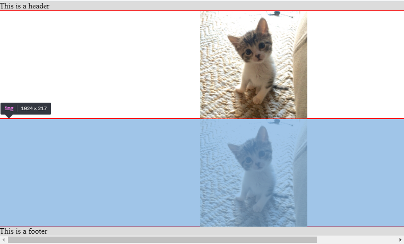
зҺ°еңЁпјҢеҸҰдёҖдёӘй—®йўҳжҳҜжӮЁзҡ„еӣҫеғҸзҡ„е®ҪеәҰдёә1024pxпјҢиҖҢеј№жҖ§йЎ№зӣ®е°ҶдёҚдјҡstretch past its content size due to the min-width constraintпјҢеӣ жӯӨжӮЁйңҖиҰҒж·»еҠ {{1} }гҖӮиҝҷж ·дёҖжқҘпјҢжӮЁе°ұдёҚдјҡеҶҚеҮәзҺ°жәўеҮәй—®йўҳпјҢйӮЈд№ҲжӮЁзҡ„еӣҫеғҸе°Ҷиў«еҢ…еҗ«еңЁflexboxеёғеұҖжүҖе®ҡд№үзҡ„еҢәеҹҹеҶ…гҖӮ
min-width:0html,
body {
margin: 0;
height: 100%;
}
.page {
height: 100%;
display: flex;
}
.main-container {
flex: 1 1 0;
display: flex;
min-width: 0; /*added*/
flex-direction: column;
}
.half-containers {
flex: 0 1 50%;
overflow: auto;
box-sizing: border-box;
border: 0.5px solid red;
display: flex;
}
.page-header {
flex: 0 0 auto;
background-color: #dcdcdc;
}
.page-footer {
flex: 0 0 auto;
background-color: #dcdcdc;
}
img {
object-fit: contain;
min-width: 0; /*added*/
}
иҖғиҷ‘еҲ°<div class="page">
<div class="main-container">
<div class="page-header">
This is a header
</div>
<div class="half-containers">
<img src='https://i.imgur.com/tqQvuFr.jpg' />
</div>
<div class="half-containers">
<img src='https://i.imgur.com/tqQvuFr.jpg' />
</div>
<div class="page-footer">
This is a footer
</div>
</div>
</div>е’Ңbackground-imageпјҢжӮЁд№ҹеҸҜд»Ҙеҫ—еҲ°зӣёеҗҢзҡ„иҫ“еҮәпјҢеӣ дёәжІЎжңүжӣҙеӨҡеҶ…е®№пјҢжӮЁдёҚеҶҚйңҖиҰҒдёәbackground-size:containзәҰжқҹиҖҢзғҰжҒј
min-widthhtml,
body {
margin: 0;
height: 100%;
}
.page {
height: 100%;
display: flex;
}
.main-container {
flex: 1 1 0;
display: flex;
flex-direction: column;
}
.half-containers {
flex: 0 1 50%;
overflow: auto;
box-sizing: border-box;
border: 0.5px solid red;
display: flex;
background:url(https://i.imgur.com/tqQvuFr.jpg) center/contain no-repeat;
}
.page-header {
flex: 0 0 auto;
background-color: #dcdcdc;
}
.page-footer {
flex: 0 0 auto;
background-color: #dcdcdc;
}
зӯ”жЎҲ 1 :(еҫ—еҲҶпјҡ0)
жӮЁеҸҜд»Ҙе°Ҷimgж ҮзӯҫдёҺdivзҡ„{вҖӢвҖӢ{1}}еҢ…иЈ…еңЁдёҖиө·пјҢ并е°ҶеӣҫеғҸwidth: 100%и®ҫзҪ®дёәheightпјҢиҖҢж— йңҖдҪҝз”Ё100%пјҡ< / p>
object-fithtml,
body {
margin: 0;
height: 100%;
}
.page {
height: 100%;
display: flex;
}
.main-container {
flex: 1 1 0;
display: flex;
flex-direction: column;
}
.half-containers {
flex: 0 1 50%;
overflow: auto;
box-sizing: border-box;
border: 0.5px solid red;
display: flex;
}
.page-header {
flex: 0 0 auto;
background-color: #dcdcdc;
}
.page-footer {
flex: 0 0 auto;
background-color: #dcdcdc;
}
.img-container {
width: 100%;
}
img {
height: 100%;
}
- еӣҫеғҸжҜ”imgзҡ„еҺҹе§Ӣе®ҪеәҰдҪҺ100пј…
- CSSеҜ№иұЎйҖӮеҗҲеӣҫеғҸжү©еұ•еёғеұҖ
- вҖңobject-fitпјҡcontainsвҖқе’ҢвҖңmax-widthпјҡ100пј…; max-heightпјҡ100пј…вҖқд№Ӣй—ҙжңүд»Җд№ҲеҢәеҲ«пјҹ
- зҷҫеҲҶжҜ”е®ҪеәҰDivдёҚйҖӮеҗҲ
- CSSиЈҒеүӘеӣҫеғҸд»ҘйҖӮеә”еұҸ幕е®ҪеәҰпјҢеҗҢж—¶дҝқжҢҒеӣҫеғҸзҡ„еҺҹе§Ӣй«ҳеәҰ
- е…·жңүmax-heightе’Ңmax-widthд»ҘеҸҠobject-fitзҡ„flexзҲ¶зә§еҶ…зҡ„еӣҫеғҸеҢ…еҗ«
- еҜ№иұЎйҖӮеҗҲзҡ„еӣҫеғҸеңҶи§’й—®йўҳпјҡеҢ…еҗ«
- еӣҫзүҮе®ҪеәҰйҖӮеҗҲжөҸи§ҲеҷЁе®ҪеәҰ
- йҖӮеҗҲеҜ№иұЎпјҡеҢ…еҗ«пјӣж №жҚ®е®ҪеәҰзҷҫеҲҶжҜ”пј…и®Ўз®—еқҮеҢҖй«ҳеәҰпјҹ
- CSS object-fitпјҡеҢ…еҗ«пјӣеңЁеёғеұҖдёӯдҝқжҢҒеҺҹе§ӢеӣҫеғҸе®ҪеәҰ
- жҲ‘еҶҷдәҶиҝҷж®өд»Јз ҒпјҢдҪҶжҲ‘ж— жі•зҗҶи§ЈжҲ‘зҡ„й”ҷиҜҜ
- жҲ‘ж— жі•д»ҺдёҖдёӘд»Јз Ғе®һдҫӢзҡ„еҲ—иЎЁдёӯеҲ йҷӨ None еҖјпјҢдҪҶжҲ‘еҸҜд»ҘеңЁеҸҰдёҖдёӘе®һдҫӢдёӯгҖӮдёәд»Җд№Ҳе®ғйҖӮз”ЁдәҺдёҖдёӘз»ҶеҲҶеёӮеңәиҖҢдёҚйҖӮз”ЁдәҺеҸҰдёҖдёӘз»ҶеҲҶеёӮеңәпјҹ
- жҳҜеҗҰжңүеҸҜиғҪдҪҝ loadstring дёҚеҸҜиғҪзӯүдәҺжү“еҚ°пјҹеҚўйҳҝ
- javaдёӯзҡ„random.expovariate()
- Appscript йҖҡиҝҮдјҡи®®еңЁ Google ж—ҘеҺҶдёӯеҸ‘йҖҒз”өеӯҗйӮ®д»¶е’ҢеҲӣе»әжҙ»еҠЁ
- дёәд»Җд№ҲжҲ‘зҡ„ Onclick з®ӯеӨҙеҠҹиғҪеңЁ React дёӯдёҚиө·дҪңз”Ёпјҹ
- еңЁжӯӨд»Јз ҒдёӯжҳҜеҗҰжңүдҪҝз”ЁвҖңthisвҖқзҡ„жӣҝд»Јж–№жі•пјҹ
- еңЁ SQL Server е’Ң PostgreSQL дёҠжҹҘиҜўпјҢжҲ‘еҰӮдҪ•д»Һ第дёҖдёӘиЎЁиҺ·еҫ—第дәҢдёӘиЎЁзҡ„еҸҜи§ҶеҢ–
- жҜҸеҚғдёӘж•°еӯ—еҫ—еҲ°
- жӣҙж–°дәҶеҹҺеёӮиҫ№з•Ң KML ж–Ү件зҡ„жқҘжәҗпјҹ