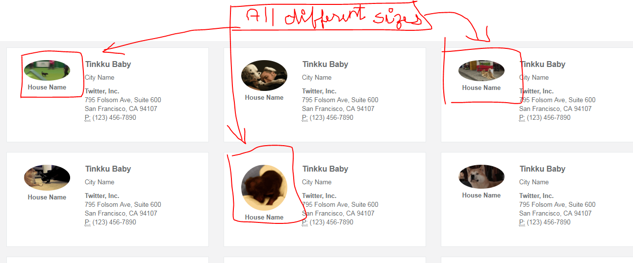
并非以固定的高度和宽度响应所有分辨率的图像
我创建了一个个人资料页面,其中使用了许多不同大小的图像。为了使它响应,我使用了twitter bootstrap3。对于图像,我使用了img-circle m-t-xs img-responsive,但是静止图像却没有以固定的宽度和高度显示,如下所示。
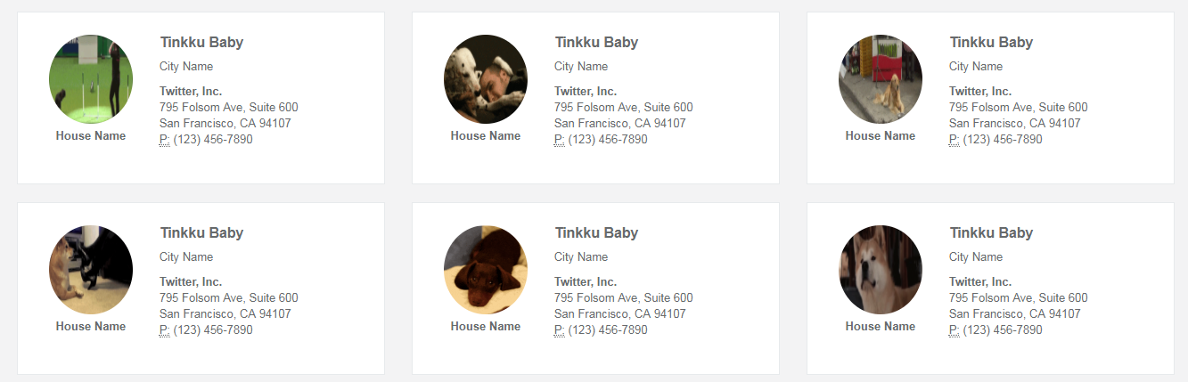
但是当我为.img-responsive添加一个固定的高度和宽度时,它起作用,如下所示,但是我再次知道,这会影响响应式设计。
.img-responsive {
     height: 100px;
     width: 100px;
}
实际视图也很好,如下所示 当我放大时,显示出很多空白,如下图所示
实际观看次数
放大视图
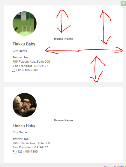
任何人都可以帮助我如何以固定的高度和宽度获取所有这些图像,以响应所有分辨率。还有我放大时如何安排这些空白
我的完整网页可在下面的导航栏中找到(我还没有为.img-responsive类添加固定的高度或宽度,可以通过添加来进行测试)
1 个答案:
答案 0 :(得分:0)
也许是这样的:
<div class="col-lg-4">
  <div class="contact-box row">
    <a href="profile.html">
      <div class="col-xs-4 col-sm-3 col-md-2 col-lg-4 text-center row">
        <div style="width: 100%; padding-top: 100%; overflow: hidden; position: relative; height: 0;">
          <div style="border-radius: 50%; position: absolute; top: 0; bottom: 0; left: 0; right: 0; background-image: url('https://cdn2.thedogapi.com/images/SkatQTaEQ.gif'); background-position: center; background-repeat: no-repeat;">
          </div>
        </div>
        <div class="m-t-xs font-bold">House Name</div>
      </div>
        <div class="col-xs-8">
          <h3><strong>Tinkku Baby</strong></h3>
          <p><i class="fa fa-map-marker"></i> City Name</p>
          <address>
            <strong>Twitter, Inc.</strong><br>
              795 Folsom Ave, Suite 600<br>
              San Francisco, CA 94107<br>
              <abbr title="Phone">P:</abbr> (123) 456-7890
          </address>
        </div>
        <div class="clearfix"></div>
      </a>
    </div>
  </div>
相关问题
最新问题
- 我写了这段代码,但我无法理解我的错误
- 我无法从一个代码实例的列表中删除 None 值,但我可以在另一个实例中。为什么它适用于一个细分市场而不适用于另一个细分市场?
- 是否有可能使 loadstring 不可能等于打印?卢阿
- java中的random.expovariate()
- Appscript 通过会议在 Google 日历中发送电子邮件和创建活动
- 为什么我的 Onclick 箭头功能在 React 中不起作用?
- 在此代码中是否有使用“this”的替代方法?
- 在 SQL Server 和 PostgreSQL 上查询,我如何从第一个表获得第二个表的可视化
- 每千个数字得到
- 更新了城市边界 KML 文件的来源?