如何保持滑块上按钮的相对位置
WPF
我试图做一个自定义控件,将图像放置在滑块上的特定刻度线上。
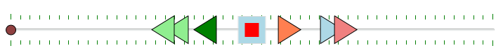
我的最终目标是复制旧的机械听写设备的功能。我的想法是将每个图像与滑块的特定值相关联。也就是说,中心位置为“停止”,最右边的三角形快速倒带,并且会产生弹力,以便只要我按住光标,它们就会“倒带”音频,但是当放开滑块将“弹回”到停止位置。最左边的三角形也可以实现快进。
我最迫切的问题是如何在调整窗口大小时如何将每个三角形与滑块上的常量值相关联,以及如何与滑块保持每个三角形的相对位置。在这里偏离轨道?
任何帮助或建议将不胜感激。
到目前为止,我的自定义控件是:
  <!--Style to replace the default style for the Thumb-->
    <Style x:Key="CustomThumbForSlider" TargetType="{x:Type Thumb}">
        <Setter Property="OverridesDefaultStyle" Value="True"/>
        <Setter Property="Template">
            <Setter.Value>
                <ControlTemplate TargetType="{x:Type Thumb}">
                    <Ellipse Fill="#FF8F4040" Stroke="#FF000000" Height="15" Width="15"/>
                </ControlTemplate>
            </Setter.Value>
        </Setter>
    </Style>

    <!--Style to hide the SliderRepeatButtons and the Track-->
    <Style x:Key="SliderRepeatButtonStyle" TargetType="{x:Type RepeatButton}">
        <Setter Property="OverridesDefaultStyle" Value="true"/>
        <Setter Property="IsTabStop" Value="false"/>
        <Setter Property="Focusable" Value="false"/>
        <Setter Property="Template">
            <Setter.Value>
                <ControlTemplate TargetType="{x:Type RepeatButton}">
                    <Rectangle Fill="Transparent"/>
                </ControlTemplate>
            </Setter.Value>
        </Setter>
    </Style>

    <SolidColorBrush x:Key="HorizontalSliderTrackNormalBackground" Color="#FFE7EAEA"/>
    <LinearGradientBrush x:Key="HorizontalSliderTrackNormalBorder" EndPoint="0,1" StartPoint="0,0">
        <GradientStop Color="#FFAEB1AF" Offset="0.1"/>
        <GradientStop Color="White" Offset=".9"/>
    </LinearGradientBrush>


    <Style TargetType="{x:Type local:MyCustomSlider}" BasedOn="{StaticResource {x:Type Slider}}">
        <Setter Property="Template">
            <Setter.Value>
                <ControlTemplate TargetType="{x:Type local:MyCustomSlider}">
                    <Border Background="{TemplateBinding Background}" BorderBrush="{TemplateBinding BorderBrush}"
                            BorderThickness="{TemplateBinding BorderThickness}">
                        <Grid>
                            <Grid.RowDefinitions>
                                <RowDefinition Height="Auto"/>
                                <RowDefinition Height="Auto" MinHeight="{TemplateBinding MinHeight}"/>
                                <RowDefinition Height="Auto"/>
                            </Grid.RowDefinitions>
                            <TickBar x:Name="TopTick" Visibility="Visible" Fill="{TemplateBinding Foreground}" Placement="Top"
                                     Height="8" Grid.Row="0"/>
                            <TickBar x:Name="BottomTick" Visibility="Visible"  Fill="{TemplateBinding Foreground}"  Placement="Bottom"
                                     Height="8" Grid.Row="2"/>

                            <!--The real track is formed by the RepeatButtons. Since I am hiding the RepeatButtons, this border will
                                act as the visible track for the Thumb.-->
                            <Border x:Name="TrackBackground"
 Background="{StaticResource HorizontalSliderTrackNormalBackground}"
 BorderBrush="{StaticResource HorizontalSliderTrackNormalBorder}"
 BorderThickness="1" CornerRadius="1"
 Margin="5,0" VerticalAlignment="Center" Height="4.0" Grid.Row="1" >
                                    <Canvas Margin="-6,-1">
                                    <Rectangle Visibility="Hidden" x:Name="PART_SelectionRange" Height="4.0"
 Fill="{DynamicResource {x:Static SystemColors.HighlightBrushKey}}"
 Stroke="{DynamicResource {x:Static SystemColors.ControlDarkDarkBrushKey}}"
 StrokeThickness="1.0"/>
                                </Canvas>
                            </Border>

                            <Border x:Name="Stop" Background="LightBlue" BorderBrush="Gainsboro" BorderThickness="1"
                                    Height="40" Width="40" Grid.Row="0" Grid.RowSpan="3" HorizontalAlignment="Center" VerticalAlignment="Center"
                                    >
                                <Rectangle Height="20" Width="20" Fill="Red" HorizontalAlignment="Center" VerticalAlignment="Center"/>
                            </Border>

                            <Path Stroke="Black" Data="M 0 0  L -32 20  L 0 40  L 0 0"  Fill="LightGreen"  Grid.Row="0" Grid.RowSpan="3"
                                  VerticalAlignment="Center" HorizontalAlignment="Left" Margin="260,0,0,0"/>
                            <Path Stroke="Black" Data="M 0 0  L -32 20  L 0 40  L 0 0"  Fill="LightGreen"  Grid.Row="0" Grid.RowSpan="3"
                                  VerticalAlignment="Center" HorizontalAlignment="Left" Margin="240,0,0,0"/>

                            <Path Stroke="Black" Data="M 0 0  L -32 20  L 0 40  L 0 0"  Fill="Green"  Grid.Row="0" Grid.RowSpan="3"
                                  VerticalAlignment="Center" HorizontalAlignment="Left" Margin="300,0,0,0"/>

                            <Path Stroke="Black" Data="M 0 0  L 0 40  L 32 20  L 0 0"  Fill="Coral"  Grid.Row="0" Grid.RowSpan="3"
                                  VerticalAlignment="Center" HorizontalAlignment="Right" Margin="0,0,280,0"/>
                            <Path Stroke="Black" Data="M 0 0  L 0 40  L 32 20  L 0 0"  Fill="LightBlue"  Grid.Row="0" Grid.RowSpan="3"
                                  VerticalAlignment="Center" HorizontalAlignment="Right" Margin="0,0,220,0"/>
                            <Path Stroke="Black" Data="M 0 0  L 0 40  L 32 20  L 0 0"  Fill="LightCoral"  Grid.Row="0" Grid.RowSpan="3"
                                  VerticalAlignment="Center" HorizontalAlignment="Right" Margin="0,0,200,0"/>

                            <!--The important thing that makes the slider control is the IncreaseRepeatButton and DecreaseRepeatButton, when
                                clicked on ends they decrease in the size to the amount of the Tickbar value making the other button grow in
                                size and that gives us the illusion that the thumb is moving. -->
                            <Track x:Name="PART_Track" Grid.Row="1">
                                <Track.DecreaseRepeatButton>
                                    <RepeatButton Style="{StaticResource SliderRepeatButtonStyle}" Command="{x:Static Slider.DecreaseLarge}"/>
                                </Track.DecreaseRepeatButton>
                                <Track.IncreaseRepeatButton>
                                    <RepeatButton Style="{StaticResource SliderRepeatButtonStyle}" Command="{x:Static Slider.IncreaseLarge}"/>
                                </Track.IncreaseRepeatButton>
                                <Track.Thumb>
                                    <Thumb x:Name="Thumb" Style="{StaticResource CustomThumbForSlider}" Background="Black"/>
                                </Track.Thumb>
                            </Track>
                        </Grid>
                    </Border>
                </ControlTemplate>
            </Setter.Value>
        </Setter>
    </Style>
窗口调用为:
<Window x:Class="TheNewReporterProject.MainWindow"
        xmlns="http://schemas.microsoft.com/winfx/2006/xaml/presentation"
        xmlns:x="http://schemas.microsoft.com/winfx/2006/xaml"
        xmlns:d="http://schemas.microsoft.com/expression/blend/2008"
        xmlns:mc="http://schemas.openxmlformats.org/markup-compatibility/2006"
        xmlns:local="clr-namespace:TheNewReporterProject"
        mc:Ignorable="d"
        Title="MainWindow" Height="450" Width="800">
    <Grid>

        <local:MyCustomSlider x:Name="CusomSlider" Height="50" MinHeight="30" Foreground="Green" IsSnapToTickEnabled="True"
                              TickFrequency=".2"
                              VerticalAlignment="Top" Margin="46,65,37,0" />


    </Grid>
</Window>
0 个答案:
没有答案
相关问题
最新问题
- 我写了这段代码,但我无法理解我的错误
- 我无法从一个代码实例的列表中删除 None 值,但我可以在另一个实例中。为什么它适用于一个细分市场而不适用于另一个细分市场?
- 是否有可能使 loadstring 不可能等于打印?卢阿
- java中的random.expovariate()
- Appscript 通过会议在 Google 日历中发送电子邮件和创建活动
- 为什么我的 Onclick 箭头功能在 React 中不起作用?
- 在此代码中是否有使用“this”的替代方法?
- 在 SQL Server 和 PostgreSQL 上查询,我如何从第一个表获得第二个表的可视化
- 每千个数字得到
- 更新了城市边界 KML 文件的来源?