如何为边框按钮添加边框?
我最近才陷入困境,到目前为止,我一直很喜欢它,但是我一直在进行一些UI更改。任何帮助表示赞赏!
我的目标是要获得一个圆形按钮,该按钮的图标带有蓝色背景,但外部周围有一个较深的蓝色边框。附带图片。
我的方法是:
- 获取一个蓝色圆形按钮。
- 在该按钮中放置一个图标。
- 添加边框。
我陷入了第3步,因为我不知道如何添加边框,或者考虑到我解决问题的方式,是否还有可能添加边框。目前,具体颜色对我来说并不重要,稍后我将更改主题。
这是我目前的明智代码:
  var messageBtn = new Row(
  children: <Widget>[
    new Padding(
      padding: const EdgeInsets.all(20.0),
      child: new RawMaterialButton(
        onPressed: _messages,
        child: new Padding(
          padding: const EdgeInsets.all(20.0),
          child: new Icon(
            Icons.message,
            size: 30.0,
            color: Colors.white,
          ),
        ),
        shape: new CircleBorder(),
        fillColor: Colors.deepPurple,
      ),
    ),
    new Padding(
        padding: const EdgeInsets.all(8.0),
        child: new Text(
          'Send Messages',
          style: new TextStyle(
            fontSize: 20.0,
          ),
        )),
  ],
);
它产生以下内容:see screenshot
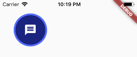
我想要这个:see second screenshot
5 个答案:
答案 0 :(得分:7)
只需将IconButton包裹到Container中,并将其decoration设置如下:
Container(
  decoration: BoxDecoration(
    border: Border.all(color: Colors.blue, width: 4),
    color: Colors.yellow,
    shape: BoxShape.circle,
  ),
  child: IconButton(
    iconSize: 56,
    icon: Icon(Icons.check),
    onPressed: () {},
  ),
),
答案 1 :(得分:5)
你好凯瑟琳,欢迎您!
通过更深入地研究组成MaterialButton的小部件,可以实现所需的目标。
首先,您需要Ink小部件。这样可以使用BoxDecoration提供更灵活的样式。
然后 Ink可以包含一个InkWell小部件,该小部件可以识别onTap并绘制飞溅效果。默认情况下,飞溅会继续到包含框的边缘,但是您可以通过给InkWell很大的borderRadius使其呈圆形。
这是您要使用的按钮的示例:
Material(
  child: Ink(
    decoration: BoxDecoration(
      border: Border.all(color: Colors.indigoAccent, width: 4.0),
      color: Colors.indigo[900],
      shape: BoxShape.circle,
    ),
    child: InkWell(
      //This keeps the splash effect within the circle
      borderRadius: BorderRadius.circular(1000.0), //Something large to ensure a circle
      onTap: _messages,
      child: Padding(
        padding:EdgeInsets.all(20.0),
        child: Icon(
          Icons.message,
          size: 30.0,
          color: Colors.white,
        ),
      ),
    ),
  )
),
结果如下:
答案 2 :(得分:4)
可以使用带边框的 FloatingActionButton :
   FloatingActionButton(
                              mini: false,
                              backgroundColor: Colors.blue.shade900,
                              splashColor: Colors.black,
                              onPressed: () {
                                logOutDialog(context);
                              },
                              hoverElevation: 1.5,
                              shape: StadiumBorder(
                                  side: BorderSide(
                                      color: Colors.blue, width: 4)),
                              elevation: 1.5,
                              child: Icon(
                                Icons.logout,
                                color: _foregroundColor,
                              ),
                            )
答案 3 :(得分:1)
在 Flutter 2 中有 TextButton:
TextButton(
  style: ButtonStyle(
   side: RedSelectedBorderSide(),
  ),
  child: Text(
    "Button"
  ),
  onPressed: (){}
);
RedSelectedBorderSide() 在哪里:
class RedSelectedBorderSide extends MaterialStateBorderSide {
  @override
  BorderSide resolve(Set<MaterialState> states) {
    if (states.contains(MaterialState.selected)) {
      return BorderSide(
        width: 2,
        color: Colors.red,
      ); //
    }
    return null;// Defer to default value on the theme or widget.
  }
}
答案 4 :(得分:0)
对于TextButton
在 style 中使用 side 和 MaterialStateProperty 和 BorderSide。
TextButton(
  style: ButtonStyle(
   side: MaterialStateProperty.all(
     BorderSide(width: 1, color: Colors.black),
   ),
  ),
  child: Text(
    "My Button"
  ),
  onPressed: (){}
);
相关问题
最新问题
- 我写了这段代码,但我无法理解我的错误
- 我无法从一个代码实例的列表中删除 None 值,但我可以在另一个实例中。为什么它适用于一个细分市场而不适用于另一个细分市场?
- 是否有可能使 loadstring 不可能等于打印?卢阿
- java中的random.expovariate()
- Appscript 通过会议在 Google 日历中发送电子邮件和创建活动
- 为什么我的 Onclick 箭头功能在 React 中不起作用?
- 在此代码中是否有使用“this”的替代方法?
- 在 SQL Server 和 PostgreSQL 上查询,我如何从第一个表获得第二个表的可视化
- 每千个数字得到
- 更新了城市边界 KML 文件的来源?