在Bootstrap中使用HTML Meta Viewport标签
我目前正在Bootstrap 4中建立一个网站。我正在使用Google Lighthouse分析该网站,并建议我在代码的head标签中添加<meta name="viewport" content="width=device-width, initial-scale=1">,以便在移动设备上正确显示。 / p>
此标签通过使文字在移动设备上显示更大的字体来改善了我的网站;以前,它看起来像是桌面视图,因此文本和图片更难以阅读。不幸的是,它也弄乱了Bootstrap格式。文本在导航栏和元素之外重叠,外观完全混乱。
在使用该标记之前,我的网站在移动设备上看起来像这样:

使用该标签后,我的网站在移动设备上看起来像这样:

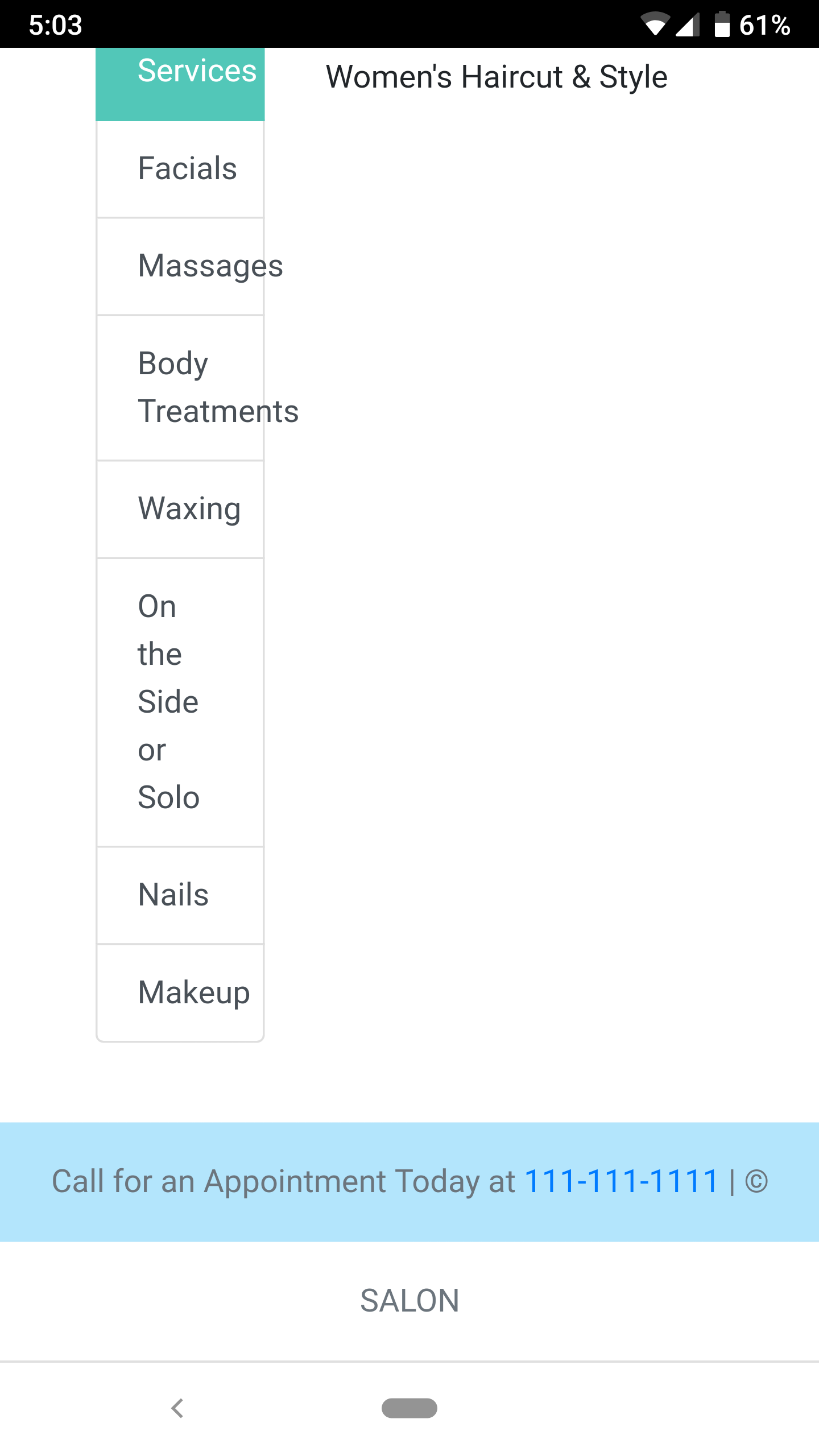
请注意文本如何更容易阅读,但在其容器外重叠。在使用Bootstrap时不应该使用此标签吗?我想保持增加的文本大小并提高文本的可读性,但也不想弄乱用户界面。
这是我的页面HTML代码:
<html lang="en">
<head>
    <link rel="stylesheet" href="https://stackpath.bootstrapcdn.com/bootstrap/4.1.0/css/bootstrap.min.css" integrity="sha384-9gVQ4dYFwwWSjIDZnLEWnxCjeSWFphJiwGPXr1jddIhOegiu1FwO5qRGvFXOdJZ4" crossorigin="anonymous">
    <link rel="stylesheet" type="text/css" href="styling.css">
    <meta charset="UTF-8">
    <meta name="viewport" content="width=device-width, initial-scale=1">
    <title>Services</title>
    <meta name="Description" content="Salon's Offered Services.">
    <link rel="manifest" href="manifest.webmanifest">
</head>
<body>
    <div id="navbar"></div>
    <div class="container-fluid py-4 px-5">
        <div class="row">
            <div class="col">
                <h1 class="text-center">Your escape awaits.</h1>
                <h5>
                    Our services are customized for you to enhance your personal style and overall wellbeing. Take a moment for yourself . . . embrace your natural beauty, find a sense of balance, and, most importantly, have fun. You're always welcome at Salon.
                </h5>
            </div>
        </div>
        <br>
        <div class="row">
            <div class="col-4">
                <div class="list-group" id="list-tab" role="tablist">
                    <a class="list-group-item list-group-item-action active" id="list-hair-list" data-toggle="list" href="#list-hair" role="tab" aria-controls="list-hair">Hair Services</a>
                    <a class="list-group-item list-group-item-action" id="list-facials-list" data-toggle="list" href="#list-facials" role="tab" aria-controls="list-facials">Facials</a>
                    <a class="list-group-item list-group-item-action" id="list-massages-list" data-toggle="list" href="#list-massages" role="tab" aria-controls="list-massages">Massages</a>
                    <a class="list-group-item list-group-item-action" id="list-body-list" data-toggle="list" href="#list-body" role="tab" aria-controls="list-body">Body Treatments</a>
                    <a class="list-group-item list-group-item-action" id="list-waxing-list" data-toggle="list" href="#list-waxing" role="tab" aria-controls="list-waxing">Waxing</a>
                    <a class="list-group-item list-group-item-action" id="list-sideorsolo-list" data-toggle="list" href="#list-sideorsolo" role="tab" aria-controls="list-sideorsolo">On the Side or Solo</a>
                    <a class="list-group-item list-group-item-action" id="list-nails-list" data-toggle="list" href="#list-nails" role="tab" aria-controls="list-nails">Nails</a>
                    <a class="list-group-item list-group-item-action" id="list-makeup-list" data-toggle="list" href="#list-makeup" role="tab" aria-controls="list-makeup">Makeup</a>
                </div>
            </div>
            <div class="col-8">
                <div class="tab-content" id="nav-tabContent">
                    <div class="tab-pane fade show active" id="list-hair" role="tabpanel" aria-labelledby="list-hair-list">
                        <p>Consultation</p>
                        <p>Women's Haircut & Style</p>
                    </div>
                    <div class="tab-pane fade" id="list-facials" role="tabpanel" aria-labelledby="list-facials-list">...</div>
                    <div class="tab-pane fade" id="list-massages" role="tabpanel" aria-labelledby="list-massages-list">...</div>
                    <div class="tab-pane fade" id="list-body" role="tabpanel" aria-labelledby="list-body-list">...</div>
                    <div class="tab-pane fade" id="list-waxing" role="tabpanel" aria-labelledby="list-waxing-list">...</div>
                    <div class="tab-pane fade" id="list-sideorsolo" role="tabpanel" aria-labelledby="list-sideorsolo-list">...</div>
                    <div class="tab-pane fade" id="list-nails" role="tabpanel" aria-labelledby="list-nails-list">...</div>
                    <div class="tab-pane fade" id="list-makeup" role="tabpanel" aria-labelledby="list-makeup-list">...</div>
                </div>
            </div>
        </div>
    </div>
    <div id="footer"></div>
</body>
<script src="https://code.jquery.com/jquery-3.3.1.min.js"></script>
<script src="https://cdnjs.cloudflare.com/ajax/libs/popper.js/1.14.0/umd/popper.min.js" integrity="sha384-cs/chFZiN24E4KMATLdqdvsezGxaGsi4hLGOzlXwp5UZB1LY//20VyM2taTB4QvJ" crossorigin="anonymous"></script>
<script src="https://stackpath.bootstrapcdn.com/bootstrap/4.1.0/js/bootstrap.min.js" integrity="sha384-uefMccjFJAIv6A+rW+L4AHf99KvxDjWSu1z9VI8SKNVmz4sk7buKt/6v9KI65qnm" crossorigin="anonymous"></script>
<script src="loadelements.js"></script>
</html>
这是我的CSS:
:root {
    --primary-color: #03A9F4;
    --primary-color--light: #B3E5FC;
    --secondary-color: #009688;
    --secondary-color--dark: #00675b;
    --secondary-color--light: #52c7b8;
}
html {
    position: relative;
    min-height: 100%;
}
body {
    margin-bottom: 60px; /* Margin bottom by footer height */
}
nav {
    background-color: var(--primary-color);
}
.navbar-brand {
    font-family: 'Franklin Gothic Medium', 'Arial Narrow', Arial, sans-serif !important;
}
footer {
    background-color: var(--primary-color--light);
    position: absolute;
    bottom: 0;
    width: 100%;
    height: 60px; /* Set the fixed height of the footer here */
    line-height: 60px; /* Vertically center the text there */
}
#get-started-button {
    border-color: var(--secondary-color);
    background-color: var(--secondary-color);
}
#hairstyle-carousel {
    width: 400px;
    margin: 0 auto;
}
.list-group-item.list-group-item-action.active {
    border-color: var(--secondary-color--light);
    background-color: var(--secondary-color--light);
}
.image-description {
    color: var(--secondary-color--dark);
}
2 个答案:
答案 0 :(得分:0)
使用引导程序以确保正确渲染和触摸缩放时,应将视口元标记添加到
dotnet publish -c Release -r linux-x64您还可以禁用缩放:
<meta name="viewport" content="width=device-width, initial-scale=1">
它表明您没有以正确的方式使用引导程序元素(例如:边栏表的with)。...请发布您的html代码,以便我为您提供帮助...
现在有了代码,我可以看到您应该做什么:
第24行替换
    <meta name="viewport" content="width=device-width, initial-scale=1,
          maximum-scale=1, user-scalable=no">
通过
<div class="col-4">
答案 1 :(得分:0)
请确保如果您使用的元素仅是窗口大小的一小部分(例如列),请阅读其响应性准则。例如,使用col类,您可以添加一个类似col-sm-4的断点。根据您使用的断点(sm,md,lg,xl),列将响应地调整大小以适合列。
https://getbootstrap.com/docs/4.1/layout/grid/
这是引导页面,其中包含您所寻找的所有内容!祝好运!
换句话说,将其添加到您的列类中,可以解决大多数间距和“压缩”问题。 (我个人认为md断点是最理想的,但这又是一种观点。您的网站就是您想要的!)
- 我写了这段代码,但我无法理解我的错误
- 我无法从一个代码实例的列表中删除 None 值,但我可以在另一个实例中。为什么它适用于一个细分市场而不适用于另一个细分市场?
- 是否有可能使 loadstring 不可能等于打印?卢阿
- java中的random.expovariate()
- Appscript 通过会议在 Google 日历中发送电子邮件和创建活动
- 为什么我的 Onclick 箭头功能在 React 中不起作用?
- 在此代码中是否有使用“this”的替代方法?
- 在 SQL Server 和 PostgreSQL 上查询,我如何从第一个表获得第二个表的可视化
- 每千个数字得到
- 更新了城市边界 KML 文件的来源?