具有行和列跨度的CSS响应网格
我无法使响应式网格与行和列跨度一起正常工作。 我一直在尝试通过引导程序来完成此任务,但同时也在尝试使用本机CSS。
这是我正在尝试使用CSS的一个很好的例子:
https://codepen.io/adrianpuescu/pen/PwRVej
这是我要实现的网格图像。
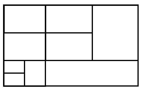
有什么方法可以调整到Codepen以实现图像中的网格? 我遇到的问题是使底部网格正常工作。
/* Optional */
html,
body {
  height: 100%;
  padding: 0;
  margin: 0;
}
* {
  -webkit-box-sizing: border-box;
  -moz-box-sizing: border-box;
  box-sizing: border-box;
}
table {
  height: 100%;
}
.cell {
  background: #ddd;
  border: 5px solid #fff;
}
/* Optional */
[class*="col-"] {
  float: left;
}
.col-1 {
  width: 8.333333%;
}
.col-2 {
  width: 16.666666%;
}
.col-3 {
  width: 25%;
}
.col-4 {
  width: 33.333333%;
}
.col-5 {
  width: 41.666666%;
}
.col-6 {
  width: 50%;
}
.col-7 {
  width: 58.333333%;
}
.col-8 {
  width: 66.666666%;
}
.col-9 {
  width: 75%;
}
.col-10 {
  width: 83.333333%;
}
.col-11 {
  width: 91.666666%;
}
.col-12 {
  width: 100%;
}
.row-1 {
  height: 8.333333%;
}
.row-2 {
  height: 16.666666%;
}
.row-3 {
  height: 25%;
}
.row-4 {
  height: 33.333333%;
}
.row-5 {
  height: 41.666666%;
}
.row-6 {
  height: 50%;
}
.row-7 {
  height: 58.333333%;
}
.row-8 {
  height: 66.666666%;
}
.row-9 {
  height: 75%;
}
.row-10 {
  height: 83.333333%;
}
.row-11 {
  height: 91.666666%;
}
.row-12 {
  height: 100%;
}
<div class="row-12 col-6">
<div class="row-8 cell">row 1-2, cell 1</div>
<div class="row-4 cell">row 1, cell 2</div>
</div>
<div class="row-12 col-6">
<div class="row-12 col-6">
<div class="row-4 cell">row 1, cell 1</div>
<div class="row-8 cell">row 2-3, cell 2</div>
</div>
<div class="row-12 col-6">
<div class="row-4 cell">row 1, cell 1</div>
<div class="row-4 cell">row 2, cell 2</div>
<div class="row-4 cell">row 3, cell 1</div>
</div>
</div>
2 个答案:
答案 0 :(得分:2)
通过新的“网格布局”规范,您可以轻松完成此操作。
.container {
  display: grid;
  grid-template-columns: repeat(1fr, 6);
  grid-template-rows: repeat(1fr, 6);
  grid-column-gap: 5px;
  grid-row-gap: 5px;
  grid-template-areas:
    'col1 col1 col2 col2 col5 col5'
    'col1 col1 col2 col2 col5 col5'
    'col3 col3 col4 col4 col5 col5'
    'col3 col3 col4 col4 col5 col5'
    'col6 col8 col9 col9 col9 col9'
    'col7 col8 col9 col9 col9 col9';
}

[class^='col'] {
  background: pink;
  min-height: 40px;
  display: flex;
  align-items: center;
  justify-content: center;
}

.col1 { grid-area: col1; }
.col2 { grid-area: col2; }
.col3 { grid-area: col3; }
.col4 { grid-area: col4; }
.col5 { grid-area: col5; }
.col6 { grid-area: col6; }
.col7 { grid-area: col7; }
.col8 { grid-area: col8; }
.col9 { grid-area: col9; }
<div class="container">
<div class="col1">1</div>
<div class="col2">2</div>
<div class="col3">3</div>
<div class="col4">4</div>
<div class="col5">5</div>
<div class="col6">6</div>
<div class="col7">7</div>
<div class="col8">8</div>
<div class="col9">9</div>
</div>
以下是有关Grid的更多信息:
https://developer.mozilla.org/en-US/docs/Web/CSS/CSS_Grid_Layout
答案 1 :(得分:1)
您可以将其放入表格中。在我的回答中,我将您的部分分为4行和4列。列定义在<colgroup>标记中提供。您可以根据需要将这些样式推入CSS。
/* Optional */
html,
body {
  height: 100%;
  padding: 0;
  margin: 0;
}

* {
  -webkit-box-sizing: border-box;
  -moz-box-sizing: border-box;
  box-sizing: border-box;
}

table {
  width: 100%;
  height: 100%;
}

table td {
  background: #ddd;
  border: 5px solid #fff;
}
<table>
<colgroup>
<col style="width:16.66%">
<col style="width:16.66%">
<col style="width:33.33%">
<col style="width:33.33%">
</colgroup>
<tbody>
<tr>
<td colspan=2>row 1, cell 1-2</td>
<td>row 1, cell 3</td>
<td rowspan=2>row 1, cell 4</td>
</tr>
<tr>
<td colspan=2>row 2, cell 1-2</td>
<td>row 2, cell 3</td>
</tr>
<tr>
<td>row 3, cell 1</td>
<td rowspan=2>row 3-4, cell 2</td>
<td rowspan=2 colspan=2>row 3-4, cell 3</td>
</tr>
<tr>
<td>row 4, cell 1</td>
</tr>
</tbody>
</table>
还有另一个问题:How to Create a Grid/Tile View提倡使用jQuery Masonry plugin(插件开销),Flexbox(可能很复杂且令人困惑)或Columns(也可以是复杂)。
如果这些解决方案适合您,则取决于您,但是不可能像许多SO问题中指出的那样仅使用CSS Floats。
相关问题
最新问题
- 我写了这段代码,但我无法理解我的错误
- 我无法从一个代码实例的列表中删除 None 值,但我可以在另一个实例中。为什么它适用于一个细分市场而不适用于另一个细分市场?
- 是否有可能使 loadstring 不可能等于打印?卢阿
- java中的random.expovariate()
- Appscript 通过会议在 Google 日历中发送电子邮件和创建活动
- 为什么我的 Onclick 箭头功能在 React 中不起作用?
- 在此代码中是否有使用“this”的替代方法?
- 在 SQL Server 和 PostgreSQL 上查询,我如何从第一个表获得第二个表的可视化
- 每千个数字得到
- 更新了城市边界 KML 文件的来源?