如何创建像苹果这样的导航栏?
如何创建Apple一样的导航栏?我已经尝试过了,到目前为止,这是我所拥有的: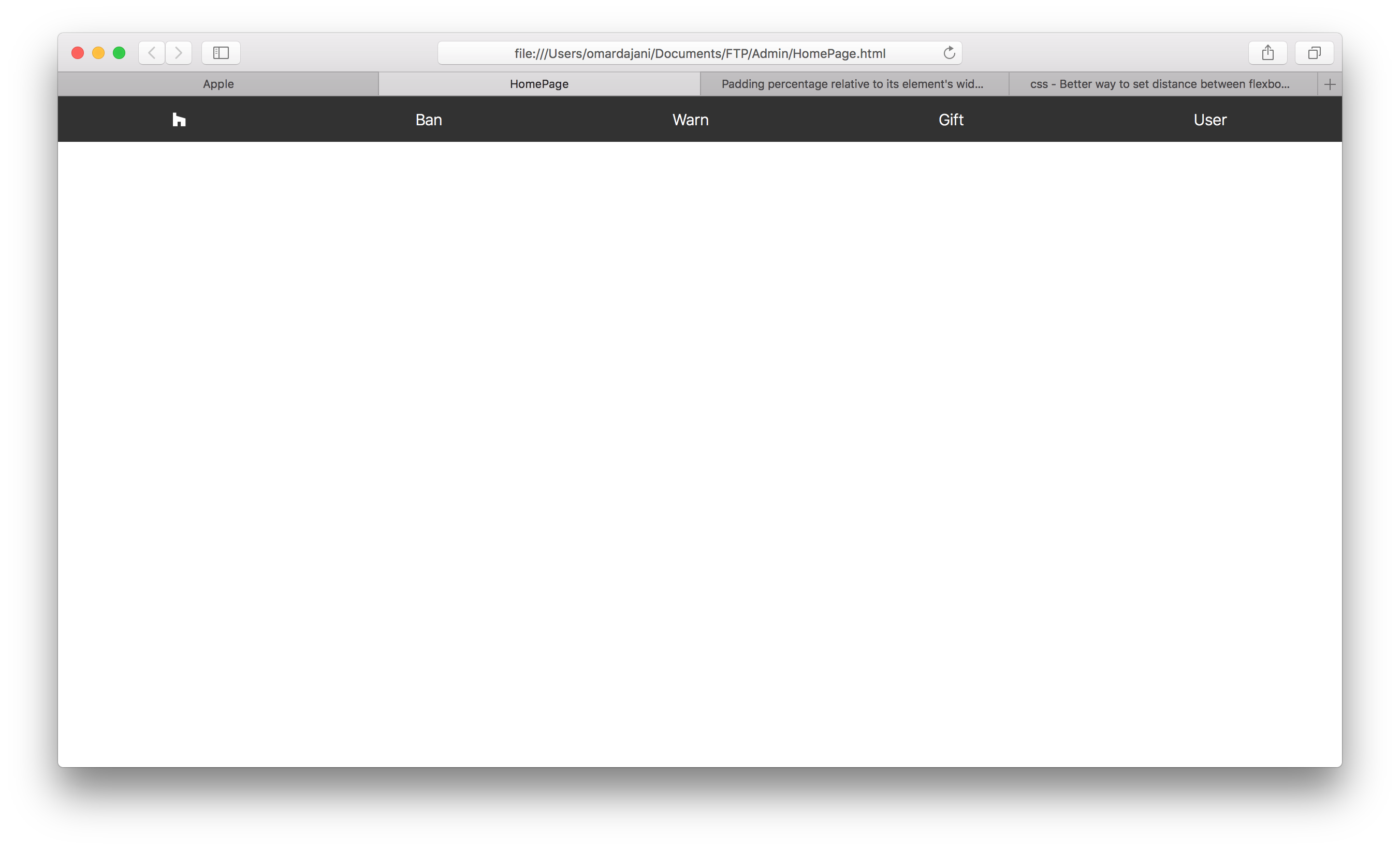
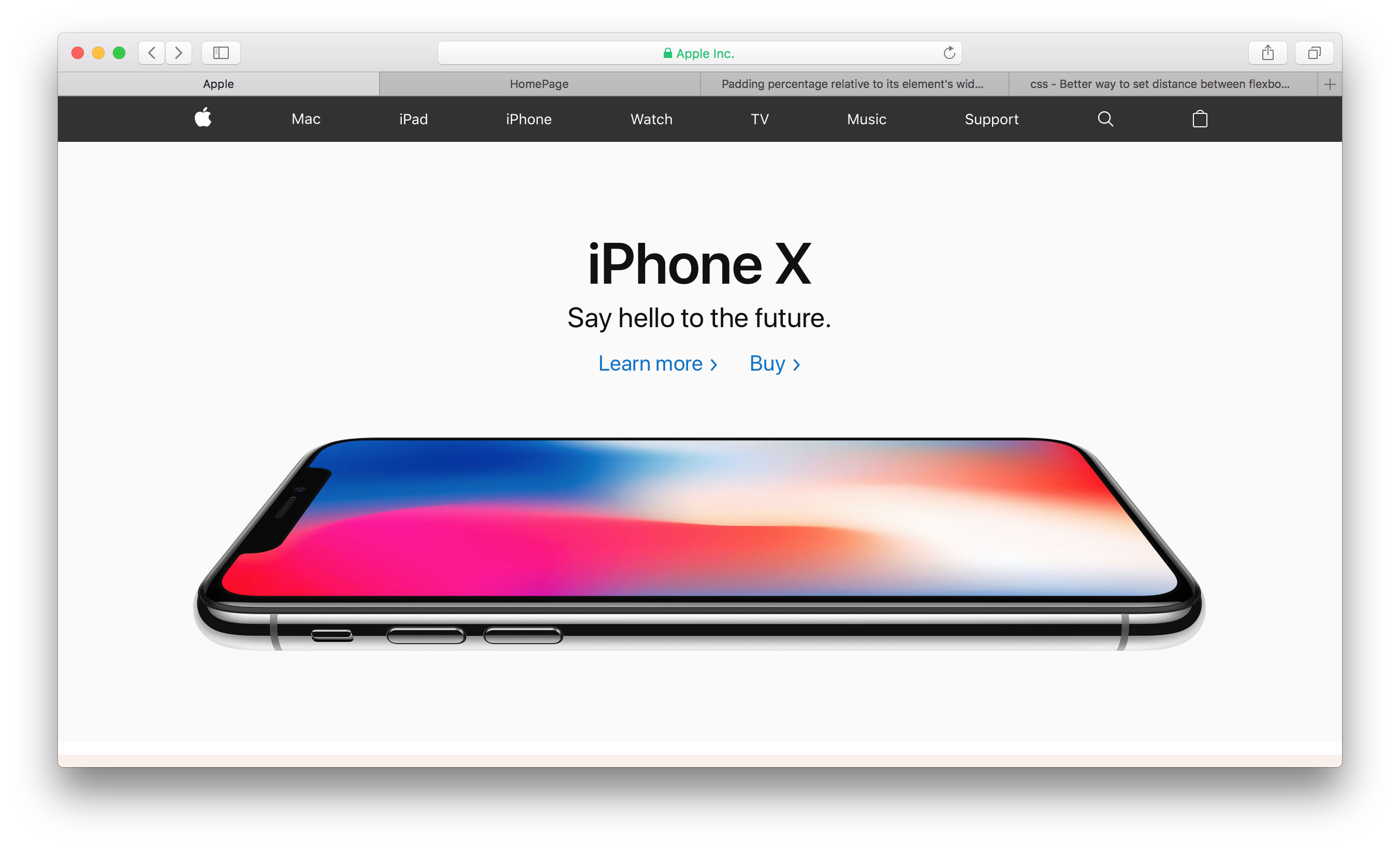
如您所见,按钮的间距略微偏小。我使用justify-content: space-around实现了这一目标。我曾尝试使间距与Apple网站一样,但没有成功,并且想知道是否有人可以帮助我。仅供参考,这是Apple网站的导航栏。
这是我尝试过的:
.wrapper {
  height: 100vh;
}

nav {
  height: 44px;
  overflow: scroll;
  background: #323232;
}

nav ul {
  display: flex;
  height: 44px;
  justify-content: space-around;
  align-items: center;
  padding: 0;
  margin: 0;
  list-style-type: none;
}

nav li {}

nav a {
  display: block;
  color: white;
  font-size: 15px;
  font-weight: lighter;
  text-decoration: none;
  transition: 0.3s;
}

nav a:hover {
  color: #B8B8B8;
}
<div class="wrapper">
<nav>
<ul>
<li><a href="#"><i class="fab fa-houzz"></i></a></li>
<li><a href="#">Ban</a></li>
<li><a href="#">Warn</a></li>
<li><a href="#">Gift</a></li>
<li><a href="#">User</a></li>
</ul>
</nav>
</div>
6 个答案:
答案 0 :(得分:4)
几件事:
- 苹果公司在导航中应用了“容器”和“最大宽度”。这已添加到下面。
- 我已经调整了一些样式以改善外观。以下CSS中的注释。
- 如果仔细看,苹果在链接之间会有“死角”。该标记/布局中也存在。
如果这不能解决您的问题,请告知“间隔不正确”的含义-具体并清除,否则将无济于事。 ...:)
body {
margin: 0;
}

.wrapper {
  height: 100vh;
}

nav {
  height: 44px;
  background: #323232;
  text-align: center; /* to center the UL in the nav */
}

nav ul {
  display: flex;
  max-width: 1200px; /* change to desired width */
  /* removed height from here, apply to a elements */
  justify-content: space-around;
  align-items: center;
  padding: 0;
  margin: 0 auto; /* 0 auto allows it to self-center in the nav */
  list-style-type: none;
}

nav li {}

nav a {
  display: inline-block;
  height: 44px; /* apply the height here, pushes the li / ul to be the correct height */
  line-height: 44px; /* to get vertical centering */
  color: white;
  font-size: 15px;
  font-weight: 100;
  text-decoration: none;
  transition: 0.3s;
}

nav a:hover {
  color: #B8B8B8;
}
<div class="wrapper">
<nav>
<ul>
<li><a href="#"><i class="fab fa-houzz"></i></a></li>
<li><a href="#">Ban</a></li>
<li><a href="#">Warn</a></li>
<li><a href="#">Gift</a></li>
<li><a href="#">User</a></li>
</ul>
</nav>
</div>
答案 1 :(得分:3)
您需要为ul添加一个额外的包装,比方说“ appleNav”
将以下内容添加到appleNav
.appleNav {
  max-width: 980px;
  margin: 0 auto;
}
.wrapper {
  height: 100vh;
}

body {
  margin: 0;
}

nav {
  height: 44px;
  overflow: scroll;
  background: #323232;
}

nav ul {
  display: flex;
  height: 44px;
  justify-content: space-around;
  align-items: center;
  padding: 0;
  margin: 0 auto;
  list-style-type: none;
}

nav li {}

nav a {
  display: block;
  color: white;
  font-size: 15px;
  font-weight: lighter;
  text-decoration: none;
  transition: 0.3s;
}

nav a:hover {
  color: #B8B8B8;
}

.appleNav {
  max-width: 980px;
  margin: 0 auto;
}
<div class="wrapper">
<nav>
<div class="appleNav">
<ul>
<li>
<a href="#"><img src="https://www.iconsdb.com/icons/preview/white/apple-xxl.png" height="20"></a>
</li>
<li><a href="#">Mac</a></li>
<li><a href="#">iPad</a></li>
<li><a href="#">iPhone</a></li>
<li><a href="#">Watch</a></li>
<li><a href="#">TV</a></li>
<li><a href="#">Music</a></li>
<li><a href="#">Support</a></li>
<li>
<a href="#"><img src="https://www.iconsdb.com/icons/preview/white/search-3-xxl.png" height="20"></a>
</li>
<li><a href="#">User</a></li>
</ul>
</div>
</nav>
</div>
答案 2 :(得分:0)
如果要在每个按钮和一个按钮之间留出一个空格,则必须使用margin命令在所有按钮之间均等地进行间隔和间隔。将margin放置在要与其余按钮之间保持相等距离的按钮之前,然后在样式中定义它,并设置所需的每个按钮之间的距离,并使用margin命令并选择方向您要设置与另一个按钮之间的距离(如果向左或向右),例如:
margin-right: 20px;
答案 3 :(得分:0)
要在按钮之前与其他按钮之间保持相等距离的位置,然后在其内定义该位置,以设置每个按钮之间的距离,并使用命令并选择要在两个按钮之间设置距离的方向另一个按钮(如果是左侧或右侧),例如
答案 4 :(得分:0)
这是他们在此密码笔中的代码:https://codepen.io/anon/pen/aRKjzz
World::World(ViewPlane * v, Vector3d &Ambient){
    vp = v;
    shader = (Shader(Ambient));
}
CSS太大,无法在此处包含。
答案 5 :(得分:0)
.wrapper {
  height: 100vh;
}

body {
  margin: 0;
}

nav {
  height: 44px;
  overflow: scroll;
  background: #323232;
}

nav ul {
  display: flex;
  height: 44px;
  justify-content: space-around;
  align-items: center;
  padding: 0;
  margin: 0 auto;
  list-style-type: none;
}

nav li {}

nav a {
  display: block;
  color: white;
  font-size: 15px;
  font-weight: lighter;
  text-decoration: none;
  transition: 0.3s;
}

nav a:hover {
  color: #B8B8B8;
}

.appleNav {
  max-width: 980px;
  margin: 0 auto;
}
<div class="wrapper">
<nav>
<div class="appleNav">
<ul>
<li>
<a href="#"><img src="https://www.iconsdb.com/icons/preview/white/apple-xxl.png" height="20"></a>
</li>
<li><a href="#">Mac</a></li>
<li><a href="#">iPad</a></li>
<li><a href="#">iPhone</a></li>
<li><a href="#">Watch</a></li>
<li><a href="#">TV</a></li>
<li><a href="#">Music</a></li>
<li><a href="#">Support</a></li>
<li>
<a href="#"><img src="https://www.iconsdb.com/icons/preview/white/search-3-xxl.png" height="20"></a>
</li>
<li><a href="#">User</a></li>
</ul>
</div>
</nav>
</div>
- 我写了这段代码,但我无法理解我的错误
- 我无法从一个代码实例的列表中删除 None 值,但我可以在另一个实例中。为什么它适用于一个细分市场而不适用于另一个细分市场?
- 是否有可能使 loadstring 不可能等于打印?卢阿
- java中的random.expovariate()
- Appscript 通过会议在 Google 日历中发送电子邮件和创建活动
- 为什么我的 Onclick 箭头功能在 React 中不起作用?
- 在此代码中是否有使用“this”的替代方法?
- 在 SQL Server 和 PostgreSQL 上查询,我如何从第一个表获得第二个表的可视化
- 每千个数字得到
- 更新了城市边界 KML 文件的来源?