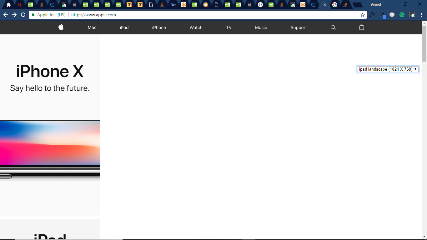
在我的应用中,我们正在查看网页。有一个按钮可以加载ex-的网页:单击按钮后,如image所示,它打开了apple.com。现在,我想在每个设备宽度上显示该网页,但是这样做会导致网页失去响应。选择分辨率(用红色墨水标记)是chrome扩展名,用于更改任何网页的宽度,并且不应更改网页的网址(不能使用框架)。image after changing width Result should be like this but without the use of iframe/frames
var html = '<div class="captureMainWrap" style="position:absolute; top:100px; right: 10px;"><div class="captureCollapse" style="cursor: pointer;"><i class="captureAccordian fa fa-caret-right" style="color:#fff; margin: 11px 5px 0 5px; font-size:25px;"></i></div><div class="capture"><div id="screenEmulator" style="margin-top:6px;"><select class="selDevice" id="selectDevice"><option disabled selected hidden>Select Resolution</option><option data-height="100%" data-width="100%">My Screen</option><option data-height="568px" data-width="320px">iphone 5s (320 X 568)</option><option data-height="627px" data-width="375px">iphone 6s (375 X 627)</option><option data-height="1024px" data-width="768px">ipad portrait (768 X 1024)</option><option data-height="768px" data-width="1024px">ipad landscape (1024 X 768)</option><option data-height="567px" data-width="360px">Nexus 5 (360 X 567)</option><option data-height="659px" data-width="412px">Nexus 6 (412 X 659)</option></select></div><div class="append"></div><div class="onCamera"><i class="fa fa-camera" id="onCameraClick" style="font-size:25px text-shadow: 0px 0px 3px #00fa91;"></i><div></div></div> </div></div>';
$('body').append(html);
var div ='<div id="maindiv"></div>';
var body = $('body');
var head = $('head');
$('html').append(div);
$('#maindiv').append(body);
$('#maindiv').append(head);

$('#selectDevice').change(function(){
var selectHeight=$("#selectDevice").find('option:selected').attr('data-height');
var selectWidth=$("#selectDevice").find('option:selected').attr('data-width');
if(($("#selectDevice").val()=="My Screen")){
   $('#maindiv').css('width','100px');
}
else{
   $('#maindiv').css('width','100px');
}
});