仅使用DIV在JavaScript中制作时钟
我们必须使用div s(document.createElement())在JavaScript中构建时钟。不知何故,我从来没有得到div对的定位。目前,我已经在努力制作第一个DIV。
很抱歉,如果我在计算角度方面有错误。
有没有更好的方法来实现这一目标?
现在看起来有点像这样:
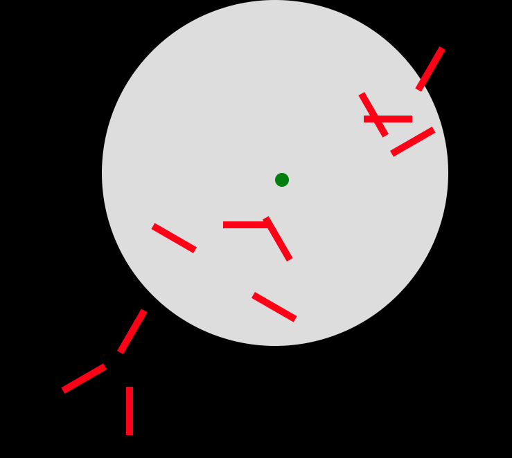
红线代表一个时钟的数字(总共12个)。
window.onload = function drawclock() {
  var clock = this.document.getElementById("clock");
  var width = clock.offsetHeight;
  var radius = width / 2;

  for (var i = 1; i < 12; i++) {
    var element = document.createElement("DIV");
    addClass(element, "h");
    addClass(element, i);
    var deg = 30 * i;
    var x = Math.cos(deg * (180 / Math.PI)) * radius + radius;
    var y = Math.sin((90 - deg) * (180 / Math.PI)) * radius + radius;
    console.log(x + " " + y);
    element.style.position = "absolute";
    element.style.left = x + "px";
    element.style.top = y + "px";
    element.style.transform = "rotate(" + deg + "deg)";
    clock.appendChild(element);
  }
}

function addClass(element, name) {
  var arr;
  arr = element.className.split(" ");
  if (arr.indexOf(name) == -1) {
    element.className += " " + name;
  }
}
* {
margin: 0;
padding: 0;
border: 0;
}
body {
background-color: #000;
}
#clock {
height: 500px;
width: 500px;
background-color: #DDDDDD;
border-radius: 100%;
position: absolute;
}
.h {
width: 10px;
height: 70px;
background-color: red
}
.m {
width: 5px;
height: 80px;
background-color: blue
}<!DOCTYPE html>
<html>
<head>
<meta charset="utf-8" />
<meta http-equiv="X-UA-Compatible" content="IE=edge">
<title>Page Title</title>
<meta name="viewport" content="width=device-width, initial-scale=1">
<link rel="stylesheet" type="text/css" media="screen" href="main.css" />
<script src="main.js"></script>
</head>
<body>
<div id="clock">
</div>
</body>
</html>
1 个答案:
答案 0 :(得分:2)
以下是Eric Brewer在CodePen上制作的时钟示例。
我已经编译了SCSS和Pug,只保留代码的必要部分以使时钟工作。此版本不需要运行任何JavaScript。
但是,我添加了一些JavaScript代码,使其从特定位置开始。这可以使用类Date来获取当前日期,并为每个时钟臂设置animation-delay CSS属性和属性animationDelay。
以下是工作代码:
let setTime = function(date) {

  const delay = [
    date.getHours() * 3600 + date.getMinutes() * 60 + date.getSeconds(),
    date.getMinutes() * 60 + date.getSeconds(),
    date.getSeconds()
  ];

  [...document.querySelectorAll('.hand')].forEach((e, i) => e.style.animationDelay = `-${delay[i]}s`);

}

setTime(new Date())
body {
width: 100%;
height: 100vh;
display: flex;
justify-content: center;
align-items: center;
}
/* Main style for the clock */
.face {
position: relative;
display: flex;
justify-content: center;
align-items: flex-start;
width: 400px;
height: 400px;
background: #eee;
border-radius: 50%;
padding: 20px;
border: 20px solid #d9d9d9;
}
.face:after {
display: block;
position: absolute;
top: 0;
left: 0;
width: 100%;
height: 100%;
content: "";
border-radius: 50%;
z-index: 3;
}
/* Numbers: styling and positioning */
.numbers {
position: relative;
}
.number {
position: absolute;
height: 200px;
transform-origin: 0 100%;
font-size: 28px;
}
.number:nth-child(1) {
transform: rotate(25deg);
}
.number:nth-child(1) span {
display: block;
transform: rotate(-25deg);
}
.number:nth-child(2) {
transform: rotate(55deg);
}
.number:nth-child(2) span {
display: block;
transform: rotate(-55deg);
}
.number:nth-child(3) {
transform: rotate(85deg);
}
.number:nth-child(3) span {
display: block;
transform: rotate(-85deg);
}
.number:nth-child(4) {
transform: rotate(115deg);
}
.number:nth-child(4) span {
display: block;
transform: rotate(-115deg);
}
.number:nth-child(5) {
transform: rotate(145deg);
}
.number:nth-child(5) span {
display: block;
transform: rotate(-145deg);
}
.number:nth-child(6) {
transform: rotate(178deg);
}
.number:nth-child(6) span {
display: block;
transform: rotate(-175deg);
}
.number:nth-child(7) {
transform: rotate(205deg);
}
.number:nth-child(7) span {
display: block;
transform: rotate(-205deg);
}
.number:nth-child(8) {
transform: rotate(235deg);
}
.number:nth-child(8) span {
display: block;
transform: rotate(-235deg);
}
.number:nth-child(9) {
transform: rotate(265deg);
}
.number:nth-child(9) span {
display: block;
transform: rotate(-265deg);
}
.number:nth-child(10) {
transform: rotate(295deg);
}
.number:nth-child(10) span {
display: block;
transform: rotate(-295deg);
}
.number:nth-child(11) {
transform: rotate(325deg);
}
.number:nth-child(11) span {
display: block;
transform: rotate(-325deg);
}
.number:nth-child(12) {
transform: rotate(355deg);
}
.number:nth-child(12) span {
display: block;
transform: rotate(-355deg);
}
/* Clock hands styling */
.hands {
position: absolute;
top: 50%;
left: 50%;
}
.hand {
position: absolute;
top: 50%;
left: 50%;
height: 120px;
width: 10px;
content: "";
background: black;
transform: translate(-50%, -100%);
border-radius: 0 0 20px 20px;
transform-origin: 50% 100%;
z-index: 4;
animation: count 3600s linear infinite;
}
.hand:before {
display: block;
position: absolute;
top: -50px;
width: 0;
height: 0;
border: 10px solid transparent;
border-width: 10px 5px 41px;
border-bottom-color: black;
content: "";
}
.hand.hand-hour {
height: 70px;
transform: translate(-50%, -100%) rotate(30deg);
animation: count 43200s linear infinite;
}
.hand.hand-second {
height: 130px;
width: 8px;
transform: translate(-50%, -100%) rotate(60deg);
z-index: 3;
background: red;
animation: count 60s linear infinite;
}
.hand.hand-second .body {
display: block;
position: relative;
top: 0;
left: 0;
width: 100%;
height: 100%;
content: "";
background: red;
z-index: 4;
}
.hand.hand-second:before {
border-width: 10px 4px 41px;
border-bottom-color: red;
z-index: -1;
}
/* animation of the clock hands */
@keyframes count {
0%,
100% {
transform: translate(-50%, -100%);
}
25% {
transform: translate(-50%, -100%) rotate(90deg);
}
50% {
transform: translate(-50%, -100%) rotate(180deg);
}
75% {
transform: translate(-50%, -100%) rotate(270deg);
}
}<div class="watch">
<div class="face">
<div class="numbers">
<div class="number number-1"><span>1</span></div>
<div class="number number-2"><span>2</span></div>
<div class="number number-3"><span>3</span></div>
<div class="number number-4"><span>4</span></div>
<div class="number number-5"><span>5</span></div>
<div class="number number-6"><span>6</span></div>
<div class="number number-7"><span>7</span></div>
<div class="number number-8"><span>8</span></div>
<div class="number number-9"><span>9</span></div>
<div class="number number-10"><span>10</span></div>
<div class="number number-11"><span>11</span></div>
<div class="number number-12"><span>12</span></div>
</div>
<div class="hands">
<div class="hand hand-hour"></div>
<div class="hand hand-minute"></div>
<div class="hand hand-second">
<div class="body"></div>
</div>
</div>
</div>
</div>
只需在date中设置当前日期,JavaScript代码就会循环播放时钟并延迟每个动画。 CSS动画将允许时钟在页面加载后连续运行。
这种方法比使用JavaScript函数计算位置和移动时钟指针要高效得多。 CSS动画在这里更强大。
编辑:
当您编写一段代码时,您应该始终从一张纸开始,然后定义您想要的内容,以及在开始输入之前如何实现它。在打字之前你必须有一个计划,否则,它将无法正常工作。
所以当你告诉我你只想定位数字时(原来的问题不是那么清楚......)。将所有刻度线设置为位于中心的黑色矩形更容易,设置height和width。所以我们有:
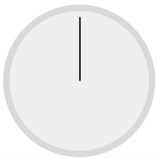
然后使用transform属性将每个刻度旋转为直角:0°,30°,60°,90°,...,{ {1}},300°和330°。使用360°。
最后,trick设置了勾号&#39;大小正确: 使用渐变来隐藏靠近中心的蜱的部分,因此我们只显示每个蜱的尖端:
rotate(x deg) 
最后你应该:

将此与前面的代码相结合,使时钟变为:
background: linear-gradient(
   to top,
   #eee 0%,
   #eee 80%,
   black 80%,
   black 100%
);
let drawTicks = function() {

  for (let i = 1; i < 13; i++) {

    let el = document.createElement('div');
    el.setAttribute('class', `number number${i}`);
    el.style.transform = `rotate(${i*30}deg)`;

    document.querySelector('.numbers').appendChild(el);

  }

}; drawTicks()


let setTime = function(date) {

  const delay = [
    date.getHours() * 3600 + date.getMinutes() * 60 + date.getSeconds(),
    date.getMinutes() * 60 + date.getSeconds(),
    date.getSeconds()
  ];

  [...document.querySelectorAll('.hand')].forEach((e, i) => e.style.animationDelay = `-${delay[i]}s`);

}; setTime(new Date())
body {
width: 100%;
height: 100vh;
display: flex;
justify-content: center;
align-items: center;
}
/* Main style for the clock */
.face {
position: relative;
display: flex;
justify-content: center;
align-items: flex-start;
width: 400px;
height: 400px;
background: #eee;
border-radius: 50%;
padding: 20px;
border: 20px solid #d9d9d9;
}
.face:after {
display: block;
position: absolute;
top: 0;
left: 0;
width: 100%;
height: 100%;
content: "";
border-radius: 50%;
z-index: 3;
}
/* Numbers: styling and positioning */
.numbers {
position: relative;
}
.number {
width: 5px;
background: linear-gradient( to top, #eee 0%, #eee 80%, black 80%, black 100%);
position: absolute;
height: 200px;
transform-origin: 0 100%;
font-size: 28px;
}
/* Clock hands styling */
.hands {
position: absolute;
top: 50%;
left: 50%;
}
.hand {
position: absolute;
top: 50%;
left: 50%;
height: 120px;
width: 10px;
content: "";
background: black;
transform: translate(-50%, -100%);
border-radius: 0 0 20px 20px;
transform-origin: 50% 100%;
z-index: 4;
animation: count 3600s linear infinite;
}
.hand:before {
display: block;
position: absolute;
top: -50px;
width: 0;
height: 0;
border: 10px solid transparent;
border-width: 10px 5px 41px;
border-bottom-color: black;
content: "";
}
.hand.hand-hour {
height: 70px;
transform: translate(-50%, -100%) rotate(30deg);
animation: count 43200s linear infinite;
}
.hand.hand-second {
height: 130px;
width: 8px;
transform: translate(-50%, -100%) rotate(60deg);
z-index: 3;
background: red;
animation: count 60s linear infinite;
}
.hand.hand-second:before {
border-width: 10px 4px 41px;
border-bottom-color: red;
z-index: -1;
}
/* animation of the clock hands */
@keyframes count {
0%,
100% {
transform: translate(-50%, -100%);
}
25% {
transform: translate(-50%, -100%) rotate(90deg);
}
50% {
transform: translate(-50%, -100%) rotate(180deg);
}
75% {
transform: translate(-50%, -100%) rotate(270deg);
}
}
- 我写了这段代码,但我无法理解我的错误
- 我无法从一个代码实例的列表中删除 None 值,但我可以在另一个实例中。为什么它适用于一个细分市场而不适用于另一个细分市场?
- 是否有可能使 loadstring 不可能等于打印?卢阿
- java中的random.expovariate()
- Appscript 通过会议在 Google 日历中发送电子邮件和创建活动
- 为什么我的 Onclick 箭头功能在 React 中不起作用?
- 在此代码中是否有使用“this”的替代方法?
- 在 SQL Server 和 PostgreSQL 上查询,我如何从第一个表获得第二个表的可视化
- 每千个数字得到
- 更新了城市边界 KML 文件的来源?