Flexbox - 根据显示的项目重复布局
我正在尝试使用flexbox创建一个砌体样式布局,我的目标是看起来像这样......
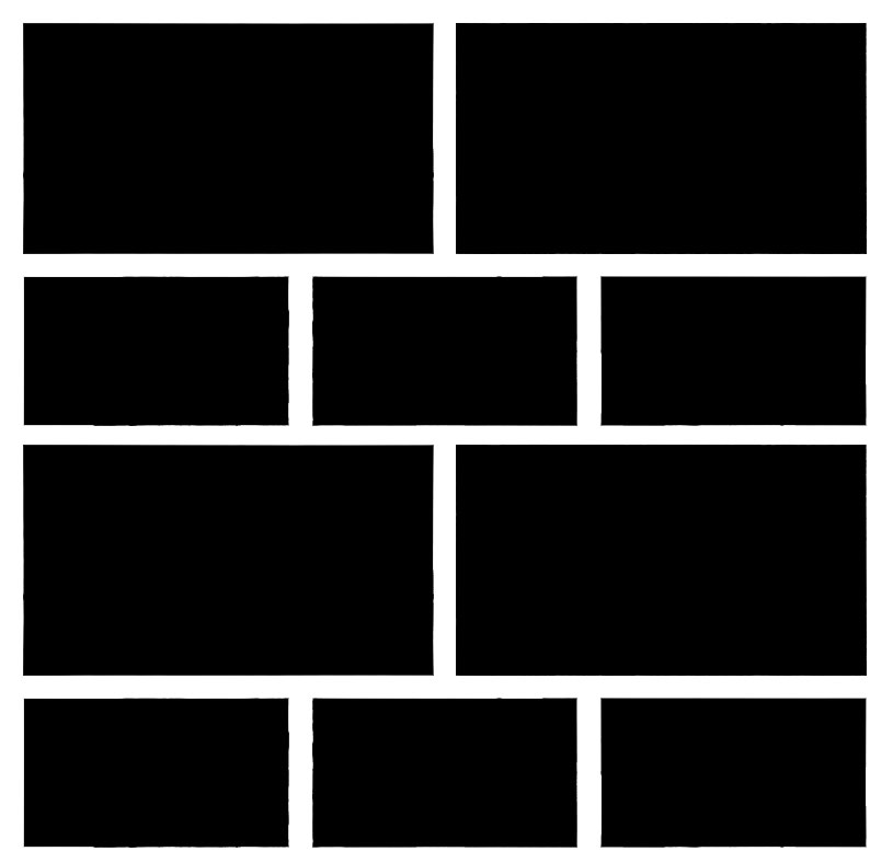
我可以简单地创建布局,但我希望根据显示的项目数重复布局。
任何人都有类似的例子或如何处理它的任何指导?
我正在考虑先做一些PHP处理来计算出有多少项,然后生成布局,不确定这是否是实现它的最佳方法。
2 个答案:
答案 0 :(得分:3)
您可以使用Flexbox执行此操作,只需使用flex-wrap: wrap并将前两项的宽度设置为50%,将其他3项设置为33.33%。您还需要在项目宽度中包含边距。
* {
  box-sizing: border-box;
}
.layout {
  display: flex;
  flex-wrap: wrap;
}
.item {
  height: 100px;
  margin: 5px;
  border: 1px solid black;
}
.item:nth-child(5n + 1),
.item:nth-child(5n + 2) {
  height: 150px;
  background: blue;
  flex: 0 0 calc(50% - 10px);
}
.item:nth-child(5n + 3),
.item:nth-child(5n + 4),
.item:nth-child(5n + 5) {
  background: blue;
  flex: 0 0 calc(33.33% - 10px);
}
<div class="layout">
<div class="item"></div>
<div class="item"></div>
<div class="item"></div>
<div class="item"></div>
<div class="item"></div>
<div class="item"></div>
<div class="item"></div>
<div class="item"></div>
<div class="item"></div>
<div class="item"></div>
</div>
您也可以使用grid-template-columns: repeat(6, 1fr)进行网格布局,然后制作前两项[{1}}和其他3 span 3。这意味着前两个项目将分别占3个单位的6个,其他3个单位将占2个单位的6个。
span 2* {
box-sizing: border-box;
}
.layout {
display: grid;
grid-gap: 10px;
grid-template-columns: repeat(6, 1fr);
grid-auto-rows: 150px 100px;
}
.item {
border: 1px solid black;
}
.item:nth-child(5n + 1),
.item:nth-child(5n + 2) {
grid-column: span 3;
}
.item:nth-child(5n + 3),
.item:nth-child(5n + 4),
.item:nth-child(5n + 5) {
grid-column: span 2;
}
答案 1 :(得分:-1)
是的,这可以通过flexbox来实现。以下是如何实现这一目标:
.masonry {
    display: flex;
    flex-flow: row wrap;
    width: 100%;
}

.masonry-item {
    overflow: hidden;
    border-radius: 5px;
    margin: 0 0 8px 8px;
    background-color: #333;
    flex: auto;
}
<div class="masonry">
<div class="masonry-item">
<!-- this will be your inner content you dont need to specifically give this width and height -->
<div style="width: 200px; height: 100px;"></div>
</div>
<div class="masonry-item">
<div style="width: 150px; height: 100px;"></div>
</div>
<div class="masonry-item">
<div style="width: 150px; height: 150px;"></div>
</div>
<div class="masonry-item">
<div style="width: 250px; height: 150px;"></div>
</div>
<div class="masonry-item">
<div style="width: 100px; height: 100px;"></div>
</div>
<div class="masonry-item">
<div style="width: 100px; height: 100px;"></div>
</div>
<div class="masonry-item">
<div style="width: 100px; height: 100px;"></div>
</div>
<div class="masonry-item">
<div style="width: 300px; height: 100px;"></div>
</div>
<div class="masonry-item">
<div style="width: 100px; height: 100px;"></div>
</div>
<div class="masonry-item">
<div style="width: 150px; height: 100px;"></div>
</div>
<div class="masonry-item">
<div style="width: 150px; height: 100px;"></div>
</div>
<div class="masonry-item">
<div style="width: 100px; height: 100px;"></div>
</div>
</div>
无论你有多少内容,这都适合他们。
相关问题
最新问题
- 我写了这段代码,但我无法理解我的错误
- 我无法从一个代码实例的列表中删除 None 值,但我可以在另一个实例中。为什么它适用于一个细分市场而不适用于另一个细分市场?
- 是否有可能使 loadstring 不可能等于打印?卢阿
- java中的random.expovariate()
- Appscript 通过会议在 Google 日历中发送电子邮件和创建活动
- 为什么我的 Onclick 箭头功能在 React 中不起作用?
- 在此代码中是否有使用“this”的替代方法?
- 在 SQL Server 和 PostgreSQL 上查询,我如何从第一个表获得第二个表的可视化
- 每千个数字得到
- 更新了城市边界 KML 文件的来源?