答案 0 :(得分:1)
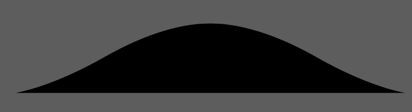
clip-path: polygon(0 56%, 8% 51%, 14% 48%, 24% 44%, 31% 39%, 38% 34%, 45% 30%,
51% 28%, 56% 29%, 62% 33%, 68% 38%, 74% 42%, 81% 47%, 86% 51%, 94% 51%, 100%
55%);
答案 1 :(得分:0)
虽然不是你想要的,但只是努力。您可以调整CSS以使其具有更好的外观。
.main {
  background: red;
  display: inline-block;
  margin: 0 1em 1em 0;
  height: 45px;
  width: 90px;
  border-top-left-radius: 90px;
  border-top-right-radius: 90px;
  position:absolute;
  top:3px;
  left:24px;
}

.quarter-left {
  width:20px;
  height:20px;
  background: white;
  border-radius: 0 0 90px 0;
  position:absolute;
  top:27px;
  left:9px;
  z-index:1;
}

.quarter-right {
  width:20px;
  height:20px;
  background: white;
  border-radius: 0 0 0 90px;
  position:absolute;
  top:28px;
  left:110px;
  z-index:1;
}


.right{
     width:0;
     height:0;
     border-right:20px solid transparent;
     border-top:20px solid transparent;
     border-left:20px solid red;
     border-bottom:20px solid red;
     position:absolute;
     top:8px;
     left:90px;
}

.left{
     width:0;
     height:0;
     border-right:20px solid red;
     border-top:20px solid transparent;
     border-left:20px solid transparent;
     border-bottom:20px solid red;
}
<div class="left"></div>
<div class="quarter-left"></div>
<div class="main"></div>
<div class="quarter-right"></div>
<div class="right"></div>