Angular项目
我有一个可调整大小的按钮,可以在某些条件下工作。我的问题是我觉得我的代码应该有用,我会解释我的内容和期望的内容。
app.component.ts
<button class="button button5"> </button>
app.component.css
.button {
    background-color: #0066ff;
    border: 1px solid #0066ff;
    color: white;
    height: 60%;
    width: 60%;
    margin-left: 20%;
    margin-right: auto;
    margin-top: 20%;
    padding: 0;
}

.button5 {
border-radius: 50%;
}
的index.html
<body>
  <app-root>

  </app-root>
</body>
index.html css
<style>

body, html {
    height: 100%;
    width: 100%;
    margin: 0;
}

app-root {
    display: block;
    height: 100%;
    width: 100%;
    margin: 0;
}

</style>
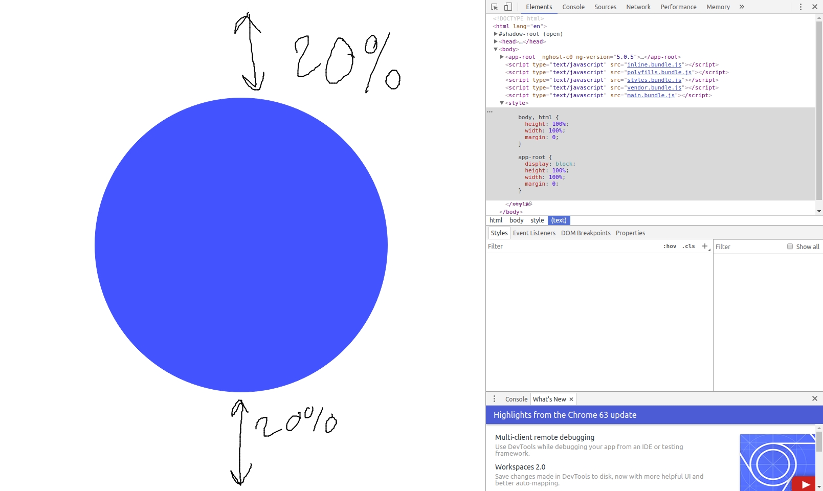
我的目标是创建一个按钮,该页面的高度始终为60%,顶部为20%。另外,60%宽度,而左起20%。
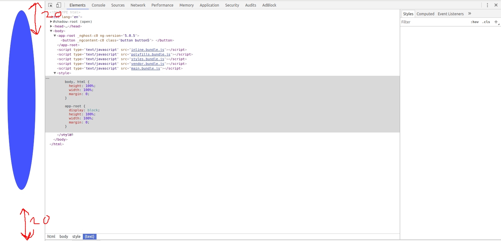
这在某些条件下完美无缺,例如。Here is my goal, unresized但是当我调整它的大小This happens时。
你可以看到它不是20%。我不知道为什么,在任何时候我hard code values和我strictly using percentages的所有时间都没有,所以我认为这是万无一失的。为什么它看起来像5%在顶部,35%在底部
答案 0 :(得分:0)
我认为您应该使用vh和vw单位(称为viewport units)。如果您总是希望屏幕上的20%作为保证金,那么它是20vh,而其他财产则相同。 %总是指宽度,因此如果您调整屏幕大小,则宽度会减少,因此边距会减少。但使用20vh表示屏幕高度的20%,因此它不受屏幕宽度的影响:
.button {
  background-color: #0066ff;
  border: 1px solid #0066ff;
  color: white;
  height: 60vh;
  width: 60vw; /*You can also keep 60% as % depend on width and here width of parent is equal to 100vw so you will have the same result*/
  margin-left: 20vw; /* You can also keep 20%*/
  margin-right: auto;
  margin-top: 20vh;
  padding: 0;
}

.button5 {
  border-radius: 50%;
}
<button class="button button5"> </button>
但似乎你想要居中屏幕中间的按钮,所以你可以依靠flex并避免指定边距:
body {
  height:100vh;
  margin:0;
  display:flex;
  align-items:center;
  justify-content:center;
}

.button {
  background-color: #0066ff;
  border: 1px solid #0066ff;
  color: white;
  height: 60vh;
  width: 60vw;
  padding: 0;
}

.button5 {
  border-radius: 50%;
}
<button class="button button5"> </button>