使用CSS设置工具提示箭头的边框颜色
我试图将工具提示箭头键的边框颜色设置为白色。我能够将工具提示的底部边框颜色设置为白色,如何设置箭头的底部边框颜色?这是我试过的:


.hint {
  position: relative;
  display: inline-block;
}

.hint:before,
.hint:after {
  position: absolute;
  opacity: 0;
  z-index: 100;
  -webkit-transition: 0.3s ease;
  -moz-transition: 0.3s ease;
  pointer-events: none;
}

.hint:hover:before,
.hint:hover:after {
  opacity: 1;
}

.hint:before {
  content: '';
  position: absolute;
  background: transparent;
  border: 6px solid transparent;
  position: absolute;
  transform: translateX(-50%);
}

.hint:after {
  content: attr(data-hint);
  background: rgba(0, 0, 0, 0.8);
  border-bottom-left-radius: 20px;
  border-top-right-radius: 20px;
  color: white;
  padding: 8px 10px;
  font-size: 16px;
  font-style: italic;
  white-space: nowrap;
  box-shadow: 4px 4px 8px rgba(0, 0, 0, 0.4);
  transform: translateX(-50%);
}


/* top mouse-icon*/

.hint--top:before {
  bottom: 100%;
  left: 50%;
  margin: 0 0 -18px 0;
  border-top-color: rgba(0, 0, 0, 0.8);
}

.hint--top:after {
  bottom: 100%;
  left: 50%;
  margin: 0 0 -6px -10px;
}


/*arrow key*/

.hint--top:hover:before {
  margin-bottom: -12px;
  border-width: 12px;
  /*margin-left: -56px;*/
  border-color: rgba(194, 225, 245, 0);
  border-top-color: rgba(0, 0, 0, 0.8);
}

.hint--top:hover:after {
  margin-bottom: 12px;
  border-width: 10px;
  /*margin-left: -50px;*/
  border-top-color: rgba(0, 0, 0, 0.8);
  border-bottom: 1px solid #f0f0f0;
}
<br /><br /><br /><br />
<div class="hint hint--top" data-hint="May Peace, Mercy and Blessings of Allah be Upon You" class="intro-sub">
<a>Assalaamu 'Alaikum</a>
</div>
为了澄清,我在这里包括样本图片。现在我有这个:
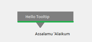
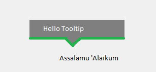
但我需要类似下面给出的图片:
2 个答案:
答案 0 :(得分:2)
首先你的html很奇怪。在元素上添加两次class属性是没有意义的。此外,br并不是创造空间的好习惯。请使用边距或其他内容。
对于您的问题,您需要另一个红色边框位于黑色三角形下方的三角形。这个红色三角形应该更大。
然后,小黑三角的z-index应大于工具提示,因此它将覆盖工具提示的红色边框
我在代码段的开头添加了所有新代码。见下文
你需要改变一点动画。但它应该很容易
  .border-triangle {
    top: -20px;
    left: 50%;
    transform: translateX(-50%);
    width: 0;
    position: absolute;
    height: 0;
    border-left: 20px solid transparent;
    border-right: 20px solid transparent;
    opacity: 0;
    transition: 0.3s ease-out;
    border-top: 20px solid red;
  }

  .hint:hover .border-triangle {
    opacity: 1;
  }

  .hint {
    position: relative;
    display: inline-block;
  }

  .hint:before,
  .hint:after {
    position: absolute;
    opacity: 0;
    z-index: 100;
    -webkit-transition: 0.3s ease;
    -moz-transition: 0.3s ease;
    pointer-events: none;
  }

  .hint:hover:before,
  .hint:hover:after {
    opacity: 1;
  }

  .hint:before {
    content: '';
    position: absolute;
    background: transparent;
    border: 6px solid transparent;
    position: absolute;
    transform: translateX(-50%);
  }

  .hint:after {
    content: attr(data-hint);
    background: rgba(0, 0, 0, 1);
    border-bottom-left-radius: 20px;
    border-top-right-radius: 20px;
    color: white;
    padding: 8px 10px;
    font-size: 16px;
    font-style: italic;
    white-space: nowrap;
    box-shadow: 4px 4px 8px rgba(0, 0, 0, 0.4);
    transform: translateX(-50%);
  }
  /* top mouse-icon*/

  .hint--top:before {
    bottom: 100%;
    left: 50%;
    margin: 0 0 -18px 0;
    border-top-color: rgba(0, 0, 0, 0.8);
  }

  .hint--top:after {
    bottom: 100%;
    left: 50%;
    margin: 0 0 -6px -10px;
    z-index: 1;
  }
  /*arrow key*/

  .hint--top:hover:before {
    margin-bottom: -10px;
    border-width: 12px;
    /*margin-left: -56px;*/
    border-color: rgba(194, 225, 245, 0);
    border-top-color: rgba(0, 0, 0, 1);
    z-index: 2;
  }

  .hint--top:hover:after {
    margin-bottom: 12px;
    border-width: 10px;
    /*margin-left: -50px;*/
    border-top-color: rgba(0, 0, 0, 0.8);
    border-bottom: 2px solid red;
  }
<br>
<br>
<br>
<div class="hint hint--top" data-hint="May Peace, Mercy and Blessings of Allah be Upon You" class="intro-sub"> <!-- intro-sub second class is usless -->
<div class="border-triangle">
</div>
<a>Assalaamu 'Alaikum</a>
</div>
答案 1 :(得分:2)
我之前也曾努力画三角形。处理HTML中的三角形的here和here等几乎所有技巧都会处理边框。因此,用这种技巧绘制三角形边框是不可能的。
另一种方法是旋转正方形并隐藏一半。这种方法的优点是绘制边框很容易,但我没有找到超级干净的方法来隐藏一半的方块。因此,当工具提示或三角形的不透明度小于1时,这不是一种理想的方法。
也许这就是你想要的。 Jsfiddle.net演示是here。
.hint {
  position: relative;
  display: inline-block;
  margin-top: 40px;
}

.hint:before,
.hint:after {
  position: absolute;
  opacity: 0;
  -webkit-transition: 0.3s ease;
  -moz-transition: 0.3s ease;
  pointer-events: none;
}

.hint:hover:before,
.hint:hover:after {
  opacity: 1;
}

.hint:before {
  content: '';
  position: absolute;
  background: rgba(0, 0, 0, 1);
  width: 6px;
  height: 6px;
  transform: translateX(-50%) rotate(45deg);
  z-index: 2;
}

.hint:after {
  content: attr(data-hint);
  background: rgba(0, 0, 0, 1);
  border-bottom-left-radius: 20px;
  border-top-right-radius: 20px;
  color: white;
  padding: 8px 10px;
  font-size: 16px;
  font-style: italic;
  white-space: nowrap;
  box-shadow: 4px 4px 8px rgba(0, 0, 0, 0.4);
  transform: translateX(-50%);
  z-index: 1;
}


/* top mouse-icon*/

.hint--top:before {
    bottom: 100%;
    left: 50%;
    margin: 0 0 -12px 0;
}

.hint--top:after {
  bottom: 100%;
  left: 50%;
  margin: 0 0 -6px -10px;
}


/*arrow key*/

.hint--top:hover:before {
    margin-bottom: 0px;
    /* border-width: 2px; */
    width: 24px;
    height: 24px;
    /* margin-left: -56px; */
    border: solid white;
    border-width: 0 1px 1px 0;
    border-top-left-radius: 100%;
    box-shadow: 4px 4px 8px rgba(0, 0, 0, 0.4);
    /* border-top-color: rgba(0, 0, 0, 0.8); */
}

.hint--top:hover:after {
  margin-bottom: 12px;
  border-width: 10px;
  /*margin-left: -50px;*/
  border-top-color: rgba(0, 0, 0, 0.8);
  border-bottom: 1px solid #f0f0f0;
}
<div class="hint hint--top" data-hint="May Peace, Mercy and Blessings of Allah be Upon You" class="intro-sub">
<a>Assalaamu 'Alaikum</a>
</div>
相关问题
最新问题
- 我写了这段代码,但我无法理解我的错误
- 我无法从一个代码实例的列表中删除 None 值,但我可以在另一个实例中。为什么它适用于一个细分市场而不适用于另一个细分市场?
- 是否有可能使 loadstring 不可能等于打印?卢阿
- java中的random.expovariate()
- Appscript 通过会议在 Google 日历中发送电子邮件和创建活动
- 为什么我的 Onclick 箭头功能在 React 中不起作用?
- 在此代码中是否有使用“this”的替代方法?
- 在 SQL Server 和 PostgreSQL 上查询,我如何从第一个表获得第二个表的可视化
- 每千个数字得到
- 更新了城市边界 KML 文件的来源?