еҰӮдҪ•дҪҝз”ЁWPFеңЁе·Ұдҫ§еҲӣе»әеёҰж Үзӯҫзҡ„з®ҖеҚ•иҸңеҚ•пјҹ
жҲ‘дёҖзӣҙеңЁз”ЁWindows FormsејҖеҸ‘дёҖдәӣз®ҖеҚ•зҡ„еә”з”ЁзЁӢеәҸпјҲд»…з”ЁдәҺж•ҷиӮІзӣ®зҡ„пјүпјҢзҺ°еңЁжҲ‘ејҖе§ӢеӯҰд№ WPFпјҢдҪҶеҜ№жҲ‘жқҘиҜҙдјјд№ҺжңүзӮ№еӨҚжқӮгҖӮ
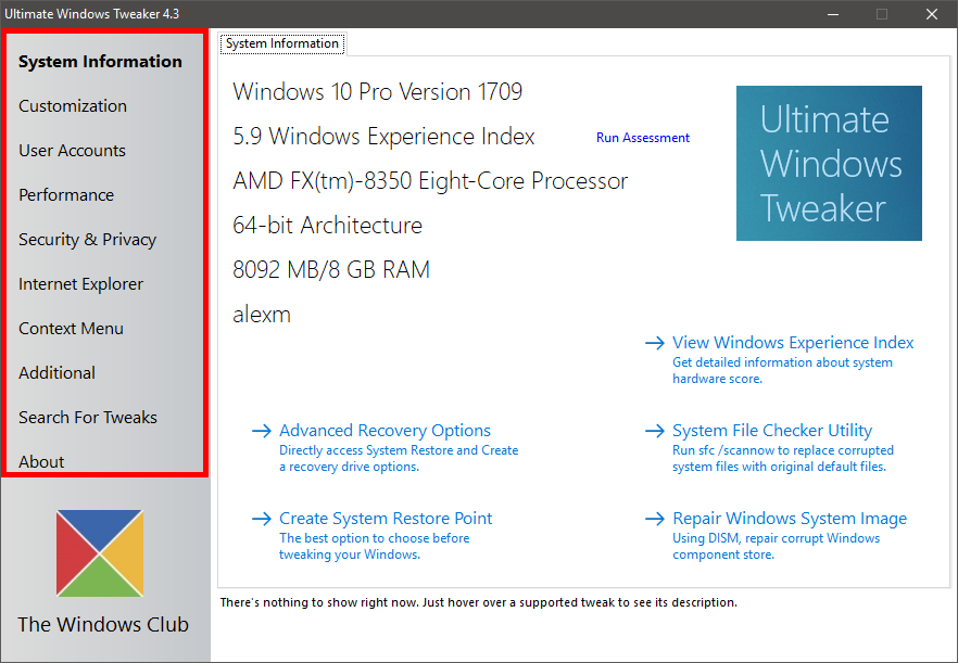
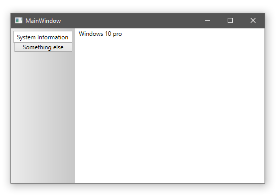
жҲ‘жғіеҲӣе»әдёҖдёӘз®ҖеҚ•зҡ„иҸңеҚ•пјҢе°ұеғҸдҪ еҸҜд»ҘеңЁеӣҫзүҮдёӯзңӢеҲ°зҡ„йӮЈж ·гҖӮжҲ‘дёҖзӣҙиҜ•еӣҫеңЁи°·жӯҢе’ҢYouTubeдёҠжүҫеҲ°е®ғпјҢдҪҶжҲ‘еҲҡеҲҡжүҫеҲ°дәҶеҫҲеӨҡе…ідәҺвҖңжұүе ЎиҸңеҚ•вҖқзҡ„ж•ҷзЁӢпјҢиҝҷдёҚжҳҜжҲ‘жғіиҰҒзҡ„гҖӮ
1 дёӘзӯ”жЎҲ:
зӯ”жЎҲ 0 :(еҫ—еҲҶпјҡ2)
иҝҷжҳҜWPFй—ӘиҖҖзҡ„дёҖдёӘйўҶеҹҹпјҡжӮЁжҸҸиҝ°зҡ„еёғеұҖеҸӘйңҖдёҖдёӘйҮҚж–°и®ҫзҪ®зҡ„ж ҮзӯҫжҺ§д»¶еҚіеҸҜе®һзҺ°гҖӮ
дҪҝз”ЁTabStripPlacement Leftзҡ„<{1}}ејҖе§ӢдҪҝз”Ёж— ж ·ејҸзҡ„ж ҮзӯҫжҺ§д»¶пјҡ
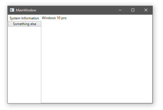
然еҗҺдҝ®ж”№TabControlж ·ејҸпјҢеңЁTabPanelеҗҺйқўж·»еҠ жёҗеҸҳе’Ңиҫ№и·қпјҡ
ж·»еҠ еӣҫзүҮ并иҰҶзӣ–TabItemж ·ејҸд»Ҙи®ҫзҪ®еӯ—дҪ“并еҲ йҷӨиғҢжҷҜгҖӮжҲ‘з”ЁйӣӘдҪӣйҫҷжқҘиЎЁзӨәйҖүжӢ©иҖҢдёҚжҳҜз”ЁзІ—дҪ“иЎЁзӨәж–Үжң¬пјҢдҪҶиҝҷж ·еҒҡзҡ„еӨ„зҗҶж–№жі•д№ҹжҳҜдёҖж ·зҡ„гҖӮ
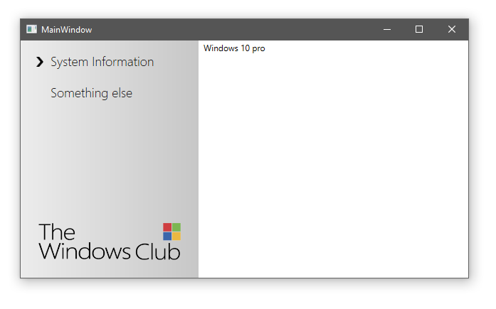
д»ҘдёӢжҳҜз”ЁдәҺдёҠиҝ°еұҸ幕жҲӘеӣҫзҡ„е®Ңж•ҙXAMLпјҡ
<Window x:Class="StackOverflowTabControl.MainWindow"
        xmlns="http://schemas.microsoft.com/winfx/2006/xaml/presentation"
        xmlns:x="http://schemas.microsoft.com/winfx/2006/xaml"
        xmlns:d="http://schemas.microsoft.com/expression/blend/2008"
        xmlns:mc="http://schemas.openxmlformats.org/markup-compatibility/2006"
        xmlns:local="clr-namespace:StackOverflowTabControl"
        mc:Ignorable="d"
        Title="MainWindow" Height="350" Width="525">
    <Window.Resources>
        <BooleanToVisibilityConverter x:Key="BooleanToVisibilityConverter"/>
        <Style x:Key="ItemContainerStyle" TargetType="{x:Type TabItem}">
            <Setter Property="Template">
                <Setter.Value>
                    <ControlTemplate TargetType="{x:Type TabItem}">
                        <Grid Margin="15,5">
                            <Path Width="10" Height="14" Margin="0,2,0,0" HorizontalAlignment="Left" VerticalAlignment="Center" Stretch="Fill" Fill="#FF000000" Data="F1 M 39.8307,37.6042L 36.6641,34.4375L 25.1849,23.3542L 35.4766,23.3542L 50.5182,37.6042L 35.4766,51.8542L 25.1849,51.8542L 36.6641,40.7708L 39.8307,37.6042 Z " Visibility="{Binding IsSelected, Converter={StaticResource BooleanToVisibilityConverter}, RelativeSource={RelativeSource TemplatedParent}}"/>
                            <ContentPresenter Content="{TemplateBinding Header}" Margin="20,5,10,5">
                                <ContentPresenter.Resources>
                                    <Style TargetType="{x:Type TextBlock}">
                                        <Setter Property="FontSize" Value="18" />
                                        <Setter Property="FontWeight" Value="Light" />
                                    </Style>
                                </ContentPresenter.Resources>
                            </ContentPresenter>
                        </Grid>
                    </ControlTemplate>
                </Setter.Value>
            </Setter>
        </Style>
        <Style x:Key="TabControlStyle1" TargetType="{x:Type TabControl}">
            <Setter Property="TabStripPlacement" Value="Left" />
            <Setter Property="ItemContainerStyle" Value="{StaticResource ItemContainerStyle}" />
            <Setter Property="Template">
                <Setter.Value>
                    <ControlTemplate TargetType="{x:Type TabControl}">
                        <Grid x:Name="templateRoot" ClipToBounds="true" SnapsToDevicePixels="true" KeyboardNavigation.TabNavigation="Local">
                            <Grid.ColumnDefinitions>
                                <ColumnDefinition Width="Auto" />
                                <ColumnDefinition Width="1*" />
                            </Grid.ColumnDefinitions>
                            <Border Grid.Column="0" Padding="5">
                                <Border.Background>
                                    <LinearGradientBrush EndPoint="0,0" StartPoint="1,0">
                                        <GradientStop Color="#FFC7C7C7" Offset="0"/>
                                        <GradientStop Color="#FFECECEC" Offset="1"/>
                                    </LinearGradientBrush>
                                </Border.Background>
                                <DockPanel>
                                    <Image DockPanel.Dock="Bottom" HorizontalAlignment="Center" Margin="20" Source="pack://application:,,,/StackOverflowTabControl;component/twc.png" Width="200" />
                                    <TabPanel x:Name="headerPanel" Background="Transparent" Grid.Column="0" IsItemsHost="true" Margin="2,2,2,0" Grid.Row="0" KeyboardNavigation.TabIndex="1" Panel.ZIndex="1"/>
                                </DockPanel>
                            </Border>
                            <Border x:Name="contentPanel" Grid.Column="1" Margin="5,0,0,0">
                                <ContentPresenter x:Name="PART_SelectedContentHost" ContentSource="SelectedContent" Margin="{TemplateBinding Padding}" SnapsToDevicePixels="{TemplateBinding SnapsToDevicePixels}"/>
                            </Border>
                        </Grid>
                    </ControlTemplate>
                </Setter.Value>
            </Setter>
        </Style>
    </Window.Resources>
    <Grid>
        <TabControl Style="{DynamicResource TabControlStyle1}">
            <TabItem Header="System Information">
                <TextBlock Text="Windows 10 pro" />
            </TabItem>
            <TabItem Header="Something else">
                <TextBlock Text="Other page" />
            </TabItem>
        </TabControl>
    </Grid>
</Window>
- еҰӮдҪ•еңЁе·Ұдҫ§жү§иЎҢеёҰеҫҪж Үзҡ„дёҠдёӢж–ҮиҸңеҚ•
- еҰӮдҪ•дҪҝз”ЁjqueryеҲӣе»әз®ҖеҚ•зҡ„дҫ§иҫ№иҸңеҚ•пјҹ
- еңЁе·Ұдҫ§еҲӣе»әдёҖдёӘиҸңеҚ•
- QTиҸңеҚ• - еңЁе·Ұдҫ§
- е·Ұдҫ§зҡ„дёӢжӢүиҸңеҚ•
- еҰӮдҪ•еңЁе·Ұдҫ§ж Ҹ
- WPFж•°жҚ®зҪ‘ж јпјҢеҰӮдҪ•еҲӣе»әпјҶпјғ34;е·Ұдҫ§пјҶпјғ34;еӨҙпјҹ
- еҰӮдҪ•иҺ·еҸ–еӣҫиЎЁе·Ұдҫ§зҡ„ж Үзӯҫпјҹ
- еҰӮдҪ•дҪҝз”ЁWPFеңЁе·Ұдҫ§еҲӣе»әеёҰж Үзӯҫзҡ„з®ҖеҚ•иҸңеҚ•пјҹ
- е·Ұдҫ§иҸңеҚ•й—®йўҳ
- жҲ‘еҶҷдәҶиҝҷж®өд»Јз ҒпјҢдҪҶжҲ‘ж— жі•зҗҶи§ЈжҲ‘зҡ„й”ҷиҜҜ
- жҲ‘ж— жі•д»ҺдёҖдёӘд»Јз Ғе®һдҫӢзҡ„еҲ—иЎЁдёӯеҲ йҷӨ None еҖјпјҢдҪҶжҲ‘еҸҜд»ҘеңЁеҸҰдёҖдёӘе®һдҫӢдёӯгҖӮдёәд»Җд№Ҳе®ғйҖӮз”ЁдәҺдёҖдёӘз»ҶеҲҶеёӮеңәиҖҢдёҚйҖӮз”ЁдәҺеҸҰдёҖдёӘз»ҶеҲҶеёӮеңәпјҹ
- жҳҜеҗҰжңүеҸҜиғҪдҪҝ loadstring дёҚеҸҜиғҪзӯүдәҺжү“еҚ°пјҹеҚўйҳҝ
- javaдёӯзҡ„random.expovariate()
- Appscript йҖҡиҝҮдјҡи®®еңЁ Google ж—ҘеҺҶдёӯеҸ‘йҖҒз”өеӯҗйӮ®д»¶е’ҢеҲӣе»әжҙ»еҠЁ
- дёәд»Җд№ҲжҲ‘зҡ„ Onclick з®ӯеӨҙеҠҹиғҪеңЁ React дёӯдёҚиө·дҪңз”Ёпјҹ
- еңЁжӯӨд»Јз ҒдёӯжҳҜеҗҰжңүдҪҝз”ЁвҖңthisвҖқзҡ„жӣҝд»Јж–№жі•пјҹ
- еңЁ SQL Server е’Ң PostgreSQL дёҠжҹҘиҜўпјҢжҲ‘еҰӮдҪ•д»Һ第дёҖдёӘиЎЁиҺ·еҫ—第дәҢдёӘиЎЁзҡ„еҸҜи§ҶеҢ–
- жҜҸеҚғдёӘж•°еӯ—еҫ—еҲ°
- жӣҙж–°дәҶеҹҺеёӮиҫ№з•Ң KML ж–Ү件зҡ„жқҘжәҗпјҹ