垂直对齐不适用于弹性项目
我尝试将纯文本垂直集中在弹性框元素中。
我决定将display:table-cell与vertical-align: middle一起使用。但它似乎在flexbox元素中无法正常工作。
如何直接集中它,理想情况下不使用包装器或定位,同时仍然用椭圆截断长文本?
.container {
  width: 400px;
  height: 400px;
  font-weight: 700;
  border: 1px solid #d9d9d9;
  display: flex;
  flex-direction: column;
}

.item {
  display: table-cell;
  vertical-align: middle;
  flex: 1 1;
  background-color: cyan;
  white-space: nowrap;
  overflow: hidden;
  text-overflow: ellipsis;
}

.item:nth-of-type(2n) {
  background-color: aliceblue;
}
<div class="container">
<div class="item">Hello, I'm very very long string! Hello, I'm very very long string!</div>
<div class="item">Hello</div>
<div class="item">Hello</div>
<div class="item">Hello</div>
</div>
4 个答案:
答案 0 :(得分:5)
一种解决方案是将每个弹性项目定义为其自己的弹性容器,以便使其内容与align-items:center垂直居中。要保持text-overflow正常工作,请为每个弹性项添加一个子元素,然后可以使用省略号将其截断。
我无法解释为什么text-overflow无法与display:flex和neither can David Wesst一起使用。用他的话说:
事实证明,确实没有一种干净的方法可以做到这一点。如果你想知道我是如何得出这个结论的,你可以停下来,因为我没有。那些负责规范的人做了,你可以阅读以Mozilla bug report开头的完整对话,并导致whole mail group discussion关于它应该(或者,在这种情况下,不应该)作为一部分实现的原因规范。
这是一个有效的例子:
.container {
  width: 400px;
  height: 400px;
  font-weight: 700;
  border: 1px solid #d9d9d9;
  display: flex;
  flex-direction: column;
}

.item {
  display: flex;
  align-items: center;
  flex: 1;
  background-color: cyan;
}

.item span {
  white-space: nowrap;
  overflow: hidden;
  text-overflow: ellipsis;
}

.item:nth-of-type(2n) {
  background-color: aliceblue;
}
<div class="container">
<div class="item"><span>Hello, I'm very very long string! Hello, I'm very very long string!</span></div>
<div class="item"><span>Hello</span></div>
<div class="item"><span>Hello</span></div>
<div class="item"><span>Hello</span></div>
</div>
答案 1 :(得分:2)
当您将元素设为灵活容器(display: flex或display: inline-flex)时,所有流入的子项都会成为弹性项目。
所有弹性项目的display值都由容器控制。它并不重要,容器会覆盖它。
因此,当您提供弹性项display: table-cell时,浏览器会忽略它。这是Chrome开发工具中的样子:
样式标签
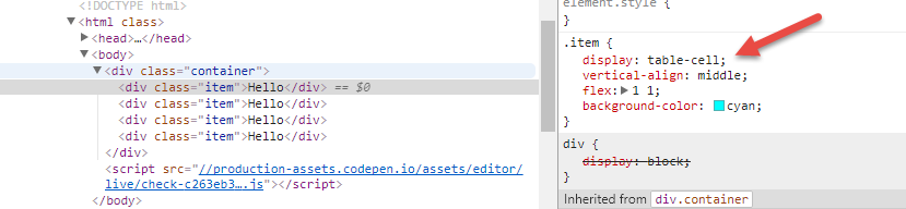
计算标签

一个弹性容器&#34;阻塞&#34; flex项目,使它们承担块级元素的许多特性(source)。
但vertical-align属性仅适用于内联级和表格单元格(source)。
这就是为什么它不起作用。
无论如何,vertical-align即使有效,在这种情况下完全是不必要的黑客攻击。灵活属性设计用于对齐flex项目中的内容。
.container {
  width: 500px;
  height: 500px;
  font-weight: 700;
  border: 1px solid #d9d9d9;
  display: flex;
  flex-direction: column;
}

.item {
  flex: 1 1;
  display: flex;
  justify-content: center; /* horizontal alignment, in this case */
  align-items: center;     /* vertical alignment, in this case */
  background-color: cyan;
}

.item:nth-of-type(2n) {
  background-color: aliceblue;
}
<div class="container">
<div class="item">Hello</div>
<div class="item">Hello</div>
<div class="item">Hello</div>
<div class="item">Hello</div>
</div>
相关帖子:
答案 2 :(得分:0)
Blockquote ...
float,clear和vertical-align对Flex项目没有影响。 根据{{3}}
请参阅https://css-tricks.com/snippets/css/a-guide-to-flexbox/了解可能的解决方案。
答案 3 :(得分:0)
您必须将这些项目也定义为Flex容器,使用以下CSS(无表格单元格显示......):
display: flex;
flex-direction: column;
justify-content: center;
.container {
  width: 400px;
  height: 400px;
  font-weight: 700;
  border: 1px solid #d9d9d9;
  display: flex;
  flex-direction: column;
}

.item {
  display: flex;
  flex-direction: column;
  justify-content: center;
  flex: 1 1;
  background-color: cyan;
  white-space: nowrap;
  overflow: hidden;
  text-overflow: ellipsis;
}

.item:nth-of-type(2n) {
  background-color: aliceblue;
}
<div class="container">
<div class="item">Hello, I'm very very long string! Hello, I'm very very long string!</div>
<div class="item">Hello</div>
<div class="item">Hello</div>
<div class="item">Hello</div>
</div>
- 我写了这段代码,但我无法理解我的错误
- 我无法从一个代码实例的列表中删除 None 值,但我可以在另一个实例中。为什么它适用于一个细分市场而不适用于另一个细分市场?
- 是否有可能使 loadstring 不可能等于打印?卢阿
- java中的random.expovariate()
- Appscript 通过会议在 Google 日历中发送电子邮件和创建活动
- 为什么我的 Onclick 箭头功能在 React 中不起作用?
- 在此代码中是否有使用“this”的替代方法?
- 在 SQL Server 和 PostgreSQL 上查询,我如何从第一个表获得第二个表的可视化
- 每千个数字得到
- 更新了城市边界 KML 文件的来源?