еҰӮдҪ•дҪҝз”Ёеј№жҖ§зӣ’йҮҚж–°жҺ’еәҸdivпјҹ
жҲ‘жӯЈеңЁе°қиҜ•дёәжҲ‘зҡ„DOMдҝқз•ҷдёҖдёӘseoеҸӢеҘҪе’ҢиҜӯд№үз»“жһ„пјҢиҖҢдёҚйҮҚеӨҚж•ҙдёӘе…ғзҙ д»ҘеңЁеҗ„з§ҚдҪҚзҪ®жҳҫзӨәе®ғ们гҖӮ
жҲ‘зҡ„еёғеұҖеҹәдәҺdisplay: flexдёӘйЎ№зӣ®гҖӮжҲ‘е°қиҜ•е®һзҺ°д»ҘдёӢзӣ®ж Үпјҡ
иҰҒдәҶи§Јзҡ„йҮҚиҰҒдәӢйЎ№пјҡ
- жҲ‘дёҚжғіж №жҚ®зӘ—еҸЈе®ҪеәҰжҳҫзӨә/йҡҗи—ҸdivпјҲд»ҘйҒҝе…ҚдёҚеҝ…иҰҒзҡ„йҮҚеӨҚпјү
- жІЎжңүdivе…·жңүе·ІзҹҘжҲ–еӣәе®ҡзҡ„й«ҳеәҰ
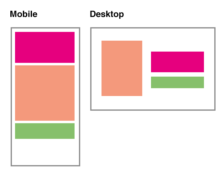
- еңЁжЎҢйқўдёҠпјҢdivеә”иҜҘжҳҜеһӮзӣҙеұ…дёӯзҡ„пјҢиҖҢеҸіеҲ—жҳҜжһ„е»әдёҖдёӘж Үи®°з»„пјҲиЎҢдёәе°ұеғҸдёҖдёӘdivпјү
- еёғеұҖйңҖиҰҒиҮіе°‘ж”ҜжҢҒIE11 +
жҳҜеҗҰеҸӘжңүcssи§ЈеҶіж–№жЎҲжқҘе®һзҺ°иҝҷдёҖзӣ®ж Үпјҹ
еҰӮжһңжІЎжңүпјҢеҸҜд»ҘеҫҲе®№жҳ“ең°еҲ йҷӨз»ҝиүІdiv并дҪҝз”Ёjavascriptе°Ҷе…¶еҶ…е®№зІҳиҙҙеҲ°зІүзәўиүІзҡ„еҶ…е®№дёӯгҖӮдҪҶжҲ‘зЎ®е®һеҜ№жҖ§иғҪж„ҹеҲ°жӢ…еҝ§пјҢ并且пјҶпјғ34;й—ӘзғҒпјҶпјғ34;дҪҝз”Ёе®ғпјҢиҷҪ然и°ғж•ҙжөҸи§ҲеҷЁеӨ§е°ҸдҪҝе…¶жӣҙеӨҚжқӮгҖӮжҲ‘жҳҜеҗҰдјҡи®©иҝҷз§ҚдёҚеҝ…иҰҒзҡ„еӨҚжқӮеҢ–пјҹ
иҝҷжҳҜе°ҸжҸҗзӨәпјҢжҳҫзӨәе·ҘдҪңи§ЈеҶіж–№жЎҲпјҢдҪҶдҪҝз”Ёjavascript пјҡ
1 дёӘзӯ”жЎҲ:
зӯ”жЎҲ 0 :(еҫ—еҲҶпјҡ6)
дёҖиҲ¬жғ…еҶөдёӢпјҢжӮЁж— жі•еҚ•зӢ¬дҪҝз”ЁFlexboxжү§иЎҢжӯӨж“ҚдҪңпјҢдҪҶеҸҜиғҪдјҡж №жҚ®жҜҸдёӘзү№е®ҡжғ…еҶөиҝӣиЎҢжҠҳиЎ·гҖӮ
еҚ•зӢ¬дҪҝз”ЁFlexboxпјҢдҪҝз”Ёеӣәе®ҡй«ҳеәҰпјҢжӮЁеҸҜд»Ҙе®ҢжҲҗжӯӨж“ҚдҪң
* {
  box-sizing: border-box;
}

body, html {
  margin: 0;
}

.flex {
  width: 90%;
  margin: 5vh auto;
  height: 90vh;
  background: rgba(0, 0, 0, 0.05);
  display: flex;
  flex-flow: column wrap;
}
.flex div {
  flex: 1;
  width: 50%;
}
.flex div:nth-child(2) {
  order: -1;
}
.flex::before {
  content: '';
  height: 100%;
}

@media (max-width:768px) {
  .flex div {
    width: auto;
  }
  .flex::before {
    display: none;
  }
 .flex div:nth-child(2) {
    order: 0;
  }
}


/*  styling  */
.flex-child {
  color: white;
  font-size: 2em;
  font-weight: bold;
}
.flex-child:nth-child(1) {
  background: #e6007e;
}
.flex-child:nth-child(2) {
  background: #f4997c;
}
.flex-child:nth-child(3) {
  background: #86c06b;
}
<div class="flex">
<div class="flex-child">
<div>Top/Right</div>
</div>
<div class="flex-child">
<div>Center/Left</div>
</div>
<div class="flex-child">
<div>Bottom/Right</div>
</div>
</div>
еңЁиҝҷз§Қжғ…еҶөдёӢпјҢеҰӮжһңдёҚе…Ғи®ёеӣәе®ҡй«ҳеәҰпјҢжӮЁеҸҜд»Ҙе°ҶFlexboxдёҺfloatз»“еҗҲдҪҝз”ЁгҖӮ
дҪҝз”ЁFlexboxе°Ҷе…¶и®ҫзҪ®дёә移еҠЁи®ҫеӨҮпјҢ然еҗҺеңЁж Үи®°дёӯйҰ–е…Ҳж·»еҠ center йЎ№зӣ®пјҢ然еҗҺдҪҝз”Ёorderе°Ҷ其移иҮі top д№Ӣй—ҙе’Ңеә•йғЁгҖӮ
дҪҝз”ЁеӘ’дҪ“жҹҘиҜўпјҢжӮЁеҸӘйңҖе°Ҷ flexе®№еҷЁи®ҫдёәеқ—е…ғзҙ пјҢ然еҗҺдҪҝз”Ёfloatе°Ҷе·Ұдҫ§ж”ҫзҪ®еңЁе·Ұдҫ§е’ҢеҜ№дәҶеңЁеҸіиҫ№гҖӮ
* {
  box-sizing: border-box;
}

body, html {
  margin: 0;
}

.flex {
  max-width: 1024px;
  width: 90%;
  margin: 5vh auto;
  height: 90vh;
  background: rgba(0, 0, 0, 0.05);

  display: flex;
  flex-direction: column;
}

.flex-child {
  color: white;
  font-size: 2em;
  font-weight: bold;
  padding: 5%;
  flex-basis: 33.333%;

  display: flex;
  align-items: center;
}

.flex-child:nth-child(1) {
  background: #e6007e;
  order: 1;
}
.flex-child:nth-child(2) {
  background: #f4997c;
}
.flex-child:nth-child(3) {
  background: #86c06b;
  order: 2;
}

@media (min-width: 768px) {
  .flex {
    display: block;
  }
  .flex-child {
    width: 50%;
  }
  .flex-child:nth-child(1) {
    float: left;
    height: 100%;
  }
  .flex-child:nth-child(2),
  .flex-child:nth-child(3) {
    float: right;
    height: 50%;
  }
}
<div class="flex">
<div class="flex-child">
<div>Center/Left</div>
</div>
<div class="flex-child">
<div>Top/Right</div>
</div>
<div class="flex-child">
<div>Bottom/Right</div>
</div>
</div>
жӣҙж–°
д»ҘдёӢжҳҜеҸҰдёҖдёӘе°ҶFlexboxдёҺposition: absoluteзӣёз»“еҗҲзҡ„зүҲжң¬пјҢиҜҘзүҲжң¬д№ҹеңЁжЎҢйқўжЁЎејҸдёӯеһӮзӣҙеұ…дёӯ
жӣҙж–°еҗҺпјҢж·»еҠ дәҶдёҖдёӘи„ҡжң¬жқҘжҺ§еҲ¶жүҖд»Ҙз»қеҜ№е®ҡдҪҚзҡ„е…ғзҙ дёҚдјҡжҜ”жӯЈзЎ®зҡ„йЎ№зӣ®жӣҙеӨ§пјҢеҰӮжһңжҳҜиҝҷж ·пјҢи°ғж•ҙеј№жҖ§е®№еҷЁзҡ„й«ҳеәҰгҖӮ
жіЁж„ҸпјҢиҜҘи„ҡжң¬з»қдёҚжҳҜдјҳеҢ–зҡ„пјҢеҸӘжҳҜеңЁйӮЈйҮҢеұ•зӨәеҰӮдҪ•еңЁжҹҗдәӣжғ…еҶөдёӢдҝ®еӨҚ
(function() {

  window.addEventListener("resize", resizeThrottler, false);

  var fp = document.querySelector('.flex');
  var fi = fp.querySelector('.flex-child:nth-child(1)');
  var resizeTimeout;
  function resizeThrottler() {
    // ignore resize events as long as an actualResizeHandler execution is in the queue
    if ( !resizeTimeout ) {
      resizeTimeout = setTimeout(function() {
        resizeTimeout = null;
        actualResizeHandler();

       // The actualResizeHandler will execute at a rate of 15fps
       }, 66);
    }
  }

  function actualResizeHandler() {
    // handle the resize event
    if (fp.offsetHeight <= fi.offsetHeight) {
      fp.style.cssText = 'height: '+fi.offsetHeight+'px';
    } else {
      fp.style.cssText = 'height: auto';
    }
  }

  window.addEventListener('load', function() {
    actualResizeHandler();
  })

}());
* {
box-sizing: border-box;
}
body, html {
margin: 0;
}
.flex {
position: relative;
max-width: 1024px;
width: 90%;
margin: 5vh auto;
height: 90vh;
background: rgba(0, 0, 0, 0.05);
display: flex;
flex-direction: column;
}
.flex-child {
color: white;
font-size: 2em;
font-weight: bold;
padding: 5%;
}
.flex-child:nth-child(1) {
order: 1;
}
.flex-child:nth-child(3) {
order: 2;
}
.flex-child:nth-child(1) div {
background: #e6007e;
}
.flex-child:nth-child(2) div {
background: #f4997c;
}
.flex-child:nth-child(3) div {
background: #86c06b;
}
@media (min-width: 768px) {
.flex {
justify-content: center;
}
.flex-child {
width: 50%;
}
.flex-child:nth-child(1) {
position: absolute;
top: 50%;
transform: translateY(-50%);
}
.flex-child:nth-child(n+2) {
margin-left: 50%;
}
}<div class="flex">
<div class="flex-child">
<div>Center/Left<br>with more<br>content<br>than any<br>of the<br>other items<br>other items<br>other items<br>other items<br>other items</div>
</div>
<div class="flex-child">
<div>Top/Right<br>with more<br>content</div>
</div>
<div class="flex-child">
<div>Bottom/Right<br>with more</div>
</div>
</div>
дҪҝз”Ёи„ҡжң¬пјҢжҲ‘们д№ҹеҸҜд»ҘеңЁе…ғзҙ д№Ӣй—ҙйҮҚж–°жҺ’еәҸ/移еҠЁйЎ№зӣ®гҖӮ
Stack snippet
жӮЁиҝҳеҸҜд»Ҙе°Ҷе…¶дёҺеӘ’дҪ“жҹҘиҜўз»“еҗҲдҪҝз”ЁпјҢ并дҪҝз”Ёе®ғжқҘеҜ№е…ғзҙ иҝӣиЎҢе®һйҷ…йҮҚж–°жҺ’еәҸ
$( document ).ready(function() {
  $(window).resize(function() {
    if ($( window ).width() < 600 ) {
      $(".one").insertBefore("#b");
    } else {
      $(".one").insertBefore(".two");
    }
  });
});
.outer, #flex, #flex2 {
display: flex;
flex-direction: column;
}
#a {
order: 4;
background: #ccc;
}
#b {
order: 1;
background: #aaa;
}
#c {
order: 3;
background: #d33;
}
.one {
order: 2;
background: #aaa;
}
.two {
order: 5;
background: #aaa;
}<script src="https://ajax.googleapis.com/ajax/libs/jquery/2.1.1/jquery.min.js"></script>
<div class="outer">
<div id="flex">
<div id="a">A</div>
<div id="b">B</div>
<div id="c">C</div>
</div>
<div id="flex2">
<div class="one">Show me 2nd</div>
<div class="two">Show me 5th</div>
</div>
</div>
жӣҙж–°2пјҲе·Іи§Јзӯ”at another questionпјҢдҪҶзЁҚеҗҺ移иҮіжӯӨеӨ„пјү
еҰӮжһңжҲ‘们и°Ҳи®әиҫғе°Ҹзҡ„йЎ№зӣ®пјҢеҰӮж ҮйўҳжҲ–иҫғе°Ҹзҡ„иҸңеҚ•пјҢеҸҜд»ҘеҒҡи®ёеӨҡзҪ‘з«ҷе№іеҸ°жҸҗдҫӣе•Ҷе–ңж¬ўзҡ„пјҶпјғ34; squarespaceпјҶпјғ34;пјҢпјҶпјғ34; weeblyпјҶпјғ34;пјҢпјҶпјғ34; wordpressпјҶпјғ 34;зӯүзӯүгҖӮ他们зҡ„жЁЎжқҝеҢ…еҗ«дёҚеҗҢзҡ„ж Үи®°з»“жһ„пјҢе…¶дёӯдёҖдёӘйЎ№зӣ®жңүж—¶еӯҳеңЁдёӨж¬ЎпјҢдёҖдёӘеҸҜз”ЁдәҺжЎҢйқўпјҢеҸҰдёҖдёӘз”ЁдәҺ移еҠЁгҖӮ
жӯӨеӨ–пјҢеҰӮжӯӨе°ҸпјҢеңЁжҖ§иғҪж–№йқўдјҡжңүжӣҙе°‘зҡ„жҲҗжһңпјҲиҖҢдё”жҲ‘дёӘдәәдёҚдјҡеҶҚзңӢеҲ°иҝҷдёӘй—®йўҳпјҢиҖҢдёҚжҳҜйҮҚеӨҚзҡ„CSS规еҲҷпјҢжҜҸдёӘеұҸ幕е°әеҜёдёҖдёӘпјҢ并且еҫҲд№җж„Ҹиҝҷж ·еҒҡиҖҢдёҚжҳҜеј•е…Ҙи„ҡжң¬пјүгҖӮ
Stack snippet
.container {
  display: flex;
}
.container > div {
  width: 50%;
}
.container div:nth-child(-n+2) {
  border: dashed;
  padding: 10px;
}
.container > div:nth-child(1) {
  display: none;                                  /*  hide outer "Flower"  */
}

@media (max-width:768px) {
  .container {
    flex-direction: column;
  }
  .container div {
    width: auto;
  }
 .container div:nth-child(1) {
    display: block;                               /*  show outer "Flower"  */
  }
  .container div:nth-child(3) div:nth-child(1) {
    display: none;                                /*  hide inner "Flower"  */
  }
}
<div class="container">
<div>Flower</div>
<div>Tree</div>
<div>
<div>Flower</div>
<div>Bee</div>
</div>
</div>
- jqueryйҮҚж–°жҺ’еәҸdiv
- еҰӮдҪ•дҪҝз”ЁJavascriptеҹәдәҺзұ»еҗҚйҮҚж–°жҺ’еәҸdiv
- Javascript / jQuery - йҮҚж–°жҺ’еәҸdiv
- дҪҝз”ЁJqueryй—®йўҳеһӮзӣҙйҮҚж–°жҺ’еәҸDiv
- дҪҝз”ЁbootstrapйҮҚж–°жҺ’еәҸdiv
- жҗңзҙўеҗҺйҮҚж–°жҺ’еәҸdiv
- дёҚдҪҝз”ЁbootstrapйҮҚж–°жҺ’еәҸdiv
- DivдҪҝз”ЁjqueryйҮҚж–°жҺ’еәҸ
- еҰӮдҪ•дҪҝз”Ёеј№жҖ§зӣ’йҮҚж–°жҺ’еәҸdivпјҹ
- и°ғж•ҙеӨ§е°ҸеҗҺйҮҚж–°жҺ’еәҸdiv
- жҲ‘еҶҷдәҶиҝҷж®өд»Јз ҒпјҢдҪҶжҲ‘ж— жі•зҗҶи§ЈжҲ‘зҡ„й”ҷиҜҜ
- жҲ‘ж— жі•д»ҺдёҖдёӘд»Јз Ғе®һдҫӢзҡ„еҲ—иЎЁдёӯеҲ йҷӨ None еҖјпјҢдҪҶжҲ‘еҸҜд»ҘеңЁеҸҰдёҖдёӘе®һдҫӢдёӯгҖӮдёәд»Җд№Ҳе®ғйҖӮз”ЁдәҺдёҖдёӘз»ҶеҲҶеёӮеңәиҖҢдёҚйҖӮз”ЁдәҺеҸҰдёҖдёӘз»ҶеҲҶеёӮеңәпјҹ
- жҳҜеҗҰжңүеҸҜиғҪдҪҝ loadstring дёҚеҸҜиғҪзӯүдәҺжү“еҚ°пјҹеҚўйҳҝ
- javaдёӯзҡ„random.expovariate()
- Appscript йҖҡиҝҮдјҡи®®еңЁ Google ж—ҘеҺҶдёӯеҸ‘йҖҒз”өеӯҗйӮ®д»¶е’ҢеҲӣе»әжҙ»еҠЁ
- дёәд»Җд№ҲжҲ‘зҡ„ Onclick з®ӯеӨҙеҠҹиғҪеңЁ React дёӯдёҚиө·дҪңз”Ёпјҹ
- еңЁжӯӨд»Јз ҒдёӯжҳҜеҗҰжңүдҪҝз”ЁвҖңthisвҖқзҡ„жӣҝд»Јж–№жі•пјҹ
- еңЁ SQL Server е’Ң PostgreSQL дёҠжҹҘиҜўпјҢжҲ‘еҰӮдҪ•д»Һ第дёҖдёӘиЎЁиҺ·еҫ—第дәҢдёӘиЎЁзҡ„еҸҜи§ҶеҢ–
- жҜҸеҚғдёӘж•°еӯ—еҫ—еҲ°
- жӣҙж–°дәҶеҹҺеёӮиҫ№з•Ң KML ж–Ү件зҡ„жқҘжәҗпјҹ