如何在悬停时增加多行文本的下划线宽度
代码中的兄弟,
我正在尝试为text-decoration: underline;代码之间的多行文字实现自定义<p>效果。类似于一个,如下图所示。
您是否愿意分享一些针对此问题的想法或解决方案。您是否认为使用:before :after仅使用CSS可以获得结果,或者JS是否可以参与其中?
非常感谢所有可能的帮助。 会期待。
6 个答案:
答案 0 :(得分:3)
您可以使用repeating linear gradient,并在段落上设置display: inline以仅在文字下方绘制线条:
p {
  display: inline;
  font-size: 20px;
  line-height: 28px;
  background: repeating-linear-gradient(to bottom, transparent, transparent 14px, rgba(128, 0, 128, 0.5) 14px, rgba(128, 0, 128, 0.5) 22px);
}
<p>Lorem ipsum dolor sit amet, consectetur adipiscing elit. Nunc imperdiet elementum purus sed fermentum. Aliquam vehicula vel leo ut ullamcorper. <br /> Aenean condimentum justo massa, et eleifend quam elementum at. Mauris vulputate quam ut velit mattis, at pretium
ex faucibus. Nulla facilisi. <br /> Quisque condimentum sapien ut diam lacinia, non commodo turpis faucibus. Ut in nisl nec magna lobortis tristique ac vitae ante. Cras egestas felis nec tortor varius rhoncus. Phasellus sagittis eget dolor ut condimentum.</p>
答案 1 :(得分:2)
在完成research之后,如果您在<span>内放置<p>并向其中添加box-shadow,则可以执行此操作。这比border效果更好,因为border必须仅显示在文本下方。这允许下划线与文本相交。这是一个添加的元素,但它不要求你分解它自己的<p>元素中的所有内容。
.underline{
  max-width: 240px;
  font-family: sans-serif;
  font-size: 20px;
}

.underline:hover span{
  box-shadow: inset 0 -10px lightblue;
}
<p class="underline">
<span>Pick some apples.<br>
Make some juice. with more text so long that it wraps.<br>
????<br>
Profit!
</span>
</p>
答案 2 :(得分:1)
不确定是否可以在段落中插入跨度。如果可以,通过设置底部边框很简单。
p:hover > span {
  border-bottom: 5px solid black
}
<p><span>Bacon ipsum dolor amet sausage ribeye pastrami, chuck sirloin filet mignon pancetta tail boudin ground round flank pork t-bone turducken. Venison boudin cupim bresaola corned beef meatball pork loin pancetta doner drumstick. Bresaola pork loin fatback pig turkey. Biltong bresaola shoulder cow shankle pork belly brisket ham hock chuck. Meatball drumstick salami pork loin.</span></p>
答案 3 :(得分:0)
您可以像这样使用box-shadow:
&#13;
&#13;
&#13;
&#13;
.custom-underline {
font-size:200%;
font-weight:bold;
margin: 0;
display: inline-block;
}
.custom-underline:hover {
box-shadow: inset 0 -15px 0 violet, inset 0 -3px 0 black
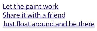
}<p class='custom-underline'>Let the paint work</p>
<br>
<p class='custom-underline'>Share it with a friend</p>
<br>
<p class='custom-underline'>Just float around and be there</p>
答案 4 :(得分:0)
这是你要找的吗?
我使用:after pseudo-element并将其absolute position
渲染效果我为pseudo-element添加了一个底边框,并使用-.35em top将其提升一点,这导致它始终调整为主要元素{ {1}}。
工作示例:
font-sizep span {
display:inline;
position: relative;
font-size: 30px;
font-weight: 500;
color: #27196e;
}
p:hover span:after {
content: "";
position: absolute;
height:100%;
width:100%;
top: -.35em;
left: 0;
border-bottom: 8px solid rgba(111, 111, 255, .4)
}
答案 5 :(得分:0)
将p内的每个短语换行,如下所示:
<p>
let the paint work21321321213123321321321  213
</p>
<p>
let the paint work
</p>
<p>
let the paint work
</p>
<强> CSS
p {
    height: auto;
    position: relative;
    width: 200px;
    }

 p::before {
        content: '';
        display: block;
        position: absolute;
        bottom: 0;
        width: 130%;
        left: 0%;
        border-bottom: 1px solid red;
    }
相关问题
最新问题
- 我写了这段代码,但我无法理解我的错误
- 我无法从一个代码实例的列表中删除 None 值,但我可以在另一个实例中。为什么它适用于一个细分市场而不适用于另一个细分市场?
- 是否有可能使 loadstring 不可能等于打印?卢阿
- java中的random.expovariate()
- Appscript 通过会议在 Google 日历中发送电子邮件和创建活动
- 为什么我的 Onclick 箭头功能在 React 中不起作用?
- 在此代码中是否有使用“this”的替代方法?
- 在 SQL Server 和 PostgreSQL 上查询,我如何从第一个表获得第二个表的可视化
- 每千个数字得到
- 更新了城市边界 KML 文件的来源?