如何使div到新线
我是css的初学者。
我想把新的div变成这样的新行,
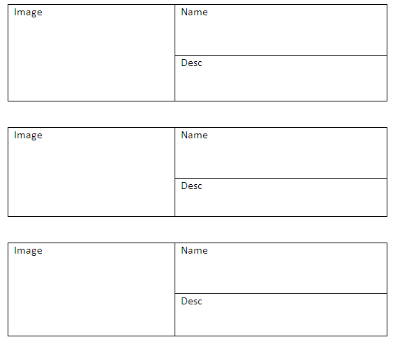
我尝试这样的代码
<style>
div{
  display:inline-block;
  float:left;
  color:#fff;
  font-size:20px;
}

.one{
  width:100px;
  height:100px;
  background:red;
}
.three{
    width:100px;
  height:100px;
}

.four{
  width:150px;
  height:50px;
background:darkblue;
}
.five{
  width:150px;
  height:50px;
background:blue;
}
 </style>

<div class="one">image</div>

<div class="three">
  <div class="four">name</div>
  <div class="five">desc</div>
</div>

<div class="one">image</div>

<div class="three">
  <div class="four">name</div>
  <div class="five">desc</div>
</div>

<div class="one">image</div>

<div class="three">
  <div class="four">name</div>
  <div class="five">desc</div>
</div>
但结果如此
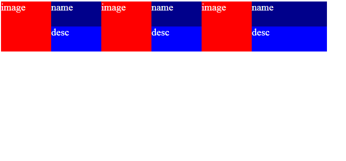
如何移动,第二张图片到新线.. 请任何人帮助我。我将很感激你的回答
8 个答案:
答案 0 :(得分:1)
&#13;
&#13;
&#13;
&#13;
div{
  /*display:inline-block;*/  /* deleted */
  /*float:left;*/            /* deleted */
  color:#fff;
  font-size:20px;
}

.some {
    margin-bottom: 10px;   /* new */
}

.one{
  float: left;  /* new  */
  width:100px;
  height:100px;
  background:red;
}

.three{
  width:100px;
  height:100px;
}

.four{
  width:150px;
  height:50px;
background:darkblue;
}
.five{
  width:150px;
  height:50px;
background:blue;
}
<div class="some">
<div class="one">image</div>
<div class="three">
<div class="four">name</div>
<div class="five">desc</div>
</div>
</div>
<div class="some">
<div class="one">image</div>
<div class="three">
<div class="four">name</div>
<div class="five">desc</div>
</div>
</div>
<div class="some">
<div class="one">image</div>
<div class="three">
<div class="four">name</div>
<div class="five">desc</div>
</div>
</div>
分隔每个块(这里我添加了一个带有类名some的div)
并且您想要一方.one和另一方.three,只需在float:left;上添加.one
答案 1 :(得分:1)
你可以使用这样的东西。
&#13;
&#13;
&#13;
&#13;
.box-wrapper {
        border: 1px solid #000;
        width: 100%;
        display: block;
        position: relative;
    }
    .box-wrapper:before, .box-wrapper:after{
      clear:both;
      display:table;
      content:"";
    }
    .box-tall {
        width: 50%;
        background:#ded9d9;
        height: 200px;
        float: left;
    }
    .box-left {
        width: 50%;
        float: left;
    }
    .box-1 {
        background: #8f8fde;
        height: 100px;
    }
    .box-2 {
        background: #d2c47a;
        height: 100px;
    }
<div class="box-wrapper">
<div class="box-tall">
tall
</div>
<div class="box-left">
<div class="box-1">top</div>
<div class="box-2">bottom</div>
</div>
</div>
答案 2 :(得分:0)
您应该添加clear:both或clear:left以使div显示在新行中
答案 3 :(得分:0)
在样式标记
之后尝试以下代码<div class="one">image</div>
<div class="three">
<div class="four">name</div>
<div class="five">desc</div>
</div>
<br>
<div class="one">image</div>
<div class="three">
<div class="four">name</div>
<div class="five">desc</div>
</div>
<br>
<div class="one">image</div>
<div class="three">
<div class="four">name</div>
<div class="five">desc</div>
</div>
我认为这就是你想要做的事情
希望有所帮助
如果您需要任何进一步的帮助,请告诉我
答案 4 :(得分:0)
您需要清除.one div上的浮动。
这是唯一可以改变的部分:
CSS:
.one{
  width:100px;
  height:100px;
  background:red;
  clear:left;
  margin-bottom: 15px;
}
您可以考虑通过打包每组divs来考虑更改标记,但这样可以满足您的需求。
答案 5 :(得分:0)
这是解决方案。 试试这个代码:
$queryt="SET time_zone='Asia/Kolkata'";
mysqli_query($mysqli, $queryt))
答案 6 :(得分:0)
您可以使用以下内容。你没有清理你的花车。
<div class="one">image</div>

<div class="three">
  <div class="four">name</div>
  <div class="five">desc</div>
</div>
<div class="clearfix">
</div>


<div class="one">image</div>

<div class="three">
  <div class="four">name</div>
  <div class="five">desc</div>
</div>
<div class="clearfix">
</div>

<div class="one">image</div>

<div class="three">
  <div class="four">name</div>
  <div class="five">desc</div>
</div>


div{
  display:inline-block;
  float:left;
  color:#fff;
  font-size:20px;
}

.clearfix{
  clear:both;
}

.one{
  width:100px;
  height:100px;
  background:red;
  margin-bottom:20px;
  display:block !important;
}
.three{
    width:100px;
  height:100px;
}

.four{
  width:150px;
  height:50px;
background:darkblue;
}
.five{
  width:150px;
  height:50px;
background:blue;
}
答案 7 :(得分:0)
你可以添加一个div来包装你的image / name / desc组,然后将clear: both;设置为这个div:
div{
  display:inline-block;
  float:left;
  color:#fff;
  font-size:20px;
}

.image-wrapper {
  clear: both;
  margin-bottom: 20px;
}

.one{
  width:100px;
  height:100px;
  background:red;
}
.three{
  width:100px;
  height:100px;
}

.four{
  width:150px;
  height:50px;
  background:darkblue;
}

.five{
  width:150px;
  height:50px;
  background:blue;
}
<div class="image-wrapper">
<div class="one">image</div>
<div class="three">
<div class="four">name</div>
<div class="five">desc</div>
</div>
</div>
<div class="image-wrapper">
<div class="one">image</div>
<div class="three">
<div class="four">name</div>
<div class="five">desc</div>
</div>
</div>
<div class="image-wrapper">
<div class="one">image</div>
<div class="three">
<div class="four">name</div>
<div class="five">desc</div>
</div>
</div>
相关问题
最新问题
- 我写了这段代码,但我无法理解我的错误
- 我无法从一个代码实例的列表中删除 None 值,但我可以在另一个实例中。为什么它适用于一个细分市场而不适用于另一个细分市场?
- 是否有可能使 loadstring 不可能等于打印?卢阿
- java中的random.expovariate()
- Appscript 通过会议在 Google 日历中发送电子邮件和创建活动
- 为什么我的 Onclick 箭头功能在 React 中不起作用?
- 在此代码中是否有使用“this”的替代方法?
- 在 SQL Server 和 PostgreSQL 上查询,我如何从第一个表获得第二个表的可视化
- 每千个数字得到
- 更新了城市边界 KML 文件的来源?