CSS,重叠子div但父div的宽度保持不变
我想使用position:relative和left属性重叠子div。由于重叠,我想减少父宽度。但是,事实上,父div并没有减少。
这是我的codepen。 https://codepen.io/anon/pen/eRMMwW
HTML
<div class="mother">
  <div class="child">1</div>
  <div class="child">2</div>
  <div class="child">3</div>
  <div class="child">4</div>
</div>
CSS
div.mother {
  background-color: red;
  display:inline-block;
}

div.child {
  background-color: blue;
  width: 50px;
  height: 50px;
  display: inline-block;
  position: relative;
}

div.child:nth-child(2) {
  left: -25px;
  background-color: yellow;
}

div.child:nth-child(3) {
  left: -50px;
  background-color: pink;
}

div.child:nth-child(4) {
  left: -75px;
  background-color: green;
}
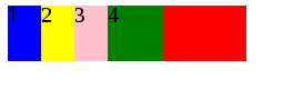
正如您所看到的,mother div宽度不适合其自己的子宽度,并且有一个超出红色部分。我想删除超红部分。你知道任何解决方案吗?还有一点。我尽量避免flex和float。
Kumar的更新为什么不将孩子的宽度减少一半。
我想制作一个彼此重叠的图像聚类。假设那些child div是这样的圆形边界。如您所见,将子宽度设置为一半并不是一个好主意。

2 个答案:
答案 0 :(得分:2)
您可以在内部div(margin-left: -25px)上使用negative margins,同时为父div提供偏移边距 - (margin-left: 25px)
&#13;
&#13;
&#13;
&#13;
div.mother {
  background-color: red;
  display: inline-block;
  margin-left: 25px;
}

div.child {
  background-color: blue;
  width: 50px;
  height: 50px;
  display: inline-block;
  position: relative;
  margin-left: -25px;
}

div.child:nth-child(2) {
  background-color: yellow;
}

div.child:nth-child(3) {
  background-color: pink;
}

div.child:nth-child(4) {
  background-color: green;
}
<div class="mother">
<div class="child">1</div>
<div class="child">2</div>
<div class="child">3</div>
<div class="child">4</div>
</div>
如果您要删除:hover
粗略动画草稿:
&#13;
&#13;
&#13;
&#13;
div.mother {
  background-color: red;
  display: inline-block;
  margin-left: 25px;
  z-index: 1; /* botttom layer */
}

div.child {
  background-color: blue;
  width: 50px;
  height: 50px;
  display: inline-block;
  position: relative;
  margin-left: -25px;
}

div.child:nth-child(2) {
  background-color: yellow;
  z-index: 2; /* botttom layer +1 */
}

div.child:nth-child(3) {
  background-color: pink;
  z-index: 3; /* botttom layer +2 */
}

div.child:nth-child(4) {
  background-color: green;
  z-index: 4; /* botttom layer +3 */
}

div.child:hover {
  position: relative;
  animation-name: slide;
  animation-duration: 1s;  /*animation speed */
  animation-iteration-count: 1;
  animation-fill-mode: forwards; /* makes animation stop at 100% and not revet back to original state */
  cursor: pointer;
}

div.child:nth-child(4):hover {
  animation-name: none; /* doesn't need animation othewise you would see red background from parent div */
}

@keyframes slide {
  0% {
    margin-right: 0px;
  }
  100% {
    margin-right: 20px; /* pushes the next div out so you can see current div. */
  }
}
<div class="mother">
<div class="child">1</div>
<div class="child">2</div>
<div class="child">3</div>
<div class="child">4</div>
</div>
答案 1 :(得分:0)
在background:transparent css类中应用mother。
&#13;
&#13;
&#13;
&#13;
div.mother {
  background: transparent;
  display:inline-block;
}

div.child {
  background-color: blue;
  width: 50px;
  height: 50px;
  display: inline-block;
  position: relative;
  border-radius:2em;
}

div.child:nth-child(2) {
  left: -25px;
  background-color: yellow;
}

div.child:nth-child(3) {
  left: -50px;
  background-color: pink;
}

div.child:nth-child(4) {
  left: -75px;
  background-color: green;
}
<div class="mother">
<div class="child">1</div>
<div class="child">2</div>
<div class="child">3</div>
<div class="child">4</div>
</div>
相关问题
最新问题
- 我写了这段代码,但我无法理解我的错误
- 我无法从一个代码实例的列表中删除 None 值,但我可以在另一个实例中。为什么它适用于一个细分市场而不适用于另一个细分市场?
- 是否有可能使 loadstring 不可能等于打印?卢阿
- java中的random.expovariate()
- Appscript 通过会议在 Google 日历中发送电子邮件和创建活动
- 为什么我的 Onclick 箭头功能在 React 中不起作用?
- 在此代码中是否有使用“this”的替代方法?
- 在 SQL Server 和 PostgreSQL 上查询,我如何从第一个表获得第二个表的可视化
- 每千个数字得到
- 更新了城市边界 KML 文件的来源?