如何在div框中心对齐溢出文本?
这是我的问题:
我的标题字溢出了div框。原因是单词大小比div的宽度宽,我设置了“nowrap”规则。它显示如下:
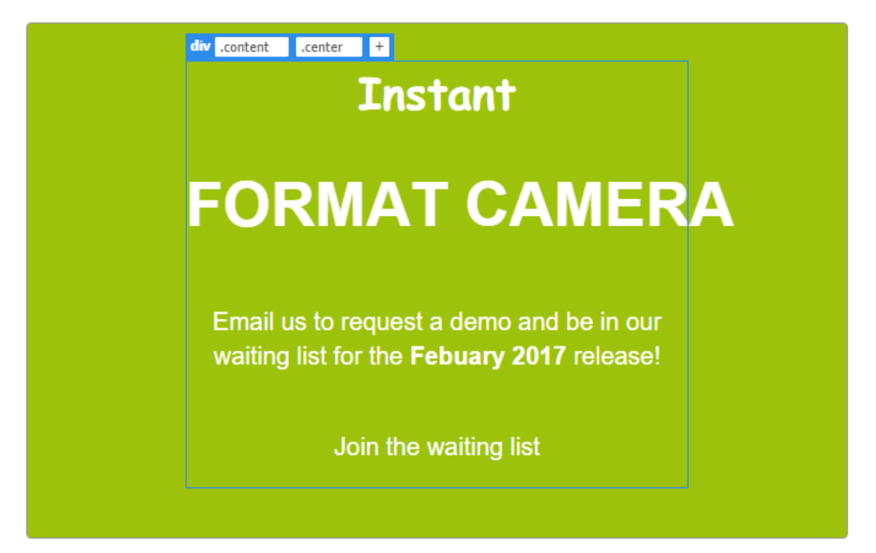
我希望单词“FORMAT CAMERA”在div框的中心轴对齐,所以它使F的一部分溢出到左边,A的一部分溢出到右边。我怎样才能做到这一点?这是我简单的CSS代码:
.content {
  text-align: center;
}

h1(FORMAT CAMERA) {
  color: white;
  font-size: 50px;
  font-family: "Rubik", sans-serif;
  line-height: 1.4;
  white-space: nowrap;
}
2 个答案:
答案 0 :(得分:5)
只需将display:flex和justify-content: center添加到.content
查看有关令人惊叹的flex box
.content {
  text-align: center;
  border: solid 1px #333;
  width: 300px;
  margin: 0 auto;
  display: flex;
  justify-content: center;
}

h1 {
  color: black;
  font-size: 50px;
  font-family: "Rubik", sans-serif;
  line-height: 1.4;
  white-space: nowrap;
}
<div class="content">
<h1>FORMAT CAMERA</h1>
</div>
答案 1 :(得分:2)
这有点hacky,但它确实有效。这是通过向h1标签添加边距和边距100%来实现的。这基本上是&#34;拉&#34;相对于窗口大小的任一侧的元素数量相等,迫使它溢出内容div。
我添加了.outerspace包装overflow:hidden,以防止出现水平滚动。
&#13;
&#13;
&#13;
&#13;
.outerspace {
  overflow:hidden;
}
.content {
  text-align: center;
  width:400px;
  margin:0 auto;
  background: pink;
}
h1 {
  color: red;
  font-size: 55px;
  font-family: "Rubik", sans-serif;
  white-space: nowrap;
  margin-left: -100%;
  margin-right:-100%;
}
<div class="outerspace">
<div class="content">
<p>Lorem ipsum dolor</p>
<h1>FORMAT CAMERA</h1>
<p>Lorem ipsum dolor sit amet, consectetur adipisicing elit, sed do eiusmod tempor incididunt ut labore et dolore magna aliqua. Ut enim ad minim veniam, quis nostrud exercitation ullamco laboris nisi ut aliquip ex ea commodo consequat. Duis aute irure dolor in reprehenderit in voluptate velit esse cillum dolore eu fugiat nulla pariatur. Excepteur sint occaecat cupidatat non proident, sunt in culpa qui officia deserunt mollit anim id est laborum.</p>
</div>
</div>
相关问题
最新问题
- 我写了这段代码,但我无法理解我的错误
- 我无法从一个代码实例的列表中删除 None 值,但我可以在另一个实例中。为什么它适用于一个细分市场而不适用于另一个细分市场?
- 是否有可能使 loadstring 不可能等于打印?卢阿
- java中的random.expovariate()
- Appscript 通过会议在 Google 日历中发送电子邮件和创建活动
- 为什么我的 Onclick 箭头功能在 React 中不起作用?
- 在此代码中是否有使用“this”的替代方法?
- 在 SQL Server 和 PostgreSQL 上查询,我如何从第一个表获得第二个表的可视化
- 每千个数字得到
- 更新了城市边界 KML 文件的来源?