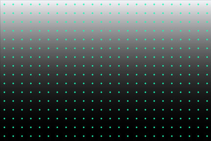
ж·ЎеҮәCSSдёӯйҮҚеӨҚеҫ„еҗ‘жёҗеҸҳзҡ„иҫ№зјҳ
жҲ‘дҪҝз”Ёrepeating-radial-gradientеҲӣе»әиҷҡзәҝиғҢжҷҜж•ҲжһңгҖӮдҪҶжҳҜпјҢжҲ‘йңҖиҰҒе°ҶйЎ¶йғЁе’Ңеә•йғЁиҫ№зјҳж·ЎеҢ–дёә0зҡ„дёҚйҖҸжҳҺеәҰпјҢиҖҢдёҚзҹҘйҒ“иғҢжҷҜйўңиүІжҳҜд»Җд№ҲгҖӮжңүжІЎжңүеҠһжі•з”ЁIE 11дёӯзҡ„CSSе·ҘдҪңпјҹ
пјҶпјғ13;
пјҶпјғ13;
пјҶпјғ13;
пјҶпјғ13;
body, html {
  padding: 0;
  margin: 0;
  width: 100%;
  height: 100%;
  background: linear-gradient(to bottom, rgba(0, 0, 0, 0) 0%, rgba(0, 0, 0, 1) 50%, rgba(0, 0, 0, 0) 100%);
}
.dots {
  width: 100%;
  height: 100%;
  background-image: repeating-radial-gradient(circle, #02fcb8 0px, #02fcb8 1px, transparent 2px, transparent 100%);
  background-size: 18px 18px;
}
<div class="dots"></div>
йңҖиҰҒиҪ¬жӯӨпјҡ
иҝӣе…ҘиҝҷдёӘпјҡ
жҲ‘еҸҜд»ҘдҪҝз”ЁеӣҫеғҸи’ҷзүҲпјҢдҪҶеңЁIE / EdgeдёӯжІЎжңүж”ҜжҢҒпјҡ
-webkit-mask-image: -webkit-gradient(linear, left top, left bottom, color-stop(0, rgba(0, 0, 0, 0)), color-stop(0.5, rgba(0, 0, 0, 1)), color-stop(1, rgba(0, 0, 0, 0)));
2 дёӘзӯ”жЎҲ:
зӯ”жЎҲ 0 :(еҫ—еҲҶпјҡ0)
иҜ•з”ЁжӯӨд»Јз Ғ
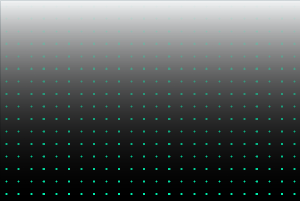
ж·ЎеҢ–дёҠиҫ№зјҳ
пјҶпјғ13;
пјҶпјғ13;
пјҶпјғ13;
пјҶпјғ13;
body, html {
  padding: 0;
  margin: 0;
  width: 100%;
  height: 100%;
    background: linear-gradient(to bottom, rgba(0, 0, 0, 0) 0%, rgba(0, 0, 0, 1) 100%);
}
.dots {
  width: 100%;
  height: 100%;
  background-image: repeating-radial-gradient(circle, #02fcb8 0px, #02fcb8 1px, transparent 2px, transparent 100%);
  background-size: 18px 18px;
  position:relative;
}
.dots:after {
    content: "";
    position: absolute;
    top: 0;
    left: 0;
    width: 100%;
    height: 100%;
    background-image: linear-gradient(to bottom, #FFFFFF 0%, transparent 100%);
}
<div class="dots"></div>
ж·ЎеҢ–йЎ¶йғЁе’Ңеә•йғЁиҫ№зјҳ
пјҶпјғ13;
пјҶпјғ13;
пјҶпјғ13;
пјҶпјғ13;
body, html {
  padding: 0;
  margin: 0;
  width: 100%;
  height: 100%;
background: linear-gradient(to bottom, rgba(0, 0, 0, 0) 0%, rgba(0, 0, 0, 1) 50%, rgba(0, 0, 0, 0) 100%);
}
.dots {
  width: 100%;
  height: 100%;
  background-image: repeating-radial-gradient(circle, #02fcb8 0px, #02fcb8 1px, transparent 2px, transparent 100%);
  background-size: 18px 18px;
}
.dots:after {
    content: "";
    position: absolute;
    top: 0;
    left: 0;
    width: 100%;
    height: 100%;
    background: linear-gradient(to bottom, #FFFFFF 0%, transparent 50%, #FFFFFF 100%);
}
<div class="dots"></div>
зӯ”жЎҲ 1 :(еҫ—еҲҶпјҡ0)
дҪҝз”ЁCSSдјјд№ҺдёҚеҸҜиғҪ;дҪҶжҳҜпјҢжҲ‘жүҫеҲ°дәҶдёҖз§Қж–№жі•пјҢдҪҝз”ЁlinearGradientе…ғзҙ дёӯзҡ„maskе’ҢSVGжЁЎејҸеңЁSVGдёӯжү§иЎҢжӯӨж“ҚдҪңпјҡ
пјҶпјғ13;
пјҶпјғ13;
пјҶпјғ13;
пјҶпјғ13;
body, html {
  padding: 0;
  margin: 0;
  width: 100%;
  height: 100%;
  background: linear-gradient(to bottom, rgba(0, 0, 0, 0) 0%, rgba(0, 0, 0, 1) 50%, rgba(0, 0, 0, 0) 100%);
}
.dots {
  width: 100%;
  height: 100%;
}
.dots svg {
  width: 100%;
  height: 100%;
}
<div class="dots">
<svg xmlns='http://www.w3.org/2000/svg'>
<defs>
<mask id="mask" maskUnits="userSpaceOnUse" maskContentUnits="userSpaceOnUse">
<linearGradient id="grad" gradientUnits="userSpaceOnUse" x1="0%" y1="0%" x2="0%" y2="100%">
<stop stop-color="black" stop-opacity="0" offset="0"/>
<stop stop-color="white" offset="0.5"/>
<stop stop-color="black" stop-opacity="0" offset="1"/>
</linearGradient>
<rect x="0" y="0" width="100%" height="100%" fill="url(#grad)" />
</mask>
<pattern id="dots" x="10" y="10" width="20" height="20" patternUnits="userSpaceOnUse">
<circle cx="10" cy="10" r="1" style="stroke: none; fill: #02fcb8" />
</pattern>
</defs>
<rect x="1" y="1" width="100%" height="100%" style="fill: url(#dots); mask: url(#mask)" />
</svg>
</div>
зӣёе…ій—®йўҳ
жңҖж–°й—®йўҳ
- жҲ‘еҶҷдәҶиҝҷж®өд»Јз ҒпјҢдҪҶжҲ‘ж— жі•зҗҶи§ЈжҲ‘зҡ„й”ҷиҜҜ
- жҲ‘ж— жі•д»ҺдёҖдёӘд»Јз Ғе®һдҫӢзҡ„еҲ—иЎЁдёӯеҲ йҷӨ None еҖјпјҢдҪҶжҲ‘еҸҜд»ҘеңЁеҸҰдёҖдёӘе®һдҫӢдёӯгҖӮдёәд»Җд№Ҳе®ғйҖӮз”ЁдәҺдёҖдёӘз»ҶеҲҶеёӮеңәиҖҢдёҚйҖӮз”ЁдәҺеҸҰдёҖдёӘз»ҶеҲҶеёӮеңәпјҹ
- жҳҜеҗҰжңүеҸҜиғҪдҪҝ loadstring дёҚеҸҜиғҪзӯүдәҺжү“еҚ°пјҹеҚўйҳҝ
- javaдёӯзҡ„random.expovariate()
- Appscript йҖҡиҝҮдјҡи®®еңЁ Google ж—ҘеҺҶдёӯеҸ‘йҖҒз”өеӯҗйӮ®д»¶е’ҢеҲӣе»әжҙ»еҠЁ
- дёәд»Җд№ҲжҲ‘зҡ„ Onclick з®ӯеӨҙеҠҹиғҪеңЁ React дёӯдёҚиө·дҪңз”Ёпјҹ
- еңЁжӯӨд»Јз ҒдёӯжҳҜеҗҰжңүдҪҝз”ЁвҖңthisвҖқзҡ„жӣҝд»Јж–№жі•пјҹ
- еңЁ SQL Server е’Ң PostgreSQL дёҠжҹҘиҜўпјҢжҲ‘еҰӮдҪ•д»Һ第дёҖдёӘиЎЁиҺ·еҫ—第дәҢдёӘиЎЁзҡ„еҸҜи§ҶеҢ–
- жҜҸеҚғдёӘж•°еӯ—еҫ—еҲ°
- жӣҙж–°дәҶеҹҺеёӮиҫ№з•Ң KML ж–Ү件зҡ„жқҘжәҗпјҹ