如何垂直浮动/弯曲div然后水平继续
我有一个由许多不同客户定制的布局,因此html结构被锁定到
<div class="container">
    <div>content</div>
    <div>content</div>
    <div>content</div>
    <div>content</div>
</div>
注意:不使用bootstrap,容器只是适用的名称
在UI中我需要能够使用CSS从这个结构中制作许多不同的布局而不改变它。有一个特别是我无法弄清楚。所需的布局是:
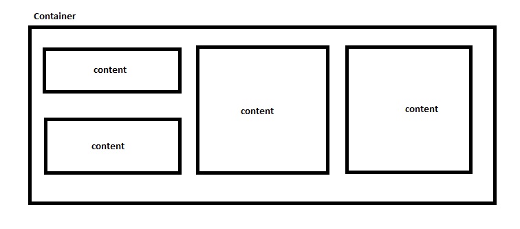
我知道如果它都是垂直的,那么简单的width和float样式就很容易做到。我也知道在前两个孩子周围抛出一个包含div是一个简单的解决方案,但同样要求保持html不变。
我试过了:
.container {
    display: flex;
    flex-wrap: wrap;
}

.container > div {
    width: 33.33335;
    height: 400px;
}

.container > div:nth-child(1),
.container > div:nth-child(2) {
    height: 200px;
}
为儿童div设置适当的高度,前两个高度是其他人的一半。
同样,我尝试过:
.container > div {
    float: left;
}

.container > div {
    height: 400px;
    width: 33.33333%;
}

.container > div:nth-child(1),
.container > div:nth-child(2) {
    height: 200px;
}
再次给予前两个孩子一半的高度。没有任何工作,在所有结果中,前两个堆栈和其他堆栈不浮动/弯曲或前两个堆栈根本不堆叠。
任何人都可以想出一种CSS方法来为所需的UI设计这种结构样式吗?
感谢帮助。
1 个答案:
答案 0 :(得分:1)
如果您可以在容器上设置固定高度,则可以将flexbox与flex-flow: column wrap一起使用。固定高度是告诉flex项目包装的必要条件。这是一个例子:
.container {
  display: flex;
  flex-direction: column;
  flex-wrap: wrap;
  justify-content: space-around; /* vertical alignment */
  align-content: center;         /* horizontal alignment */
  height: 320px;                 /* essential for this method to work */
  background-color: lightyellow;
  border: 1px dashed red;
}

.container>div {
  flex: 0 0 90%;                 /* flex-grow, flex-shrink, flex-basis */
  width: 30%;
  margin: 5px;
  background-color: lightgreen;
}

.container>div:nth-child(1),
.container>div:nth-child(2) {
  flex-basis: 40%;              /* override flex-basis from rule above */
}
<div class="container">
<div>content</div>
<div>content</div>
<div>content</div>
<div>content</div>
</div>
相关问题
最新问题
- 我写了这段代码,但我无法理解我的错误
- 我无法从一个代码实例的列表中删除 None 值,但我可以在另一个实例中。为什么它适用于一个细分市场而不适用于另一个细分市场?
- 是否有可能使 loadstring 不可能等于打印?卢阿
- java中的random.expovariate()
- Appscript 通过会议在 Google 日历中发送电子邮件和创建活动
- 为什么我的 Onclick 箭头功能在 React 中不起作用?
- 在此代码中是否有使用“this”的替代方法?
- 在 SQL Server 和 PostgreSQL 上查询,我如何从第一个表获得第二个表的可视化
- 每千个数字得到
- 更新了城市边界 KML 文件的来源?