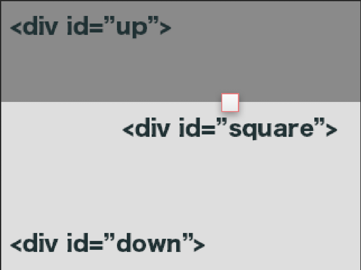
我需要制作这样的东西,我怎么能在这两个之间的中间制作正方形?这是CSS和Photo
我的Css
#up{
    width:100%;
    height:30%;
   }
#down{
    width:100%;
    height:70%;
   }
#square{
    width:40px;
    height:40px;
   }
我可以设置正方形而不计算中线位置的百分比吗? (因为我想将所有类似内容添加到网络的所有会话中,会话的高度将按文本长度进行响应
答案 0 :(得分:1)
你需要使用相对于外部div的位置和相对于内部div的位置
这里是你怎么做的链接
.one,
.two,
.three {
  width: 100%;
  height: 50px;
}

.one {
  background: yellow;
  position: relative;
}

.two {
  background: green;
}

.three {
  background: red;
}

.square {
  position: absolute;
  bottom: -10px;
  right: 30px;
  height: 20px;
  width: 20px;
  background: white;
}
<div class="one">
<div class="square">
</div>
</div>
<div class="two">
</div>
<div class="three">
</div>
答案 1 :(得分:0)
您可以将<div>方格视为:
<div id="div1"></div>
:
#div1{
 border: 1px red;
 height: /*enter the height */
 width: /* enter the width */
 position: relative;
 left: /*enter the distance */
 right: /*enter the distance */
 top: /*enter the distance */
 bottom: /*enter the distance */
 z-index: 100 /* make sure other div's have z index lesser than this div's */
}
答案 2 :(得分:0)
将方块放入第二个div中,给它一个position: absolute和一个top: -20px(和left: Xpx - 即你需要/想要的任何东西。
答案 3 :(得分:0)
你可以轻松地使用position:absolute来做你的小盒子div。
以下是可以帮助您的解决方案
body,
html {
  height: 100%;
  margin:0px;
}

#up {
  width: 100%;
  height: 30%;
  background: red;
}

#down {
  width: 100%;
  height: 70%;
  background: blue;
}

#square {
  width: 40px;
  height: 40px;
  background: green;
  position: absolute;
  top: calc(30% - 20px);
  margin: 0px auto;
  left: 0px;
  right: 0px;
  z-index: 1;
}
<div id="up"></div>
<div id="down"></div>
<div id="square"></div>