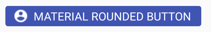
材质按钮
我正在按照this之类的问题提示创建像Material Design上建议的按钮样式。

但是,我需要通过继承Widget.AppCompat.Button.Colored样式并设置radius参数来改变角半径并且无法这样做。
我怎样才能拥有相同的风格,但有圆角?
8 个答案:
答案 0 :(得分:36)
您需要继承该样式。
添加到styles.xml:
 <style name="AppTheme.RoundedCornerMaterialButton" parent="Widget.AppCompat.Button.Colored">
        <item name="android:background">@drawable/rounded_shape</item>
 </style>
添加文件drawable / rounded_shape.xml:
<shape
    xmlns:android="http://schemas.android.com/apk/res/android"
    android:shape="rectangle"   >

    <solid
        android:color="@color/colorAccent" >
    </solid>

    <corners
        android:radius="11dp"   >
    </corners>

</shape>
最后在你的布局中:
 <Button
       android:layout_width="wrap_content"
       android:layout_height="wrap_content"
       android:text="Test Text"
       style="@style/AppTheme.RoundedCornerMaterialButton"/>
编辑:使用主题颜色而不是硬编码颜色的更新答案。
答案 1 :(得分:28)
您还可以使用新的Material Components for Android。
随着Android Material Components在2018年11月的稳定发布,Google已将材质组件从名称空间
android.support.design移至com.google.android.material。 Material Component library 是Android设计支持库的替代品。
将the dependency添加到build.gradle:
dependencies { implementation ‘com.google.android.material:material:1.0.0’ }
在这种情况下,您可以在布局文件中使用:
<com.google.android.material.button.MaterialButton
   ....
   style="@style/Widget.MaterialComponents.Button.OutlinedButton"
   app:cornerRadius=".."
   app:strokeColor="@color/colorPrimary"/>
使用app:cornerRadius属性更改转角半径的大小。这将使指定尺寸的角变圆。
您还可以使用ShapeApperance自定义角落。
<style name="MyButton" parent="Widget.MaterialComponents.Button.OutlinedButton">
    <item name="shapeAppearance">@style/MyShapeAppearance</item>
</style>
<style name="MyShapeAppearance">
    <item name="cornerFamilyTopLeft">rounded</item>
    <item name="cornerFamilyBottomLeft">rounded</item>
    <item name="cornerFamilyTopRight">cut</item>
    <item name="cornerFamilyBottomRight">cut</item>
    <item name="cornerSize">8dp</item>
</style>
<强> OLD:
使用新的Support Library 28.0.0-alpha1 release,设计库现在包含Material Button。
您可以使用以下命令将此按钮添加到我们的布局文件中:
<android.support.design.button.MaterialButton
    android:layout_width="wrap_content"
    android:layout_height="wrap_content"
    android:text="XXXXX"
    android:textSize="18sp"
    android:backgroundTint="@color/colorPrimary"
    app:icon="@drawable/ic_android_white_24dp" />
您可以使用以下属性设置转角半径:
-
app:cornerRadius:用于定义用于按钮角落的半径
目前要使用它,您必须使用Android Studio 3.1或更高版本,并且:
android {
    compileSdkVersion 'android-P'

    defaultConfig {
        targetSdkVersion 'P'
    }
    ...
}
dependencies {
  implementation 'com.android.support:design:28.0.0-alpha1'
}
答案 2 :(得分:6)
带有波纹效果的圆形材质按钮
在可绘制文件夹 ripple.xml
中创建文件{ "John": {"StudentName": "John anow", "RegistrationNo": "xxxxx", "Grade":"B"},
"Methwe 0": {"StudentName": "Methew", "RegistrationNo": "xxxxx", "Grade":"B"},
"Johnsan 09": {"StudentName": "Johnsan anow", "RegistrationNo": "xxxxx", "Grade":"B"}
}
在可绘制文件夹 rounded_shape.xml
中创建文件<?xml version="1.0" encoding="utf-8"?>
<ripple xmlns:android="http://schemas.android.com/apk/res/android"
android:color="?android:attr/colorControlHighlight">
<item android:id="@android:id/mask">
<shape android:shape="rectangle">
<solid android:color="@color/colorPrimary" />
<corners android:radius="20dp" />
</shape>
</item>
<item android:drawable="@drawable/rounded_shape" />
</ripple>
在您的按钮上:
<?xml version="1.0" encoding="utf-8"?>
<shape
    xmlns:android="http://schemas.android.com/apk/res/android"
    android:shape="rectangle"   >
    <solid
        android:color="@color/colorPrimary" >
    </solid>
    <corners
        android:radius="20dp"   >
    </corners>
</shape>
答案 3 :(得分:5)
我会告诉你我的确切解决方案。在选择器标签内,您可以放置项目(按钮的功能)
选择器标签的第二项具有相反的行为。您可以添加尽可能多的选择器(按钮行为) 添加这个可绘制的XML作为按钮的背景android:background =&#34; @ drawable / this xml&#34;
    <?xml version="1.0" encoding="utf-8"?>
<ripple xmlns:android="http://schemas.android.com/apk/res/android"
    android:color="#ffffff"> <!-- this is the ripple color(first touch color changes into this color) -->
    <item>
        <selector>
            <item android:state_enabled="true">
                <shape xmlns:android="http://schemas.android.com/apk/res/android"
                    android:shape="rectangle">
                    <!-- default button color -->

                    <solid android:color="@color/colorPrimary"></solid>

                    <corners android:radius="151dp"></corners>

                </shape>
            </item>
            <item> //first item was state enabled so this is automatically state disabled
                <shape xmlns:android="http://schemas.android.com/apk/res/android"
                    android:shape="rectangle">
                    <!-- button disabled color opposite behaviour -->
                    <solid android:color="#e9d204"></solid>

                    <corners android:radius="151dp"></corners>

                </shape>
            </item>
        </selector>
    </item>
    <item>
        <selector>
            <item android:state_pressed="true">
                <shape xmlns:android="http://schemas.android.com/apk/res/android"
                    android:shape="rectangle">
                    <!-- button first touch of your finger color -->
                    <solid android:color="#1989fa"></solid>

                    <corners android:radius="151dp"></corners>

                </shape>
            </item>
        </selector>
    </item>
    <item>
        <selector>
            <item android:state_hovered="true">
                <shape xmlns:android="http://schemas.android.com/apk/res/android"
                    android:shape="rectangle">
                    <!-- hovered with a note pencil -->
                    <solid android:color="#4affffff"></solid>

                    <corners android:radius="151dp"></corners>

                </shape>
            </item>
        </selector>
    </item>

</ripple>
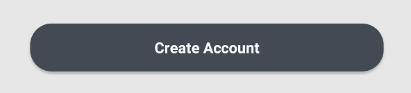
答案 4 :(得分:1)
另一种简单的方法是将它包装在cardView周围,记住将cardView的layout_width和layout_height设置为wrap_content,按钮所需的所有必需边距应该应用于cardView
<android.support.v7.widget.CardView
            android:layout_width="wrap_content"
            android:layout_height="wrap_content"
            app:cardCornerRadius="8dp"
            android:layout_marginLeft="10dp"
            android:layout_marginRight="10dp"
            android:layout_marginBottom="40dp"
            app:elevation="10dp">

            <android.support.v7.widget.AppCompatButton
                android:id="@+id/login_twitter"
                android:tag="login_twitter"
                android:layout_width="300dp"
                android:layout_height="60dp"
                android:paddingLeft="10dp"
           android:foreground="?attr/selectableItemBackgroundBorderless"
                android:textColor="@color/blue_grey_ligthen_5"
                android:drawableLeft="@drawable/twitter"
                android:background="@color/twitter"
                android:text="@string/login_with_twitter" />
        </android.support.v7.widget.CardView>
答案 5 :(得分:0)
现在将MaterialButton用于圆形按钮,您可以执行更多操作。请点击链接
并为圆角添加app:cornerRadius="8dp"
答案 6 :(得分:0)
尝试以下代码创建一个名为circle_button.xml的可绘制文件,并插入以下内容
<?xml version="1.0" encoding="utf-8"?>
<shape xmlns:android="http://schemas.android.com/apk/res/android"
android:shape="rectangle">
<solid android:color="#008577" />
<corners android:bottomRightRadius="100dp"
    android:bottomLeftRadius="100dp"
    android:topRightRadius="100dp"
    android:topLeftRadius="100dp"/>
</shape>
然后将按钮的背景更改为此可绘制文件
 <Button
      android:layout_width="wrap_content"
      android:layout_height="wrap_content"
      android:background="@drawable/circle_button"
      android:text="Button"/>
如果您想要一个完整的圆形按钮,则可以使用下面的drawable
<?xml version="1.0" encoding="utf-8"?>
<shape
    xmlns:android="http://schemas.android.com/apk/res/android"
    android:shape="oval">

    <solid
        android:color="#008577"/>

    <size
        android:width="120dp"
        android:height="120dp"/>
</shape>
答案 7 :(得分:0)
如果你不想改变整个应用的主题,你可以专门为此视图使用材料主题:
<com.google.android.material.button.MaterialButton
    android:id="@+id/fooButon"
    android:layout_width="wrap_content"
    android:layout_height="wrap_content"
    android:layout_margin="16dp"
    android:fontFamily="sans-serif"
    android:padding="8dp"
==> android:theme="@style/Theme.MaterialComponents.Light"
    app:backgroundTint="@color/base_white" />
- 我写了这段代码,但我无法理解我的错误
- 我无法从一个代码实例的列表中删除 None 值,但我可以在另一个实例中。为什么它适用于一个细分市场而不适用于另一个细分市场?
- 是否有可能使 loadstring 不可能等于打印?卢阿
- java中的random.expovariate()
- Appscript 通过会议在 Google 日历中发送电子邮件和创建活动
- 为什么我的 Onclick 箭头功能在 React 中不起作用?
- 在此代码中是否有使用“this”的替代方法?
- 在 SQL Server 和 PostgreSQL 上查询,我如何从第一个表获得第二个表的可视化
- 每千个数字得到
- 更新了城市边界 KML 文件的来源?