еҰӮдҪ•жӣҙж”№еҚ•йҖүжҢүй’®зҡ„йўңиүІпјҹ
жҲ‘зҡ„ж„ҸжҖқжҳҜпјҢеҚ•йҖүжҢүй’®жң¬иә«з”ұеңҶеҪўе’ҢдёӯеҝғзӮ№пјҲйҖүжӢ©жҢүй’®ж—¶пјүз»„жҲҗгҖӮжҲ‘жғіиҰҒж”№еҸҳзҡ„жҳҜдёӨиҖ…зҡ„йўңиүІгҖӮеҸҜд»ҘдҪҝз”ЁCSSе®ҢжҲҗеҗ—пјҹ
21 дёӘзӯ”жЎҲ:
зӯ”жЎҲ 0 :(еҫ—еҲҶпјҡ68)
еҝ«йҖҹи§ЈеҶіж–№жі•жҳҜдҪҝз”Ё:afterиҰҶзӣ–еҚ•йҖүжҢүй’®иҫ“е…Ҙж ·ејҸпјҢдҪҶжҳҜеҲӣе»әиҮӘе·ұзҡ„иҮӘе®ҡд№үе·Ҙе…·еҢ…еҸҜиғҪжҳҜжӣҙеҘҪзҡ„еҒҡжі•гҖӮ
    input[type='radio']:after {
        width: 15px;
        height: 15px;
        border-radius: 15px;
        top: -2px;
        left: -1px;
        position: relative;
        background-color: #d1d3d1;
        content: '';
        display: inline-block;
        visibility: visible;
        border: 2px solid white;
    }

    input[type='radio']:checked:after {
        width: 15px;
        height: 15px;
        border-radius: 15px;
        top: -2px;
        left: -1px;
        position: relative;
        background-color: #ffa500;
        content: '';
        display: inline-block;
        visibility: visible;
        border: 2px solid white;
    }
<input type='radio' name="gender"/>
<input type='radio' name="gender"/>
зӯ”жЎҲ 1 :(еҫ—еҲҶпјҡ58)
еҚ•йҖүжҢүй’®жҳҜзү№е®ҡдәҺжҜҸдёӘOS /жөҸи§ҲеҷЁзҡ„жң¬жңәе…ғзҙ гҖӮйҷӨйқһжӮЁжғіиҰҒе®һзҺ°иҮӘе®ҡд№үеӣҫеғҸжҲ–дҪҝз”ЁеҢ…еҗ«еӣҫеғҸзҡ„иҮӘе®ҡд№үJavascriptеә“пјҲдҫӢеҰӮthis - cached linkпјү
пјҢеҗҰеҲҷж— жі•жӣҙж”№е…¶йўңиүІ/ж ·ејҸзӯ”жЎҲ 2 :(еҫ—еҲҶпјҡ31)
д»…еҰӮжһңжӮЁиҰҒе®ҡдҪҚеҹәдәҺwebkitзҡ„жөҸи§ҲеҷЁпјҲChromeе’ҢSafariпјҢд№ҹи®ёжӮЁжӯЈеңЁејҖеҸ‘Chrome WebAppпјҢи°ҒзҹҘйҒ“...пјүпјҢжӮЁеҸҜд»ҘдҪҝз”Ёд»ҘдёӢеҶ…е®№пјҡ
input[type='radio'] {
   -webkit-appearance: none;
}
然еҗҺе°Ҷе…¶и®ҫзҪ®дёәдёҖдёӘз®ҖеҚ•зҡ„HTMLе…ғзҙ пјҢдҫӢеҰӮеә”з”ЁиғҢжҷҜеӣҫеғҸгҖӮ
еңЁйҖүжӢ©иҫ“е…Ҙж—¶дҪҝз”Ёinput[type='radio']:activeпјҢд»ҘжҸҗдҫӣеӨҮз”ЁеӣҫеҪў
жӣҙж–°пјҡиҮӘ2018е№ҙиө·пјҢжӮЁеҸҜд»Ҙж·»еҠ д»ҘдёӢеҶ…е®№д»Ҙж”ҜжҢҒеӨҡдёӘжөҸи§ҲеҷЁдҫӣеә”е•Ҷпјҡ
input[type="radio"] {
  -webkit-appearance: none;
  -moz-appearance: none;
  appearance: none;
}
зӯ”жЎҲ 3 :(еҫ—еҲҶпјҡ27)
жӯЈеҰӮеј—йӣ·еҫ·жүҖиҜҙпјҢжІЎжңүеҠһжі•еңЁйўңиүІпјҢеӨ§е°Ҹзӯүж–№йқўеҺҹз”ҹең°и®ҫзҪ®еҚ•йҖүжҢүй’®зҡ„ж ·ејҸгҖӮдҪҶжҳҜдҪ еҸҜд»ҘдҪҝз”ЁCSS Pseudoе…ғзҙ жқҘи®ҫзҪ®д»»дҪ•з»ҷе®ҡеҚ•йҖүжҢүй’®зҡ„еҶ’е……иҖ…пјҢ并и®ҫзҪ®е®ғзҡ„ж ·ејҸгҖӮжҺҘи§ҰJamieDжүҖиҜҙзҡ„пјҢе…ідәҺжҲ‘们еҰӮдҪ•дҪҝз”ЁпјҡеңЁPseudoе…ғзҙ д№ӢеҗҺпјҢдҪ еҸҜд»ҘеҗҢж—¶дҪҝз”Ёпјҡbeforeе’ҢпјҡafterжқҘе®һзҺ°зҗҶжғізҡ„еӨ–и§ӮгҖӮ
иҝҷз§Қж–№жі•зҡ„еҘҪеӨ„пјҡ
- и®ҫзҪ®еҚ•йҖүжҢүй’®зҡ„ж ·ејҸпјҢ并еҢ…еҗ«еҶ…е®№ж ҮзӯҫгҖӮ
- е°ҶеӨ–еңҲйўңиүІе’Ң/жҲ–еӢҫйҖүзҡ„еңҶеңҲжӣҙж”№дёәжӮЁе–ңж¬ўзҡ„д»»дҪ•йўңиүІгҖӮ
- з»ҷе®ғдёҖдёӘйҖҸжҳҺзҡ„еӨ–и§ӮпјҢдҝ®ж”№иғҢжҷҜйўңиүІеұһжҖ§е’Ң/жҲ–йҖүжӢ©дҪҝз”ЁдёҚйҖҸжҳҺеәҰеұһжҖ§гҖӮ
- зј©ж”ҫеҚ•йҖүжҢүй’®зҡ„еӨ§е°ҸгҖӮ
- ж·»еҠ еҗ„з§ҚжҠ•еҪұеұһжҖ§пјҢдҫӢеҰӮCSS drop shadow insetгҖӮ
- е°ҶиҝҷдёӘз®ҖеҚ•зҡ„CSS / HTMLжҠҖе·§ж··еҗҲеҲ°еҗ„з§ҚзҪ‘ж јзі»з»ҹдёӯпјҢдҫӢеҰӮBootstrap 3.3.6пјҢиҝҷж ·е®ғе°ұеҸҜд»Ҙзӣҙи§Ӯең°еҢ№й…Қе…¶дҪҷзҡ„Bootstrap组件гҖӮ
д»ҘдёӢз®Җзҹӯжј”зӨәзҡ„иҜҙжҳҺпјҡ
- дёәжҜҸдёӘеҚ•йҖүжҢүй’®и®ҫзҪ®зӣёеҜ№еҶ…еөҢеқ—
- йҡҗи—ҸеҺҹз”ҹеҚ•йҖүжҢүй’®ж„ҹи§үж— жі•зӣҙжҺҘи®ҫзҪ®ж ·ејҸгҖӮ
- ж ·ејҸ并еҜ№йҪҗж Үзӯҫ
- йҮҚжһ„CSSеҶ…е®№пјҡеңЁPseudo-elementд№ӢеүҚеҒҡ2件дәӢ - и®ҫзҪ®еҚ•йҖүжҢүй’®зҡ„еӨ–иҫ№жЎҶ并е°Ҷе…ғзҙ и®ҫзҪ®дёәйҰ–е…ҲеҮәзҺ°пјҲж ҮзӯҫеҶ…е®№зҡ„е·Ұдҫ§пјүгҖӮжӮЁеҸҜд»ҘеңЁжӯӨеӨ„еӯҰд№ дјӘе…ғзҙ зҡ„еҹәжң¬жӯҘйӘӨ - http://www.w3schools.com/css/css_pseudo_elements.asp
- еҰӮжһңйҖүдёӯеҚ•йҖүжҢүй’®пјҢиҜ·жұӮж ҮзӯҫжҳҫзӨәCSSеҶ…е®№пјҲеҚ•йҖүжҢүй’®дёӯзҡ„ж ·ејҸзӮ№пјүгҖӮ
HTML
<div class="radio-item">
    <input type="radio" id="ritema" name="ritem" value="ropt1">
    <label for="ritema">Option 1</label>
</div>

<div class="radio-item">
    <input type="radio" id="ritemb" name="ritem" value="ropt2">
    <label for="ritemb">Option 2</label>
</div>
CSS
.radio-item {
  display: inline-block;
  position: relative;
  padding: 0 6px;
  margin: 10px 0 0;
}

.radio-item input[type='radio'] {
  display: none;
}

.radio-item label {
  color: #666;
  font-weight: normal;
}

.radio-item label:before {
  content: " ";
  display: inline-block;
  position: relative;
  top: 5px;
  margin: 0 5px 0 0;
  width: 20px;
  height: 20px;
  border-radius: 11px;
  border: 2px solid #004c97;
  background-color: transparent;
}

.radio-item input[type=radio]:checked + label:after {
  border-radius: 11px;
  width: 12px;
  height: 12px;
  position: absolute;
  top: 9px;
  left: 10px;
  content: " ";
  display: block;
  background: #004c97;
}
short demoд»ҘжҹҘзңӢе…¶е®һйҷ…ж•Ҳжһң
жҖ»д№ӢпјҢдёҚйңҖиҰҒJavaScriptпјҢеӣҫеғҸжҲ–з”өжұ гҖӮзәҜCSSгҖӮ
зӯ”жЎҲ 4 :(еҫ—еҲҶпјҡ10)
дҪ еҸҜд»ҘдҪҝз”ЁеӨҚйҖүжЎҶhackпјҢеҰӮcssжҠҖе·§
дёӯжүҖиҝ°http://css-tricks.com/the-checkbox-hack/
еҚ•йҖүжҢүй’®зҡ„е·ҘдҪңзӨәдҫӢпјҡ
http://codepen.io/Angelata/pen/Eypnq
input[type=radio]:checked ~ .check {}
input[type=radio]:checked ~ .check .inside{}
еҸҜеңЁIE9 +пјҢFirefox 3.5 +пјҢSafari 1.3 +пјҢOpera 6 +пјҢChromeжөҸи§ҲеҷЁдёӯдҪҝз”ЁгҖӮ
зӯ”жЎҲ 5 :(еҫ—еҲҶпјҡ7)
жӮЁеҸҜд»Ҙз”ЁдёӨз§ҚзәҜCSSж–№ејҸе®һзҺ°иҮӘе®ҡд№үеҚ•йҖүжҢүй’®
-
йҖҡиҝҮдҪҝз”ЁCSS
appearanceеҲ йҷӨж ҮеҮҶеӨ–и§Ӯ并еә”з”ЁиҮӘе®ҡд№үеӨ–и§ӮгҖӮдёҚе№ёзҡ„жҳҜпјҢиҝҷеңЁIE for DesktopдёӯдёҚиө·дҪңз”ЁпјҲдҪҶйҖӮз”ЁдәҺWindows Phoneзҡ„IEпјүгҖӮжј”зӨәпјҡinput[type="radio"] { /* remove standard background appearance */ -webkit-appearance: none; -moz-appearance: none; appearance: none; /* create custom radiobutton appearance */ display: inline-block; width: 25px; height: 25px; padding: 6px; /* background-color only for content */ background-clip: content-box; border: 2px solid #bbbbbb; background-color: #e7e6e7; border-radius: 50%; } /* appearance for checked radiobutton */ input[type="radio"]:checked { background-color: #93e026; } /* optional styles, I'm using this for centering radiobuttons */ .flex { display: flex; align-items: center; }<div class="flex"> <input type="radio" name="radio" id="radio1" /> <label for="radio1">RadioButton1</label> </div> <div class="flex"> <input type="radio" name="radio" id="radio2" /> <label for="radio2">RadioButton2</label> </div> <div class="flex"> <input type="radio" name="radio" id="radio3" /> <label for="radio3">RadioButton3</label> </div> -
йҖҡиҝҮйҡҗи—Ҹradiobutton并е°ҶиҮӘе®ҡд№үradiobuttonеӨ–и§Ӯи®ҫзҪ®дёә
labelзҡ„дјӘйҖүжӢ©еҷЁгҖӮйЎәдҫҝиҜҙдёҖеҸҘпјҢиҝҷйҮҢдёҚйңҖиҰҒз»қеҜ№е®ҡдҪҚпјҲжҲ‘зңӢеҲ°еӨ§еӨҡж•°жј”зӨәдёӯзҡ„з»қеҜ№е®ҡдҪҚпјүгҖӮжј”зӨәпјҡ*, *:before, *:after { box-sizing: border-box; } input[type="radio"] { display: none; } input[type="radio"]+label:before { content: ""; /* create custom radiobutton appearance */ display: inline-block; width: 25px; height: 25px; padding: 6px; margin-right: 3px; /* background-color only for content */ background-clip: content-box; border: 2px solid #bbbbbb; background-color: #e7e6e7; border-radius: 50%; } /* appearance for checked radiobutton */ input[type="radio"]:checked + label:before { background-color: #93e026; } /* optional styles, I'm using this for centering radiobuttons */ label { display: flex; align-items: center; }<input type="radio" name="radio" id="radio1" /> <label for="radio1">RadioButton1</label> <input type="radio" name="radio" id="radio2" /> <label for="radio2">RadioButton2</label> <input type="radio" name="radio" id="radio3" /> <label for="radio3">RadioButton3</label>
зӯ”жЎҲ 6 :(еҫ—еҲҶпјҡ5)
з®ҖеҚ•зҡ„и·ЁжөҸи§ҲеҷЁиҮӘе®ҡд№үеҚ•йҖүжҢүй’®зӨәдҫӢ
.checkbox input{
    display: none;
}
.checkbox input:checked + label{
    color: #16B67F;
}
.checkbox input:checked + label i{
    background-image: url('http://kuzroman.com/images/jswiddler/radio-button.svg');
}
.checkbox label i{
    width: 15px;
    height: 15px;
    display: inline-block;
    background: #fff url('http://kuzroman.com/images/jswiddler/circle.svg') no-repeat 50%;
    background-size: 12px;
    position: relative;
    top: 1px;
    left: -2px;
}
<div class="checkbox">
<input type="radio" name="sort" value="popularity" id="sort1">
<label for="sort1">
<i></i>
<span>first</span>
</label>
<input type="radio" name="sort" value="price" id="sort2">
<label for="sort2">
<i></i>
<span>second</span>
</label>
</div>
зӯ”жЎҲ 7 :(еҫ—еҲҶпјҡ4)
еҲӣе»әйўқеӨ–зҡ„е…ғзҙ жҲ‘们еҸҜд»ҘдҪҝз”ЁпјҡafterпјҢпјҡbeforeпјҲжүҖд»ҘжҲ‘们дёҚеҝ…жӣҙж”№йӮЈд№ҲеӨҡзҡ„HTMLпјүгҖӮ然еҗҺпјҢеҜ№дәҺеҚ•йҖүжҢүй’®е’ҢеӨҚйҖүжЎҶпјҢжҲ‘们еҸҜд»ҘдҪҝз”ЁпјҡйҖүдёӯгҖӮжҲ‘们д№ҹеҸҜд»ҘдҪҝз”Ёе…¶д»–дёҖдәӣдјӘе…ғзҙ пјҲдҫӢеҰӮпјҡжӮ¬еҒңпјүгҖӮдҪҝз”Ёиҝҷдәӣж··еҗҲзү©пјҢжҲ‘们еҸҜд»ҘеҲӣе»әдёҖдәӣйқһеёёй…·зҡ„иҮӘе®ҡд№үиЎЁеҚ•гҖӮ check this
зӯ”жЎҲ 8 :(еҫ—еҲҶпјҡ4)
жҲ‘з”Ё@ klewis'д»Јз ҒзӨәдҫӢжһ„е»әдәҶеҸҰдёҖдёӘforkпјҢд»ҘйҖҡиҝҮдҪҝз”Ёпјҡbefore /пјҡafterдјӘе…ғзҙ е’Ңйҡҗи—Ҹзҡ„еҚ•йҖүжҢүй’®жқҘжј”зӨәдёҖдәӣзәҜCSSе’ҢжёҗеҸҳзҡ„зҺ©жі•гҖӮ

HTMLпјҡ
sample radio buttons:
<div style="background:lightgrey;">
    <span class="radio-item">
        <input type="radio" id="ritema" name="ritem" class="true" value="ropt1" checked="checked">
        <label for="ritema">True</label>
    </span>

    <span class="radio-item">
        <input type="radio" id="ritemb" name="ritem" class="false" value="ropt2">
        <label for="ritemb">False</label>
    </span>
</div>
пјҡ
CSSпјҡ
.radio-item input[type='radio'] {
    visibility: hidden;
    width: 20px;
    height: 20px;
    margin: 0 5px 0 5px;
    padding: 0;
}
    .radio-item input[type=radio]:before {
        position: relative;
        margin: 4px -25px -4px 0;
        display: inline-block;
        visibility: visible;
        width: 20px;
        height: 20px;
        border-radius: 10px;
        border: 2px inset rgba(150,150,150,0.75);
        background: radial-gradient(ellipse at top left, rgb(255,255,255) 0%, rgb(250,250,250) 5%, rgb(230,230,230) 95%, rgb(225,225,225) 100%);
        content: "";
    }
        .radio-item input[type=radio]:checked:after {
            position: relative;
            top: 0;
            left: 9px;
            display: inline-block;
            visibility: visible;
            border-radius: 6px;
            width: 12px;
            height: 12px;
            background: radial-gradient(ellipse at top left, rgb(245,255,200) 0%, rgb(225,250,100) 5%, rgb(75,175,0) 95%, rgb(25,100,0) 100%);
            content: "";
        }
            .radio-item input[type=radio].true:checked:after {
                background: radial-gradient(ellipse at top left, rgb(245,255,200) 0%, rgb(225,250,100) 5%, rgb(75,175,0) 95%, rgb(25,100,0) 100%);
            }
            .radio-item input[type=radio].false:checked:after {
                background: radial-gradient(ellipse at top left, rgb(255,225,200) 0%, rgb(250,200,150) 5%, rgb(200,25,0) 95%, rgb(100,25,0) 100%);
            }
.radio-item label {
    display: inline-block;
    height: 25px;
    line-height: 25px;
    margin: 0;
    padding: 0;
}
йў„и§Ҳпјҡ https://www.codeply.com/p/y47T4ylfib
зӯ”жЎҲ 9 :(еҫ—еҲҶпјҡ1)
е°қиҜ•иҝҷж ·зҡ„дәӢжғ…пјҡ
<html>
<head>
<style>
#yes{
  border:2px solid white;
  box-shadow:0 0 0 1px #392;
  appearance:none;
  border-radius:50%;
  width:12px;
  height:12px;
  background-color:#fff;
  transition:all ease-in 0.2s;

}
#yes:checked{
  background-color:#392;
}
#no{
  border:2px solid white;
  box-shadow:0 0 0 1px #932;
  appearance:none;
  border-radius:50%;
  width:12px;
  height:12px;
  background-color:#fff;
  transition:all ease-in 0.2s;

}
#no:checked{
  background-color:#932;
}
</style>
<body>
<input id="yes" type="radio" name="s"><label for="yes">Yes</label></br>
<input id="no" type="radio" name="s"><label for="no">No</label>
</body>
</html>:before гҖҒ :after е’Ң position жқҘиҫҫеҲ°ж•ҲжһңгҖӮ
зӯ”жЎҲ 10 :(еҫ—еҲҶпјҡ1)
жӮЁиҝҳйңҖиҰҒдёҖдәӣJavaScriptгҖӮдҫӢеҰӮпјҢиҜ·еҸӮйҳ…hereгҖӮ
зӯ”жЎҲ 11 :(еҫ—еҲҶпјҡ1)
еҜ№дәҺйӮЈдәӣе–ңж¬ўд»ҺжңҖе°ҸзӨәдҫӢејҖе§ӢејҖеҸ‘зҡ„дәәпјҢиҝҷйҮҢжңүдёҖдёӘдёҚдҫқиө–дәҺ label зҡ„з®ҖеҚ•иҮӘе®ҡд№үеҚ•йҖүжҢүй’®пјҡ
[type="radio"] {
    visibility: hidden; /* hide default radio button */
  /* you may need to adjust margin here, too */
}
[type="radio"]::before { /* create pseudoelement */
    border: 2px solid gray; /* thickness, style, color */
    height: .9em; /* height adjusts with font */
    width: .9em; /* width adjusts with font */
    border-radius: 50%; /* make it round */
    display: block; /* or flex or inline-block */
    content: " "; /* won't display without this */
    cursor: pointer; /* appears clickable to mouse users */
    visibility: visible; /* reverse the 'hidden' above */
}

[type="radio"]:checked::before { /* selected */
  /* add middle dot when selected */
  /* slightly bigger second value makes it smooth */
  /* even more (e.g., 20% 50%) would make it fuzzy */
    background: radial-gradient(gray 36%, transparent 38%);
}
<br>
<input type="radio" name="example" id="one" value="one">
<label for="one">one</label>
<br>
<br>
<input type="radio" name="example" id="two" value="two">
<label for="two">two</label>зӯ”жЎҲ 12 :(еҫ—еҲҶпјҡ1)
е°қиҜ•дҪҝз”ЁиҪ¬жҚўж—¶зҡ„cssпјҡ
$DarkBrown: #292321;

$Orange: #CC3300;

div {
  margin:0 0 0.75em 0;
}

input[type="radio"] {
    display:none;
}
input[type="radio"] + label {
    color: $DarkBrown;
    font-family:Arial, sans-serif;
    font-size:14px;
}
input[type="radio"] + label span {
    display:inline-block;
    width:19px;
    height:19px;
    margin:-1px 4px 0 0;
    vertical-align:middle;
    cursor:pointer;
    -moz-border-radius:  50%;
    border-radius:  50%;
}

input[type="radio"] + label span {
     background-color:$DarkBrown;
}

input[type="radio"]:checked + label span{
     background-color:$Orange;
}

input[type="radio"] + label span,
input[type="radio"]:checked + label span {
  -webkit-transition:background-color 0.4s linear;
  -o-transition:background-color 0.4s linear;
  -moz-transition:background-color 0.4s linear;
  transition:background-color 0.4s linear;
}
Htmlпјҡ
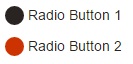
<div>
  <input type="radio" id="radio01" name="radio" />
  <label for="radio01"><span></span>Radio Button 1</label>
</div>

<div>
 <input type="radio" id="radio02" name="radio" />
 <label for="radio02"><span></span>Radio Button 2</label>
</div>
зӯ”жЎҲ 13 :(еҫ—еҲҶпјҡ1)
жӯЈеҰӮе…¶д»–дәәжүҖиҜҙпјҢжІЎжңүеҠһжі•еңЁжүҖжңүжөҸи§ҲеҷЁдёӯе®һзҺ°иҝҷдёҖзӮ№пјҢжүҖд»Ҙиҝҷж ·еҒҡзҡ„жңҖеҘҪж–№жі•жҳҜжөҸи§ҲеҷЁдҪҝз”ЁjavascriptдёҚеј•дәәжіЁзӣ®гҖӮеҹәжң¬дёҠдҪ еҝ…йЎ»е°ҶдҪ зҡ„radiobuttonеҸҳжҲҗй“ҫжҺҘпјҲе®Ңе…ЁеҸҜд»ҘйҖҡиҝҮCSSе®ҡеҲ¶пјүгҖӮжҜҸж¬ЎзӮ№еҮ»й“ҫжҺҘйғҪе°Ҷз»‘е®ҡеҲ°зӣёе…ізҡ„radioboxпјҢеҲҮжҚўд»–зҡ„зҠ¶жҖҒе’ҢжүҖжңүе…¶д»–гҖӮ
зӯ”жЎҲ 14 :(еҫ—еҲҶпјҡ1)
еҺҹз”ҹCSSж— жі•еҒҡеҲ°иҝҷдёҖзӮ№гҖӮдҪ е°ҶдёҚеҫ—дёҚдҪҝз”ЁиғҢжҷҜеӣҫзүҮе’ҢдёҖдәӣjavascriptжҠҖе·§гҖӮ
зӯ”жЎҲ 15 :(еҫ—еҲҶпјҡ0)
дёҖз§ҚиҒӘжҳҺзҡ„ж–№жі•жҳҜеҲӣе»әдёҖдёӘеҚ•зӢ¬зҡ„divпјҢй«ҳеәҰе’Ңе®ҪеәҰдёә-дҫӢеҰӮ-50pxпјҢ然еҗҺе°ҶеҚҠеҫ„50pxж”ҫзҪ®еңЁжӮЁзҡ„еҚ•йҖүжҢүй’®дёҠ...
зӯ”жЎҲ 16 :(еҫ—еҲҶпјҡ0)
жӮЁеҸҜд»Ҙе°Ҷspanе…ғзҙ еөҢе…ҘеҲ°еҚ•йҖүиҫ“е…ҘдёӯпјҢ然еҗҺйҖүжӢ©жӮЁиҰҒйҖүжӢ©зҡ„йўңиүІпјҢд»ҘеңЁйҖүдёӯеҚ•йҖүиҫ“е…Ҙж—¶е‘ҲзҺ°гҖӮиҜ·жҹҘзңӢд»ҘдёӢжқҘиҮӘw3schoolsзҡ„зӨәдҫӢгҖӮ
<!DOCTYPE html>
<html>
<style>
/* The container */
.container {
  display: block;
  position: relative;
  padding-left: 35px;
  margin-bottom: 12px;
  cursor: pointer;
  font-size: 22px;
  -webkit-user-select: none;
  -moz-user-select: none;
  -ms-user-select: none;
  user-select: none;
}

/* Hide the browser's default radio button */
.container input {
  position: absolute;
  opacity: 0;
  cursor: pointer;
}

/* Create a custom radio button */
.checkmark {
  position: absolute;
  top: 0;
  left: 0;
  height: 25px;
  width: 25px;
  background-color: #eee;
  border-radius: 50%;
}

/* On mouse-over, add a grey background color */
.container:hover input ~ .checkmark {
  background-color: #ccc;
}

/* When the radio button is checked, add a blue background */
.container input:checked ~ .checkmark {
  background-color: #00a80e;
}

/* Create the indicator (the dot/circle - hidden when not checked) */
.checkmark:after {
  content: "";
  position: absolute;
  display: none;
}

/* Show the indicator (dot/circle) when checked */
.container input:checked ~ .checkmark:after {
  display: block;
}

/* Style the indicator (dot/circle) */
.container .checkmark:after {
    top: 9px;
    left: 9px;
    width: 8px;
    height: 8px;
    border-radius: 50%;
    background: white;
}
</style>
<body>

<h1>Custom Radio Buttons</h1>
<label class="container">One
  <input type="radio" checked="checked" name="radio">
  <span class="checkmark"></span>
</label>
<label class="container">Two
  <input type="radio" name="radio">
  <span class="checkmark"></span>
</label>
<label class="container">Three
  <input type="radio" name="radio">
  <span class="checkmark"></span>
</label>
<label class="container">Four
  <input type="radio" name="radio">
  <span class="checkmark"></span>
</label>

</body>
еңЁдёӢйқўзҡ„жӯӨд»Јз Ғж®өдёӯжӣҙж”№иғҢжҷҜйўңиүІеҸҜд»Ҙи§ЈеҶій—®йўҳгҖӮ
/* When the radio button is checked, add a blue background */
.container input:checked ~ .checkmark {
  background-color: #00a80e;
}
зӯ”жЎҲ 17 :(еҫ—еҲҶпјҡ0)
е°ҶеҚ•йҖүжҢүй’®з»‘е®ҡеҲ°ж ·ејҸж ҮзӯҫеҸҜиғҪдјҡжңүжүҖеё®еҠ©гҖӮ this answerдёӯзҡ„иҜҰз»ҶдҝЎжҒҜгҖӮ
зӯ”жЎҲ 18 :(еҫ—еҲҶпјҡ0)
еҰӮжһңжӮЁдҪҝз”Ёзҡ„жҳҜ react bootstrap Form.checkпјҢжӮЁеҸҜд»Ҙиҝҷж ·еҒҡ
HTML
<Form.Check
type="radio"
id="Radio-card"
label={`check me out`}
name="paymentmethod"
value="card"
/>
SCSS
.form-check {
    display: flex;
    align-items: center;
    input[type="radio"] {
    -moz-appearance: none;
    appearance: none;

    width: 11px;
    height: 11px;
    padding: 1px;
    background-clip: content-box;
    border: 1px solid hotpink;
    background-color: white;
    border-radius: 50%;
    }

    input[type="radio"]:checked {
    outline: none;
    background-color: hotpink;
    border: 1px solid hotpink;
    }
    label {
    font-size: 14px;
    font-weight: 600;
    }
}
зӯ”жЎҲ 19 :(еҫ—еҲҶпјҡ0)
дёәдәҶжҲ‘зҡ„дҪҝз”ЁпјҢжҲ‘жғіеҒҡзҡ„е°ұжҳҜж”№еҸҳйўңиүІиҖҢдёҚжҳҜе…¶д»–д»»дҪ•дёңиҘҝпјҢжүҖд»ҘжҲ‘д»Һ@klewis йӮЈйҮҢеҫ—еҲ°дәҶзӯ”жЎҲ并е°Ҷе…¶жӣҙж”№дёә...
- дҪҝз”ЁзӣёеҜ№ % е’Ң em иҖҢдёҚжҳҜеӣәе®ҡзҡ„ px дҪҝ收йҹіжңәдёҺжөҸи§ҲеҷЁзҡ„й»ҳи®Өи®ҫзҪ®пјҲеңЁжҲ‘зҡ„дҫӢеӯҗдёӯжҳҜ ChromeпјүзӣёеҗҢгҖӮиӯҰе‘Ҡпјҡ em еҹәдәҺ
input[type=radio]зҡ„еӯ—дҪ“еӨ§е°ҸпјҢеҸҜд»Ҙ继жүҝгҖӮеҸҜиғҪйңҖиҰҒеҜ№д»ҘдёӢеҖјиҝӣиЎҢи°ғж•ҙгҖӮ - дёҚдҪҝз”Ё
display: none;并е°Ҷ:beforeе’Ң:afterеә”з”ЁеҲ°еҺҹе§ӢеҚ•йҖүжҢүй’®иҖҢдёҚжҳҜж ҮзӯҫпјҢд»ҺиҖҢдҝқз•ҷеҺҹе§ӢеҚ•йҖүжҢүй’®зҡ„иҫ…еҠ©еҠҹиғҪпјҲеҰӮиҒҡз„Ұж—¶зҡ„иҪ®е»“пјүгҖӮ< /li>
/* make default radio 'invisible' */
input[type=radio] {
  -webkit-appearance: none;
  -moz-appearance: none;
  appearance: none;
}

/* make new radio outer circle */
input[type=radio]:before {
  content: " ";
  display: inline-block;
  position: relative;
  width: 0.8em;
  height: 0.8em;
  border-radius: 50%;
  border: 1px solid grey;
  background-color: transparent;
}

/* change colour of radio outer circle when checked */
input[type=radio]:checked:before {
  border-color: green;
}

/* make new radio inner circle when checked */
input[type=radio]:checked:after {
  content: " ";
  display: block;
  position: absolute;
  width: 0.55em;
  height: 0.55em;
  border-radius: 50%;
  top: 0.4em;
  left: 0.13em;
  background: green;
}
`
зӯ”жЎҲ 20 :(еҫ—еҲҶпјҡ-1)
дёҖдёӘз®ҖеҚ•зҡ„и§ЈеҶіж–№жі•жҳҜдҪҝз”Ёд»ҘдёӢCSSеұһжҖ§гҖӮ
input[type=radio]:checked{
    background: \*colour*\;
    border-radius: 15px;
    border: 4px solid #dfdfdf;
}
- еҰӮдҪ•жӣҙж”№еҚ•йҖүжҢүй’®зҡ„йўңиүІпјҹ
- еҰӮдҪ•жӣҙж”№жҢүй’®зҡ„йўңиүІпјҹ
- дҪҝз”ЁеҚ•йҖүжҢүй’®жӣҙж”№иғҢжҷҜйўңиүІ
- еҰӮдҪ•жӣҙж”№еҚ•йҖүжҢүй’®зҡ„йўңиүІе’Ңж ·ејҸ
- еҰӮдҪ•жӣҙж”№еҚ•йҖүжҢүй’®зҡ„йўңиүІпјҢеңЁеҚ•йҖүжҢүй’®дёӯж·»еҠ еӨҡз§ҚйўңиүІ
- еҰӮдҪ•дҪҝз”ЁдёҖз»„еҚ•йҖүжҢүй’®жӣҙж”№иғҢжҷҜйўңиүІпјҹ
- еҰӮдҪ•жӣҙж”№еҚ•йҖүжҢүй’®зҡ„ж–Үжң¬йўңиүІпјҹ
- еҰӮдҪ•жӣҙж”№жҢүй’®зҡ„йўңиүІhtml / javascript
- дҪҝз”Ёе…¶д»–еҚ•йҖүжҢүй’®жӣҙж”№еҚ•йҖүжҢүй’®зҡ„еҖј
- жӣҙж”№еӯ—дҪ“йўңиүІonclickеҚ•йҖүжҢүй’®
- жҲ‘еҶҷдәҶиҝҷж®өд»Јз ҒпјҢдҪҶжҲ‘ж— жі•зҗҶи§ЈжҲ‘зҡ„й”ҷиҜҜ
- жҲ‘ж— жі•д»ҺдёҖдёӘд»Јз Ғе®һдҫӢзҡ„еҲ—иЎЁдёӯеҲ йҷӨ None еҖјпјҢдҪҶжҲ‘еҸҜд»ҘеңЁеҸҰдёҖдёӘе®һдҫӢдёӯгҖӮдёәд»Җд№Ҳе®ғйҖӮз”ЁдәҺдёҖдёӘз»ҶеҲҶеёӮеңәиҖҢдёҚйҖӮз”ЁдәҺеҸҰдёҖдёӘз»ҶеҲҶеёӮеңәпјҹ
- жҳҜеҗҰжңүеҸҜиғҪдҪҝ loadstring дёҚеҸҜиғҪзӯүдәҺжү“еҚ°пјҹеҚўйҳҝ
- javaдёӯзҡ„random.expovariate()
- Appscript йҖҡиҝҮдјҡи®®еңЁ Google ж—ҘеҺҶдёӯеҸ‘йҖҒз”өеӯҗйӮ®д»¶е’ҢеҲӣе»әжҙ»еҠЁ
- дёәд»Җд№ҲжҲ‘зҡ„ Onclick з®ӯеӨҙеҠҹиғҪеңЁ React дёӯдёҚиө·дҪңз”Ёпјҹ
- еңЁжӯӨд»Јз ҒдёӯжҳҜеҗҰжңүдҪҝз”ЁвҖңthisвҖқзҡ„жӣҝд»Јж–№жі•пјҹ
- еңЁ SQL Server е’Ң PostgreSQL дёҠжҹҘиҜўпјҢжҲ‘еҰӮдҪ•д»Һ第дёҖдёӘиЎЁиҺ·еҫ—第дәҢдёӘиЎЁзҡ„еҸҜи§ҶеҢ–
- жҜҸеҚғдёӘж•°еӯ—еҫ—еҲ°
- жӣҙж–°дәҶеҹҺеёӮиҫ№з•Ң KML ж–Ү件зҡ„жқҘжәҗпјҹ