按列拆分html表到各个表
我有一个html表,如下所示:
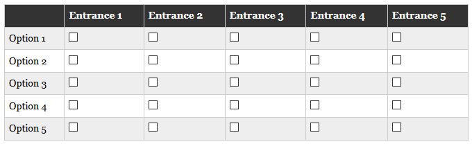
我想按照以下图片折叠移动宽度查看的每一列:
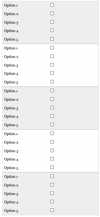
我遇到的问题是表格每行折叠而非列。有人可以指出我正确的方向,还是有更简单的方法来实现这一目标?
折叠后还可以显示表格标题“入口1”等吗?
我在下面提供了我的代码,非常感谢
HTML:
<div id="page-wrap">
<table>
    <thead>
    <tr>
        <th class="one"></th>
        <th>Entrance 1</th>
        <th>Entrance 2</th>
        <th>Entrance 3</th>
        <th>Entrance 4</th>
        <th>Entrance 5</th>
    </tr>
    </thead>
    <tbody>
    <tr>
        <td class="one">Option 1</td>
        <td><input type="checkbox"></td>
        <td><input type="checkbox"></td>
        <td><input type="checkbox"></td>
        <td><input type="checkbox"></td>
        <td><input type="checkbox"></td>
    </tr>
    <tr>
      <td class="one">Option 2</td>
        <td><input type="checkbox"></td>
        <td><input type="checkbox"></td>
        <td><input type="checkbox"></td>
        <td><input type="checkbox"></td>
        <td><input type="checkbox"></td>
    </tr>
    <tr>
      <td class="one">Option 3</td>
        <td><input type="checkbox"></td>
        <td><input type="checkbox"></td>
        <td><input type="checkbox"></td>
        <td><input type="checkbox"></td>
        <td><input type="checkbox"></td>
    </tr>
    <tr>
      <td class="one">Option 4</td>
        <td><input type="checkbox"></td>
        <td><input type="checkbox"></td>
        <td><input type="checkbox"></td>
        <td><input type="checkbox"></td>
        <td><input type="checkbox"></td>
    </tr>
    <tr>
      <td class="one">Option 5</td>
        <td><input type="checkbox"></td>
        <td><input type="checkbox"></td>
        <td><input type="checkbox"></td>
        <td><input type="checkbox"></td>
        <td><input type="checkbox"></td>
    </tr>
    </tbody>
</table>
</div>
CSS:
<style>


@media
only screen and (max-width: 760px),
(min-device-width: 768px) and (max-device-width: 1024px)  {

        .one{
        display: none;
    }

    /* Force table to not be like tables anymore */
    table, thead, tbody, th, td, tr {
        display: block;
    }

    /* Hide table headers (but not display: none;, for accessibility) */
    thead tr {
        position: absolute;
        top: -9999px;
        left: -9999px;
    }

    tr { border: 1px solid #ccc; }

    td {
        /* Behave  like a "row" */
        border: none;
        border-bottom: 1px solid #eee;
        position: relative;
        padding-left: 50%;
    }

    td:before {
        /* Now like a table header */
        position: absolute;
        /* Top/left values mimic padding */
        top: 6px;
        left: 6px;
        width: 45%;
        padding-right: 10px;
        white-space: nowrap;
    }

    /*
    Label the data
    */
    td:nth-of-type(2):before { content: "Option 1"; }
    td:nth-of-type(3):before { content: "Option 2"; }
    td:nth-of-type(4):before { content: "Option 3"; }
    td:nth-of-type(5):before { content: "Option 4"; }
    td:nth-of-type(6):before { content: "Option 5"; }

}

/* Smartphones (portrait and landscape) ----------- */
@media only screen
and (min-device-width : 320px)
and (max-device-width : 480px) {
        .one{
        display: none;
    }

    body {
        padding: 0;
        margin: 0;
        width: 320px; }
    }

/* iPads (portrait and landscape) ----------- */
@media only screen and (min-device-width: 768px) and (max-device-width: 1024px) {
        .one{
        display: none;
    }
    body {
        width: 495px;
    }
}

</style>
1 个答案:
答案 0 :(得分:0)
为什么不做这样的事情,你只需编辑包含复选框的单元格,以显示与之关联的入口。
&#13;
&#13;
&#13;
&#13;
@media
only screen and (max-width: 760px),
(min-device-width: 768px) and (max-device-width: 1024px)  {

        .one{
        display: none;
    }

    /* Force table to not be like tables anymore */
    table, tbody, th, td, tr {
        display: block;
    }
    thead{display:none;}

    /* Hide table headers (but not display: none;, for accessibility) */
    thead td {
        position: absolute;
        top: -9999px;
        left: -9999px;
    }

    td { border: 1px solid #ccc; }

    tr {
        /* Behave  like a "row" */
        border: none;
        border-bottom: 1px solid #eee;
        position: relative;
        padding-left: 50%;
    }

    tr:before {
        /* Now like a table header */
        position: absolute;
        /* Top/left values mimic padding */
        top: 6px;
        left: 6px;
        width: 45%;
        padding-right: 10px;
        white-space: nowrap;
    }

    /*
    Label the data
    */
    tr:nth-of-type(1):before { content: "Option 1"; }
    tr:nth-of-type(2):before { content: "Option 2"; }
    tr:nth-of-type(3):before { content: "Option 3"; }
    tr:nth-of-type(4):before { content: "Option 4"; }
    tr:nth-of-type(5):before { content: "Option 5"; }
}

/* Smartphones (portrait and landscape) ----------- */
@media only screen
and (min-device-width : 320px)
and (max-device-width : 480px) {
        .one{
        display: none;
    }

    body {
        padding: 0;
        margin: 0;
        width: 320px; }
    }

/* iPads (portrait and landscape) ----------- */
@media only screen and (min-device-width: 768px) and (max-device-width: 1024px) {
        .one{
        display: none;
    }
    body {
        width: 495px;
    }
}
<div id="page-wrap">
<table>
<thead>
<tr>
<th class="one"></th>
<th>Entrance 1</th>
<th>Entrance 2</th>
<th>Entrance 3</th>
<th>Entrance 4</th>
<th>Entrance 5</th>
</tr>
</thead>
<tbody>
<tr>
<td class="one">Option 1</td>
<td><input type="checkbox"></td>
<td><input type="checkbox"></td>
<td><input type="checkbox"></td>
<td><input type="checkbox"></td>
<td><input type="checkbox"></td>
</tr>
<tr>
<td class="one">Option 2</td>
<td><input type="checkbox"></td>
<td><input type="checkbox"></td>
<td><input type="checkbox"></td>
<td><input type="checkbox"></td>
<td><input type="checkbox"></td>
</tr>
<tr>
<td class="one">Option 3</td>
<td><input type="checkbox"></td>
<td><input type="checkbox"></td>
<td><input type="checkbox"></td>
<td><input type="checkbox"></td>
<td><input type="checkbox"></td>
</tr>
<tr>
<td class="one">Option 4</td>
<td><input type="checkbox"></td>
<td><input type="checkbox"></td>
<td><input type="checkbox"></td>
<td><input type="checkbox"></td>
<td><input type="checkbox"></td>
</tr>
<tr>
<td class="one">Option 5</td>
<td><input type="checkbox"></td>
<td><input type="checkbox"></td>
<td><input type="checkbox"></td>
<td><input type="checkbox"></td>
<td><input type="checkbox"></td>
</tr>
</tbody>
</table>
</div>
相关问题
最新问题
- 我写了这段代码,但我无法理解我的错误
- 我无法从一个代码实例的列表中删除 None 值,但我可以在另一个实例中。为什么它适用于一个细分市场而不适用于另一个细分市场?
- 是否有可能使 loadstring 不可能等于打印?卢阿
- java中的random.expovariate()
- Appscript 通过会议在 Google 日历中发送电子邮件和创建活动
- 为什么我的 Onclick 箭头功能在 React 中不起作用?
- 在此代码中是否有使用“this”的替代方法?
- 在 SQL Server 和 PostgreSQL 上查询,我如何从第一个表获得第二个表的可视化
- 每千个数字得到
- 更新了城市边界 KML 文件的来源?