使用transform来改变div的形状
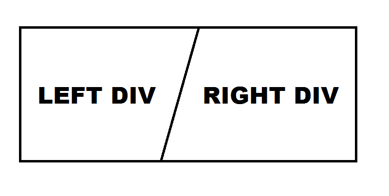
我正在尝试创建一个页面,其中包含' background'由两个不同的div组成。目前,它们被垂直线分开,我试图将其改为对角线,代表下图:
然而,似乎我无法正常使用它。我的HTML文件如下:
<!DOCTYPE html>
<html>
  <head>
    <title>Studenten Opiniepanel</title>

    <link rel="stylesheet" type="text/css" href="css/main.css">
  </head>

  <body>
    <section class="container">
      <div class="left-half">
        <article>
          <img src="img/logo-hsv-white.png" alt="Hanze Studentenbelangen Vereniging" />
          <h1>Student aan de Hanzehogeschool Groningen?</h1>

          <button class="subscribe" id="hsv">Inschrijven voor het Studenten Opiniepanel</button>

    </article>
  </div>
      <div class="right-half">
        <article>
          <img src="img/logo-sog-white.png" alt="Studenten Organisatie Groningen" />
          <h1>Student aan de Rijksuniversiteit Groningen?</h1>

          <button class="subscribe" id="sog">Inschrijven voor het Studenten Opiniepanel</button>

        </article>
      </div>
    </section>
  </body>
</html>
我的CSS:
html, body {
  margin: 0;
  padding: 0;
}

* {
  box-sizing: border-box;
}

body {
  font-size: 1.25rem;
  font-family: sans-serif;
  line-height: 150%;
  text-shadow: 0 2px 2px #b6701e;
}

section {
  color: #fff;
  text-align: center;
}

div {
  height: 100%;
}

article {
  position: absolute;
  top: 50%;
  left: 50%;
  transform: translate(-50%, -50%);
  width: 100%;
  padding: 20px;
}

h1 {
  font-size: 1.75rem;
  margin: 0 0 0.75rem 0;
}

.container {
  display: table;
  width: 100%;
}

.left-half {
  background: #f49800;
  position: absolute;
  left: 0px;
  width: 50%;
}

.right-half {
  background: #F38E09;
  position: absolute;
  right: 0px;
  width: 50%;
}
我已经尝试过使用transform: skew(),但这只能完成一半的工作。实现我在图像中绘制的内容的最佳方法是什么?
2 个答案:
答案 0 :(得分:2)
试试这个:
HTML
<div id="container"></div>
CSS
#container {
  position: relative;
  height: 200px;
  width: 200px;
  overflow: hidden;
  background-color: grey;
}

#container:before {
  content: '';
  position: absolute;
  left: 35%;
  width: 200%;
  height: 200%;
  background-color: rgb(255, 255, 255); /* fallback */
  background-color: rgba(255, 255, 255, 0.5);
  top: 0;
  -webkit-transform: rotate(25deg);
  -moz-transform: rotate(25deg);
  transform: rotate(25deg);
}
这是一个Fiddle来演示它。根据需要进行调整。
答案 1 :(得分:0)
我设置了你尝试过的偏斜,并调整了一些定位。
结果如下:
&#13;
&#13;
&#13;
&#13;
.container {
  display: table;
  width: 100%;
}
.half {
  position: absolute;
  width: 50%;
  transform: skewX(-15deg);
}
.right-half {
  left: 50%;
  background: lightblue;
  box-shadow: 100px 0px 0px lightblue;
  overflow: hidden;
}
.left-half {
  right: 50%;
  background: lightgreen;
  box-shadow: -100px 0px 0px lightgreen;
}
article {
  position: absolute;
  top: 50%;
  left: 50%;
  transform: translate(-50%, -50%) skewX(15deg);
  ransform: translate(-50%, -50%);
  width: 100%;
}
html,
body {
  margin: 0;
  padding: 0;
}
* {
  box-sizing: border-box;
}
body {
  font-size: 1.25rem;
  font-family: sans-serif;
  line-height: 150%;
  text-shadow: 0 2px 2px #b6701e;
}
section {
  color: #fff;
  text-align: center;
}
div {
  height: 100%;
}
h1 {
  font-size: 1.75rem;
  margin: 0 0 0.75rem 0;
}
<section class="container">
<div class="half left-half">
<article>
<img src="http://lorempixel.com/400/200" alt="Hanze Studentenbelangen Vereniging" />
<h1>Student aan de Hanzehogeschool Groningen?</h1>
<button class="subscribe" id="hsv">Inschrijven voor het Studenten Opiniepanel</button>
</article>
</div>
<div class="half right-half">
<article>
<img src="http://lorempixel.com/400/200" alt="Studenten Organisatie Groningen" />
<h1>Student aan de Rijksuniversiteit Groningen?</h1>
<button class="subscribe" id="sog">Inschrijven voor het Studenten Opiniepanel</button>
</article>
</div>
</section>
相关问题
最新问题
- 我写了这段代码,但我无法理解我的错误
- 我无法从一个代码实例的列表中删除 None 值,但我可以在另一个实例中。为什么它适用于一个细分市场而不适用于另一个细分市场?
- 是否有可能使 loadstring 不可能等于打印?卢阿
- java中的random.expovariate()
- Appscript 通过会议在 Google 日历中发送电子邮件和创建活动
- 为什么我的 Onclick 箭头功能在 React 中不起作用?
- 在此代码中是否有使用“this”的替代方法?
- 在 SQL Server 和 PostgreSQL 上查询,我如何从第一个表获得第二个表的可视化
- 每千个数字得到
- 更新了城市边界 KML 文件的来源?