Bootstrap在行/列中显示空白
我的网页中有一种情况,行/列中的项目设置(基于引导程序)显示不应该的空白区域。请参考此图片:
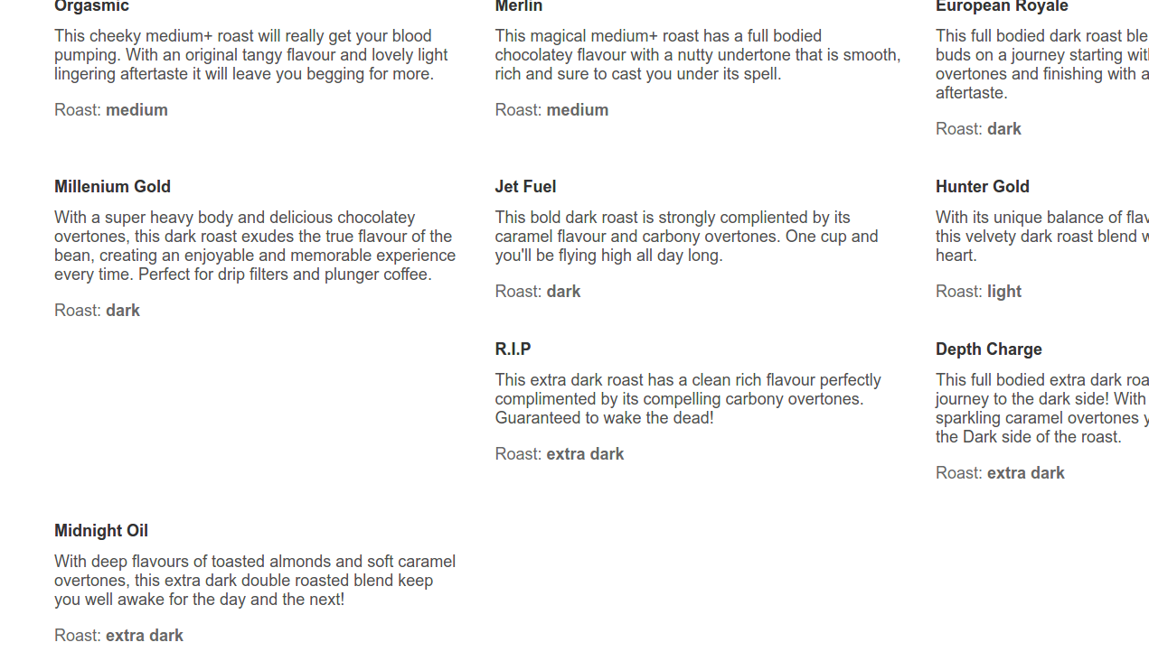
它是一个容器div,有一个行div,然后是一大堆列(确切地说:col-lg-4)。
“Millenium Gold”和“Midnight Oil”之间的垂直白色空间不应该存在。
我认为这不重要,但我使用React(即Javascript)构建页面。
我希望任何人都可以对此有所了解。
谢谢!
[更新]
以下是此页面的控制台输出:

这是我的额外CSS:
html {
    height: 100%;
}

body {
    margin: 0;
    padding: 0;
    font: 140% sans-serif;
}

input {
    font-size: 110%;
    outline: 0;
}

.jumbotron {
    color: #eee;
    background-color: #333;
}

.navbar-menu {
    padding-top: 5px;
    padding-bottom: 5px;
    margin-bottom: 0;
}

.search-bar-wrapper {
    width: 100%;
}

.blend-item {
    padding-top: 15px;
    padding-bottom: 15px;
}

.blend-item-name {
}

.blend-item-descr {
    color: rgba(0, 0, 0, 0.7);
    padding-top: 10px;
}

.blend-item-roast {
    padding-top: 15px;
    padding-bottom: 5px;
    color: rgba(0, 0, 0, 0.6);
}

.result-item {
    padding-bottom: 30px;
}

.result-item h5 {
    color: rgba(0, 0, 0, 0.6);
}

.result-item-content h2 {
    margin-top: -6px;
}

.result-item h2 small {
    color: rgba(0, 0, 0, 0.7);
}

.result-item-content {
    background-color: #FFFAF0;
    outline: 1px solid rosybrown;
    padding: 15px 15px 15px 30px;
}

.result-item-content hr {
    display: block;
    height: 1px;
    border: 0;
    border-top: 1px solid rosybrown;
    margin-bottom: 12px;
    padding: 0;
}

.result-item-content ul.list-inline li {
    color: rgba(6, 10, 26, 0.7);
}

@media screen and (min-width: 640px) {
    .search-bar-wrapper {
        min-width: 480px;
        width: 40%;
    }
}

.search-bar-field {
    position: relative;
}

.search-bar-input {
    -webkit-appearance: none;
    border: 1px solid #ddd;
    border-radius: 2px;
    box-sizing: border-box;
    margin: 0;
    padding: 10px 40px 10px 10px;
    width: 100%;
}

.has-suggestions .search-bar-input {
    border-bottom-left-radius: 0;
    border-bottom-right-radius: 0;
}

.icon {
    background-position: center center;
    background-repeat: no-repeat;
    border: 0;
    cursor: pointer;
    font-size: 0;
    height: 100%;
    outline: 0;
    padding: 0;
    position: absolute;
    right: 0;
    top: 0;
    width: 25px;
}

.search-bar-clear {
    background-image: url(../public/img/cancel.svg);
    background-size: 25%;
    right: 40px;
    width: 40px;
}

.search-bar-submit {
    background-color: #e5e5e5;
    background-image: url(../public/img/search.svg);
    background-size: 35%;
    border: 1px solid #ddd;
    border-top-right-radius: 2px;
    border-bottom-right-radius: 2px;
    padding: 0 20px;
    opacity: .8;
    width: 40px;
}

.search-bar-submit:hover {
    opacity: 1;
}

.is-focused .search-bar-input,
.is-focused .search-bar-submit {
    border-color: #ccc;
}

.search-bar-suggestions {
    border: 1px solid #ccc;
    border-bottom-left-radius: 2px;
    border-bottom-right-radius: 2px;
    box-sizing: border-box;
    font-size: 100%;
    list-style: none;
    margin: 0;
    padding: 0;
    position: relative;
    top: -1px;
}

.search-bar-suggestions li {
    cursor: default;
    letter-spacing: 0.03em;
    padding: 12px 7px 12px 10px;
    -webkit-tap-highlight-color: transparent;
}

.search-bar-suggestions li:last-child {
    border: none;
}

.search-bar-suggestions .highlighted {
    background: #f5f5f5;
}

.search-header {
    width: 100%;
}

.logo-home {
    margin-left: 72px;
}

.logo {
    float: left;
}
.logo ::after {
    clear: both;
}

.search-box {
    margin-top: 60px;
}

.results-header {
    font-family: "serif";
    margin-bottom: 20px;
}
.results-header h3 {
    font-size: 18px;
}

.results-body {
}

.results-box {
    float: left;
    margin-top: 60px;
}
.results-box ::after {
    clear: both;
}

.cafe-box {
    float: left;
    margin-top: 20px;
}

.cafe-info-beans {
    margin-top: 50px;
}

.bean-box {
    float: left;
    margin-top: 20px;
}

.bean-image {
    margin-top: 10px;
    margin-bottom: 20px;
}

.imaginary-container {
    margin-top: 20%;
}

.leftimage {
    float:left;
}

.righttext {
    margin-left: 60px;
    float: none;
}

.righttext h2 {
    margin-top: 15px;
}

.hcenter {
    text-align: center;
}

.vcenter {
    min-height: 60%;  /* Fallback for vh unit */
    min-height: 60vh; /* You might also want to use
                        'height' property instead.

                        Note that for percentage values of
                        'height' or 'min-height' properties,
                        the 'height' of the parent element
                        should be specified explicitly.

                        In this case the parent of '.vertical-center'
                        is the <body> element */

    /* Make it a flex container */
    display: -webkit-box;
    display: -moz-box;
    display: -ms-flexbox;
    display: -webkit-flex;
    display: flex;

    /* Align the bootstrap's container vertically */
    -webkit-box-align : center;
    -webkit-align-items : center;
    -moz-box-align : center;
    -ms-flex-align : center;
    align-items : center;

    /* In legacy web browsers such as Firefox 9
       we need to specify the width of the flex container */
    width: 100%;

    /* Also 'margin: 0 auto' doesn't have any effect on flex items in such web browsers
       hence the bootstrap's container won't be aligned to the center anymore.

       Therefore, we should use the following declarations to get it centered again */
    -webkit-box-pack : center;
    -moz-box-pack : center;
    -ms-flex-pack : center;
    -webkit-justify-content : center;
    justify-content : center;
}
2 个答案:
答案 0 :(得分:1)
float: left CSS属性值的不可避免的影响刻在Bootstrap 3的每个col-•类名中。请参阅this Codepen,或者只是尝试以下代码:
<div class="container">
  <div class="row">
    <div class="col-sm-4">
      <div class="big-and-tall"></div>
    </div>
    <div class="col-sm-4">
      <div class="big-and-short"></div>
    </div>
    <div class="col-sm-4">
      <div class="big-and-short"></div>
    </div>
    <div class="col-sm-4">
      <div class="big-and-kinda-tall"></div>
    </div>
    <div class="col-sm-4">
      <div class="big-and-short"></div>
    </div>
    <div class="col-sm-4">
      <div class="big-and-short"></div>
    </div>
    <div class="col-sm-4">
      <div class="big-and-kinda-tall"></div>
    </div>
  </div>
</div>
和
.big-and-tall {
  width: calc(100% - 20px);
  height: 500px;
  margin: 10px;
  background-color: green;
}

.big-and-short {
  width: calc(100% - 20px);
  height: 200px;
  margin: 10px;
  background-color: red;
}

.big-and-kinda-tall {
  width: calc(100% - 20px);
  height: 300px;
  margin: 10px;
  background-color: brown;
}
问题是&#34;大而有点高&#34;元素想要适应“大而高”的某个地方。但前面的元素限制了前者的最高边界及其底线。
您可以将cols的每个三元组放入单独的行中,也可以使用依赖于Flexbox规则的Bootstrap 4:请参阅how it would look like in another Codepen。
答案 1 :(得分:0)
您的列的高度不同,所有列都在一行内,因此您需要清除指定的第n列断点的浮点数并更正媒体查询。
@media (min-width: 1200px) {
  .blend-item:nth-child(3n+1) {
    clear: left;
  }
}
工作示例:
@media (min-width: 1200px) {
  .blend-item:nth-child(3n+1) {
    clear: left;
  }
}
<link href="https://maxcdn.bootstrapcdn.com/bootstrap/3.3.7/css/bootstrap.min.css" rel="stylesheet" />
<div class="container">
<div class="row">
<div class="col-lg-4 blend-item">
<h1>ONE</h1>
<p>Lorem Ipsum has been the industry's standard dummy text ever since the 1500s</p>
<h4>Lorem Ipsum has been the industry's</h4>
</div>
<div class="col-lg-4 blend-item">
<h1>TWO</h1>
<p>Lorem Ipsum has been the industry's standard dummy text ever since the 1500s. Lorem Ipsum has been the industry's standard dummy text ever since the 1500s. Lorem Ipsum has been the industry's standard dummy text ever since the 1500s</p>
<h4>Lorem Ipsum has been the industry's</h4>
</div>
<div class="col-lg-4 blend-item">
<h1>THREE</h1>
<p>Lorem Ipsum has been the industry's standard dummy text ever since the 1500s. Lorem Ipsum has been the industry's standard dummy text ever since the 1500s.</p>
<h4>Lorem Ipsum has been the industry's</h4>
</div>
<div class="col-lg-4 blend-item">
<h1>FOUR</h1>
<p>Lorem Ipsum has been the industry's standard dummy text ever since the 1500s</p>
<h4>Lorem Ipsum has been the industry's</h4>
</div>
<div class="col-lg-4 blend-item">
<h1>FIVE</h1>
<p>Lorem Ipsum has been the industry's standard dummy text ever since the 1500s. Lorem Ipsum has been the industry's standard dummy text ever since the 1500s. Lorem Ipsum has been the industry's standard dummy text ever since the 1500s.</p>
<h4>Lorem Ipsum has been the industry's</h4>
</div>
<div class="col-lg-4 blend-item">
<h1>SIX</h1>
<p>Lorem Ipsum has been the industry's standard dummy text ever since the 1500s. Lorem Ipsum has been the industry's standard dummy text ever since the 1500s. Lorem Ipsum has been the industry's standard dummy text ever since the 1500s.</p>
<h4>Lorem Ipsum has been the industry's</h4>
</div>
<div class="col-lg-4 blend-item">
<h1>SEVEN</h1>
<p>Lorem Ipsum has been the industry's standard dummy text ever since the 1500s. Lorem Ipsum has been the industry's standard dummy text ever since the 1500s. Lorem Ipsum has been the industry's standard dummy text ever since the 1500s.</p>
<h4>Lorem Ipsum has been the industry's</h4>
</div>
</div>
</div>
相关问题
最新问题
- 我写了这段代码,但我无法理解我的错误
- 我无法从一个代码实例的列表中删除 None 值,但我可以在另一个实例中。为什么它适用于一个细分市场而不适用于另一个细分市场?
- 是否有可能使 loadstring 不可能等于打印?卢阿
- java中的random.expovariate()
- Appscript 通过会议在 Google 日历中发送电子邮件和创建活动
- 为什么我的 Onclick 箭头功能在 React 中不起作用?
- 在此代码中是否有使用“this”的替代方法?
- 在 SQL Server 和 PostgreSQL 上查询,我如何从第一个表获得第二个表的可视化
- 每千个数字得到
- 更新了城市边界 KML 文件的来源?