Div的高度不会扩大
我一直在处理有关divs高度的一些问题。它甚至没有扩大,甚至认为是一个内容。让我先向您展示截图上的问题:
内容如下:

那就是容器:
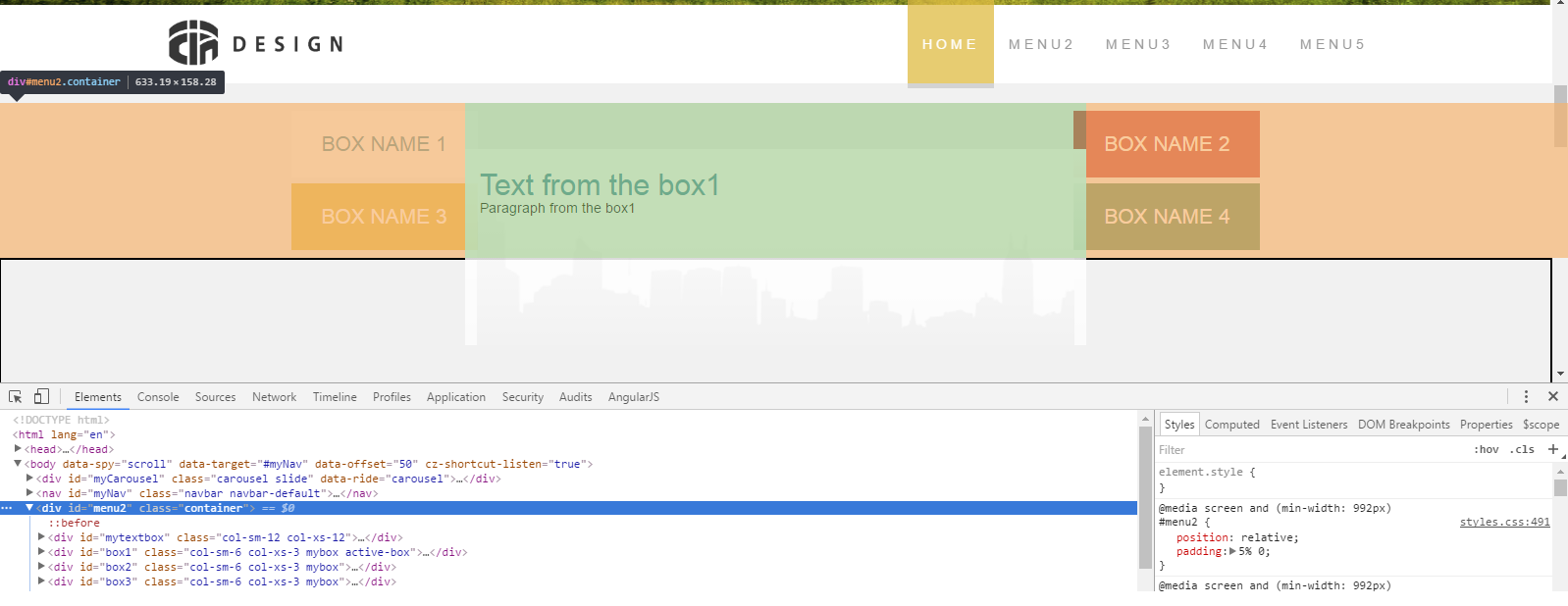
正如您所看到的,即使容器包含一些内容较长的元素,容器也很短。我尝试过添加" overflow:auto;"但它只是添加了一些滚动条..不知道我还能在这做什么..这是最重要的代码:
HTML:
<div id="menu2" class="container">
        <div id="mytextbox" class="col-sm-12 col-xs-12">

            <h2 id="h2Box1" style="visibility: visible">Text from the box1</h2>
            <h2 id="h2Box2" style="visibility: hidden">Text from the box2</h2>
            <h2 id="h2Box3" style="visibility: hidden">Text from the box3</h2>
            <h2 id="h2Box4" style="visibility: hidden">Text from the box4</h2>

            <p id="pBox1" style="visibility: visible">Paragraph from the box1</p>
            <p id="pBox2" style="visibility: hidden">Paragraph from the box2</p>
            <p id="pBox3" style="visibility: hidden">Paragraph from the box3</p>
            <p id="pBox4" style="visibility: hidden">Paragraph from the box4</p>

        </div>
        <div id="box1" class="col-sm-6 col-xs-3 mybox active-box">
            <span class="hidden-xs">BOX NAME 1</span>
            <span class="visible-xs">1</span>
        </div>

        <div id="box2" class="col-sm-6 col-xs-3 mybox">
            <span class="hidden-xs">BOX NAME 2</span>
            <span class="visible-xs">2</span>
        </div>
        <div id="box3" class="col-sm-6 col-xs-3 mybox">
            <span class="hidden-xs">BOX NAME 3</span>
            <span class="visible-xs">3</span>
        </div>
        <div id="box4" class="col-sm-6 col-xs-3 mybox">
            <span class="hidden-xs">BOX NAME 4</span>
            <span class="visible-xs">4</span>
        </div>
    </div>
CSS:
@media screen and (min-width: 992px) {

.container {
    display: flex;
    flex-flow: row wrap;
    width: 40%;
    margin-left: 30%;
    margin-right: 30%;
    padding-left: 0;
    padding-right: 0;
}

#menu2 {
    position: relative;
    padding: 5% 0;
}

.mybox {
        padding-top: 3%;
        padding-bottom: 3%;
        width: 30%;
        font-size: 1.5em;
    }

    #mytextbox {
        position:absolute;
        top: 30%;
        z-index: 2;
        order: 3;
        background:
            linear-gradient(
                rgba(255, 255, 255, 1),
                rgba(255, 255, 255, 0.7)
                ),
                url('./../images/Pattern.png') bottom no-repeat;
    }

    #box1 {
        position: absolute;
        top: 5%;
        order: 1;
        background-color: rgb(66,142,158);
        margin-right: 25%;
        margin-left: -28%;
    }

    #box2 {
        position: absolute;
        order: 2;
        background-color: rgb(196,52,52);
        margin-left: 30%;
        right: -28%;
        top: 5%;
    }
    #box3 {
        position: absolute;
        order: 4;
        background-color: rgb(223,187,66);
        margin-right: 30%;
        margin-left: -28%;
        bottom: 5%;

    }
    #box4 {
        position: absolute;
        order: 5;
        background-color: rgb(80,139,97);
        margin-left: 30%;
        right: -28%;
        bottom: 5%;
    }

}
如果您有任何想法,请帮忙!
更新: 这就是我想要实现的目标:

所以我只是在那个巨大的文本框周围设置那些盒子。当我意识到我在那里遇到了一些问题,当我把那些小的彩色盒子放在底部时,它实际上不是&#34;文本框&#34;的底部,而是它的父母的底部(&#34;容器&# 34)。事情是..我希望容器能够使用&#34;文本框&#34;所以他们的底部应该相等,然后我可以轻松地在它周围设置那些小盒子。
2 个答案:
答案 0 :(得分:1)
我不确定这是你想要的。但是,
position of `#mytextbox` div is absolute so container will never get its height.
我已经删除了媒体查询,因为这里输出的是在较小的屏幕上。您可以通过从position:absolute css
#mytextbox来尝试此操作
运行以下代码段。将输出窗口放大到全屏,以便您可以看到它将如何显示更大的屏幕。
&#13;
&#13;
&#13;
&#13;
.container {
    display: flex;
    flex-flow: row wrap;
    width: 40%;
    margin-left: 30%;
    margin-right: 30%;
    padding-left: 0;
    padding-right: 0;
}

#menu2 {
    position: relative;
    padding: 5% 0;
}

.mybox {
        padding-top: 3%;
        padding-bottom: 3%;
        width: 30%;
        font-size: 1.5em;
}

#mytextbox {
        top: 30%;
        z-index: 2;
        order: 3;
        border: 1px solid black;
        background:
            linear-gradient(
                rgba(255, 255, 255, 1),
                rgba(255, 255, 255, 0.7)
                ),
                url('./../images/Pattern.png') bottom no-repeat;
}

#box1 {
        position: absolute;
        top: 5%;
        order: 1;
        background-color: rgb(66,142,158);
        margin-right: 25%;
        margin-left: -28%;
}

#box2 {
        position: absolute;
        order: 2;
        background-color: rgb(196,52,52);
        margin-left: 30%;
        right: -28%;
        top: 5%;
}
#box3 {
        position: absolute;
        order: 4;
        background-color: rgb(223,187,66);
        margin-right: 30%;
        margin-left: -28%;
        bottom: 5%;

    }
#box4 {
        position: absolute;
        order: 5;
        background-color: rgb(80,139,97);
        margin-left: 30%;
        right: -28%;
        bottom: 5%;
}
<link href="https://maxcdn.bootstrapcdn.com/bootstrap/3.3.7/css/bootstrap.min.css" rel="stylesheet"/>
<div id="menu2" class="container">
<div id="mytextbox" class="col-sm-12 col-xs-12">
<h2 id="h2Box1" style="visibility: visible">Text from the box1</h2>
<h2 id="h2Box2" style="visibility: hidden">Text from the box2</h2>
<h2 id="h2Box3" style="visibility: hidden">Text from the box3</h2>
<h2 id="h2Box4" style="visibility: hidden">Text from the box4</h2>
<p id="pBox1" style="visibility: visible">Paragraph from the box1</p>
<p id="pBox2" style="visibility: hidden">Paragraph from the box2</p>
<p id="pBox3" style="visibility: hidden">Paragraph from the box3</p>
<p id="pBox4" style="visibility: hidden">Paragraph from the box4</p>
</div>
<div id="box1" class="col-sm-6 col-xs-3 mybox active-box">
<span class="hidden-xs">BOX NAME 1</span>
<span class="visible-xs">1</span>
</div>
<div id="box2" class="col-sm-6 col-xs-3 mybox">
<span class="hidden-xs">BOX NAME 2</span>
<span class="visible-xs">2</span>
</div>
<div id="box3" class="col-sm-6 col-xs-3 mybox">
<span class="hidden-xs">BOX NAME 3</span>
<span class="visible-xs">3</span>
</div>
<div id="box4" class="col-sm-6 col-xs-3 mybox">
<span class="hidden-xs">BOX NAME 4</span>
<span class="visible-xs">4</span>
</div>
</div>
答案 1 :(得分:0)
是的,这里做的是你使用的盒子有一个预定的高度和宽度,这是因为你使用前缀版本让它看起来与其他相同设备,如果你把overflow:auto放在它上面,它基本上会告诉div你需要更多的空间,因为它的前缀是它不能增加比现有更多的空间,这就是为什么你得到滚动条。您需要做的是删除您正在使用的javascript / css或将其设置为更大的框,例如col.sm.11,如果您需要更大的框,可以使用它。< / p>
相关问题
最新问题
- 我写了这段代码,但我无法理解我的错误
- 我无法从一个代码实例的列表中删除 None 值,但我可以在另一个实例中。为什么它适用于一个细分市场而不适用于另一个细分市场?
- 是否有可能使 loadstring 不可能等于打印?卢阿
- java中的random.expovariate()
- Appscript 通过会议在 Google 日历中发送电子邮件和创建活动
- 为什么我的 Onclick 箭头功能在 React 中不起作用?
- 在此代码中是否有使用“this”的替代方法?
- 在 SQL Server 和 PostgreSQL 上查询,我如何从第一个表获得第二个表的可视化
- 每千个数字得到
- 更新了城市边界 KML 文件的来源?