如何更改bootstrap响应式?
我们正计划以其他方式改变bootstrap的响应特性。请参阅当前的html
$(function () {
	$('.panel-title a').on('click', function () {
  	$(this).closest('.panel').siblings().toggle();
   });
 });
.panel-title a {
display: block;
text-align: center;
}
.panel-title a:active,
.panel-title a:focus,
.panel-title a:hover {
text-decoration: none;
}
.panel-title a:before {
content: "<";
position: absolute;
left: 30px;
}
.panel-title a.collapsed {
text-align: left;
}
.panel-title a.collapsed:before {
content: "";
}
.panel-title a.collapsed:after {
content: ">";
position: absolute;
right: 30px;
}
.panel-body {
animation: shake;
animation-duration: 1s;
}
@-webkit-keyframes shake {
from, to {
-webkit-transform: translate3d(0, 0, 0);
transform: translate3d(0, 0, 0);
}
10%, 30%, 50%, 70%, 90% {
-webkit-transform: translate3d(-10px, 0, 0);
transform: translate3d(-10px, 0, 0);
}
20%, 40%, 60%, 80% {
-webkit-transform: translate3d(10px, 0, 0);
transform: translate3d(10px, 0, 0);
}
}
@keyframes shake {
from, to {
-webkit-transform: translate3d(0, 0, 0);
transform: translate3d(0, 0, 0);
}
10%, 30%, 50%, 70%, 90% {
-webkit-transform: translate3d(-10px, 0, 0);
transform: translate3d(-10px, 0, 0);
}
20%, 40%, 60%, 80% {
-webkit-transform: translate3d(10px, 0, 0);
transform: translate3d(10px, 0, 0);
}
}
.shake {
-webkit-animation-name: shake;
animation-name: shake;
}<link rel="stylesheet" href="https://maxcdn.bootstrapcdn.com/bootstrap/3.3.7/css/bootstrap.min.css">
<script src="https://ajax.googleapis.com/ajax/libs/jquery/3.1.1/jquery.min.js"></script>
<script src="https://maxcdn.bootstrapcdn.com/bootstrap/3.3.7/js/bootstrap.min.js"></script>
<div class="col-md-6 col-sm-6 col-xs-12" style="overflow:hidden"><img src="http://designpieces.com/wp-content/uploads/2012/12/background-image.jpg"> </div>
<div class="col-md-6 col-sm-6 col-xs-12">
<div class="panel-group" id="accordion">
<div class="panel panel-default panel1">
<div class="panel-heading">
<h4 class="panel-title wobble">
<a data-toggle="collapse" data-parent="#accordion" id="tab1" href="#collapse1" class="collapsed">Tab1</a>
</h4>
</div>
<div id="collapse1" class="panel-collapse collapse">
<div class="panel-body">Lorem ipsum dolor sit amet, consectetur adipisicing elit,
sed do eiusmod tempor incididunt ut labore et dolore magna aliqua. Ut enim ad minim veniam,
quis nostrud exercitation ullamco laboris nisi ut aliquip ex ea commodo consequat.</div>
</div>
</div>
<div class="panel panel-default">
<div class="panel-heading">
<h4 class="panel-title">
<a data-toggle="collapse" data-parent="#accordion" href="#collapse2" class="collapsed">Tab2</a>
</h4>
</div>
<div id="collapse2" class="panel-collapse collapse">
<div class="panel-body">Lorem ipsum dolor sit amet, consectetur adipisicing elit,
sed do eiusmod tempor incididunt ut labore et dolore magna aliqua. Ut enim ad minim veniam,
quis nostrud exercitation ullamco laboris nisi ut aliquip ex ea commodo consequat.</div>
</div>
</div>
<div class="panel panel-default">
<div class="panel-heading">
<h4 class="panel-title">
<a data-toggle="collapse" data-parent="#accordion" href="#collapse3" class="collapsed">Tab3</a>
</h4>
</div>
<div id="collapse3" class="panel-collapse collapse">
<div class="panel-body">Lorem ipsum dolor sit amet, consectetur adipisicing elit,
sed do eiusmod tempor incididunt ut labore et dolore magna aliqua. Ut enim ad minim veniam,
quis nostrud exercitation ullamco laboris nisi ut aliquip ex ea commodo consequat.</div>
</div>
</div>
<div class="panel panel-default">
<div class="panel-heading">
<h4 class="panel-title">
<a data-toggle="collapse" data-parent="#accordion" href="#collapse4" class="collapsed">Tab4</a>
</h4>
</div>
<div id="collapse4" class="panel-collapse collapse">
<div class="panel-body">Lorem ipsum dolor sit amet, consectetur adipisicing elit,
sed do eiusmod tempor incididunt ut labore et dolore magna aliqua. Ut enim ad minim veniam,
quis nostrud exercitation ullamco laboris nisi ut aliquip ex ea commodo consequat.</div>
</div>
</div>
</div>
</div>
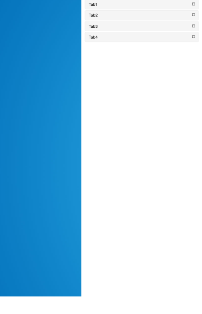
这里当调整窗口大小或在移动设备中查看时,列表组显示如下。请看图像
但是我们需要更改它。当窗口调整大小并且宽度小于某个数量时,我们希望在窗口的右侧部分(图像的右侧)显示箭头或设置图标。
请查看所需的输出

当我们点击设置图标时,图像将替换为 列表组中的内容带有关闭图标。因此,用户可以在没有图像的完整窗口中看到列表组,并且他可以操作所有操作。在此之后,他可以通过单击关闭按钮关闭该列表组。请帮忙解决这个问题。
1 个答案:
答案 0 :(得分:1)
当窗口调整大小并且宽度小于某个数量时,我们希望在窗口的右侧部分(图像的右侧)显示箭头或设置图标。
这可以通过添加带有所需图标的元素并使用Bootstrap的帮助类import random
from multiprocessing import Process, Queue
def af(q):
while True:
q.put(random.randint(0,1000))
def bf(q):
while True:
if not q.empty():
print (q.get())
def main():
a = Queue()
p = Process(target=af, args=(a,))
c = Process(target=bf, args=(a,))
p.start()
c.start()
p.join()
c.join()
if __name__ == "__main__":
main()
来实现,如:
visible-xs并将<span id="toggle" class="visible-xs"><i class="fa fa-cog fa-2x"></i></span>
添加到右栏,以便标签手风琴不会以相同的hidden-xs屏幕分辨率显示。
然后,您需要使用xs来检测窗口大小,如果窗口大小是一定大小或更小,它将允许触发(单击)cog图标来隐藏图像并显示标签内容。
如果您增加尺寸,图像会重新出现,并且标签会显示在右侧。
修改
在此之后,他可以通过单击关闭按钮关闭该列表组。
我知道你现在想要做什么。
所以,首先我将字体图标更改为与您的图像匹配的图标。
$(window).width()点击触发器最初只有在您调整窗口大小时才有效。您可以在<span id="toggle" class="visible-xs"><i class="fa fa-plus-square fa-2x">
函数之外添加相同的click事件来进行更正。 (参见更新后的JS中的评论)
因此,用户可以在标签和图片之间隐藏和显示(切换),您将使用.resize()并使用.toggle()更改图标图片
.toggleClass() 注意:保留$(this).children().toggleClass('fa-plus-square fa-minus-square');
功能,以便在大屏幕上调整窗口大小时,它仍可正常工作。正如Ron指出的那样,我还修复了.resize()函数以表现相同的。
而不是摇动如何将动画更改为从右向左滑动切换
<强> TLDR;
@keyframes允许您通过沿动画(https://developer.mozilla.org/en-US/docs/Web/CSS/@keyframes)建立航点来控制CSS动画序列中的中间步骤。我为您添加了.resize()关键帧规则,以查看其与抖动之间的差异。如果您希望在项目中实现这类内容,我建议您阅读@keyframes,以便将来可以创建自己的内容。
slideInRight$(function() {
$('.panel-title a').on('click', function() {
$(this).closest('.panel').siblings().toggle();
});
// this takes care of screensizes that start off at small sizes
// like tablets or mobile devices
$('#toggle').on('click', function() {
$(this).children().toggleClass('fa-plus-square fa-minus-square');
$(this).prev().toggle();
$(this).closest('div').siblings().toggleClass('hidden-xs');
});
// provide the same size affect and fall back on desktop sizes
// when resizing window.
$(window).resize(function() {
var windowSize = $(window).width();
if (windowSize < 768) { // BS breaking point for -xs
$('#toggle').on('click', function() {
$(this).children().toggleClass('fa-plus-square fa-minus-square');
$(this).prev().toggle();
$(this).closest('div').siblings().toggleClass('hidden-xs');
});
} else {
$('#toggle').prev().show();
$('#toggle').closest('div').siblings().addClass('hidden-xs');
}
});
});.panel-title a {
display: block;
text-align: center;
}
.panel-title a:active,
.panel-title a:focus,
.panel-title a:hover {
text-decoration: none;
}
.panel-title a:before {
content: "\f177";
font-family: "FontAwesome";
position: absolute;
left: 30px;
}
.panel-title a.collapsed {
text-align: left;
}
.panel-title a.collapsed:before {
content: "";
}
.panel-title a.collapsed:after {
content: "\f054";
font-family: "FontAwesome";
position: absolute;
right: 30px;
}
.panel-body {
animation: slideInRight;
animation-duration: 1s;
}
.img-container {
margin-bottom: 50px;
}
#toggle {
position: fixed;
top: 10px;
right: 20px;
}
@-webkit-keyframes slideInRight {
from {
-webkit-transform: translate3d(100%, 0, 0);
transform: translate3d(100%, 0, 0);
visibility: visible;
}
to {
-webkit-transform: translate3d(0, 0, 0);
transform: translate3d(0, 0, 0);
}
}
@keyframes slideInRight {
from {
-webkit-transform: translate3d(100%, 0, 0);
transform: translate3d(100%, 0, 0);
visibility: visible;
}
to {
-webkit-transform: translate3d(0, 0, 0);
transform: translate3d(0, 0, 0);
}
}
.slideInRight {
-webkit-animation-name: slideInRight;
animation-name: slideInRight;
}
@-webkit-keyframes shake {
from, to {
-webkit-transform: translate3d(0, 0, 0);
transform: translate3d(0, 0, 0);
}
10%, 30%, 50%, 70%, 90% {
-webkit-transform: translate3d(-10px, 0, 0);
transform: translate3d(-10px, 0, 0);
}
20%, 40%, 60%, 80% {
-webkit-transform: translate3d(10px, 0, 0);
transform: translate3d(10px, 0, 0);
}
}
@keyframes shake {
from, to {
-webkit-transform: translate3d(0, 0, 0);
transform: translate3d(0, 0, 0);
}
10%, 30%, 50%, 70%, 90% {
-webkit-transform: translate3d(-10px, 0, 0);
transform: translate3d(-10px, 0, 0);
}
20%, 40%, 60%, 80% {
-webkit-transform: translate3d(10px, 0, 0);
transform: translate3d(10px, 0, 0);
}
}
.shake {
-webkit-animation-name: shake;
animation-name: shake;
}
- 我写了这段代码,但我无法理解我的错误
- 我无法从一个代码实例的列表中删除 None 值,但我可以在另一个实例中。为什么它适用于一个细分市场而不适用于另一个细分市场?
- 是否有可能使 loadstring 不可能等于打印?卢阿
- java中的random.expovariate()
- Appscript 通过会议在 Google 日历中发送电子邮件和创建活动
- 为什么我的 Onclick 箭头功能在 React 中不起作用?
- 在此代码中是否有使用“this”的替代方法?
- 在 SQL Server 和 PostgreSQL 上查询,我如何从第一个表获得第二个表的可视化
- 每千个数字得到
- 更新了城市边界 KML 文件的来源?