如何使用css创建一个带模态的弹出动画?
我已经在css中创建了模态,但是当我尝试更改过渡以使其更像弹出模式而不是淡入时,它不起作用。我已经尝试过更改持续时间和转换类型,但它似乎不适用。我使用了错误的过渡吗?
请参阅小提琴:https://jsfiddle.net/mtbh24uL/
.popup {
  margin: 70px auto;
  padding: 20px;
  background: #fff;
  border-radius: 5px;
  width: 30%;
  position: relative;
  transition: all 5s ease-in-out;
}
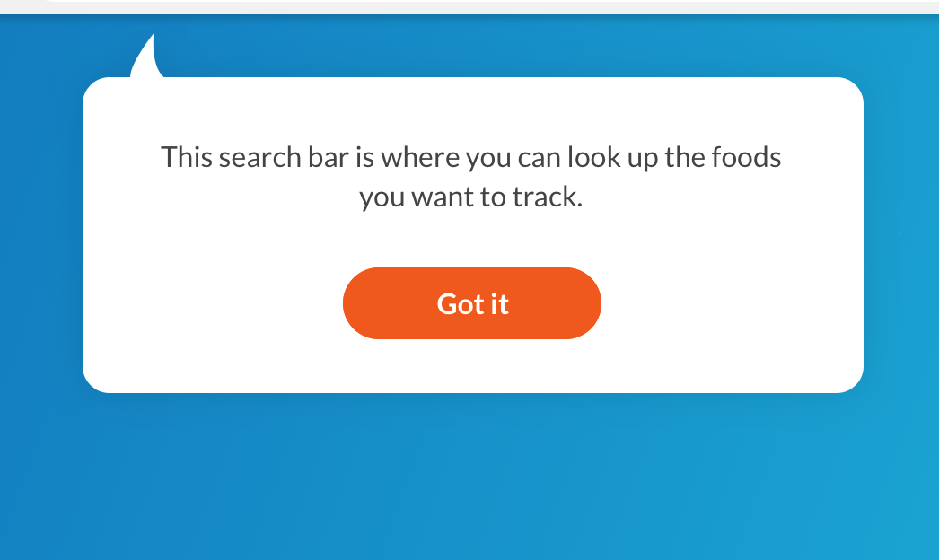
我的目标:拥有更多像真正的javascript模式一样的弹出效果。我基本上需要创建一个模态,如下图所示。我不确定最好的方法是什么或最好的插件。
2 个答案:
答案 0 :(得分:7)
您可以为此定义CSS动画,并在单击按钮时调用此动画。您可以通过添加以下CSS代码来实现此目的。这只是一个例子,可以让您大致了解效果的效果。从这一点开始,您甚至可以优化和微调动画。
<强> CSS
.overlay:target .popup{
  animation: popup 0.7s;
}

@keyframes popup {
  0%{
    transform: scale(1);
  }
  50%{
    transform: scale(1.4);
  }
  60%{
    transform: scale(1.1);
  }
  70%{
    transform: scale(1.2);
  }
  80%{
    transform: scale(1);
  }
  90%{
    transform: scale(1.1);
  }
  100%{
    transform: scale(1);
  }
}
body {
  font-family: Arial, sans-serif;
  background: url(http://www.shukatsu-note.com/wp-content/uploads/2014/12/computer-564136_1280.jpg) no-repeat;
  background-size: cover;
  height: 100vh;
}
h1 {
  text-align: center;
  font-family: Tahoma, Arial, sans-serif;
  color: #06D85F;
  margin: 80px 0;
}
.box {
  width: 40%;
  margin: 0 auto;
  background: rgba(255, 255, 255, 0.2);
  padding: 35px;
  border: 2px solid #fff;
  border-radius: 20px/50px;
  background-clip: padding-box;
  text-align: center;
}
.button {
  font-size: 1em;
  padding: 10px;
  color: #fff;
  border: 2px solid #06D85F;
  border-radius: 20px/50px;
  text-decoration: none;
  cursor: pointer;
  /* transition: all 0.3s ease-out; */
}
.button:hover {
  background: #06D85F;
}
.overlay {
  position: fixed;
  top: 0;
  bottom: 0;
  left: 0;
  right: 0;
  background: rgba(0, 0, 0, 0.7);
  transition: opacity 500ms;
  visibility: hidden;
  opacity: 0;
}
.overlay:target {
  visibility: visible;
  opacity: 1;
}
.popup {
  margin: 70px auto;
  padding: 20px;
  background: #fff;
  border-radius: 5px;
  width: 30%;
  position: relative;
  transition: all 5s ease-in-out;
}
.popup:after {
  content: '';
  position: absolute;
  bottom: 100%;
  width: 0;
  height: 0;
  border-style: solid;
  border-width: 0 20px 20px 20px;
  border-color: transparent transparent white transparent;
}
.overlay:target .popup {
  animation: popup 0.7s;
}
.popup h2 {
  margin-top: 0;
  color: #333;
  font-family: Tahoma, Arial, sans-serif;
}
.popup .close {
  position: absolute;
  top: 20px;
  right: 30px;
  transition: all 200ms;
  font-size: 30px;
  font-weight: bold;
  text-decoration: none;
  color: #333;
}
.popup .close:hover {
  color: #06D85F;
}
.popup .content {
  max-height: 30%;
  overflow: auto;
}
@media screen and (max-width: 700px) {
  .box {
    width: 70%;
  }
  .popup {
    width: 70%;
  }
}
@keyframes popup {
  0% {
    transform: scale(1);
  }
  50% {
    transform: scale(1.4);
  }
  60% {
    transform: scale(1.1);
  }
  70% {
    transform: scale(1.2);
  }
  80% {
    transform: scale(1);
  }
  90% {
    transform: scale(1.1);
  }
  100% {
    transform: scale(1);
  }
}
<h1>Popup/Modal Windows without JavaScript</h1>
<div class="box">
<a class="button" href="#popup1">Let me Pop up</a>
</div>
<div id="popup1" class="overlay">
<div class="popup">
<h2>Here i am</h2>
<a class="close" href="#">×</a>
<div class="content">
Thank to pop me out of that button, but now i'm done so you can close this window.
</div>
</div>
</div>
答案 1 :(得分:1)
在获取弯曲箭头时,您可以使用:after或:before伪元素。这样的事情会达到预期的效果:
<强> CSS
.popup:after {
  content: "";
  position: absolute;
  border: 0 solid transparent;
  border-left: 24px solid white;
  border-radius: 33px 0;
  top: -18px;
  left: 20px;
  width: 30px;
  height: 34px;
}
相关问题
最新问题
- 我写了这段代码,但我无法理解我的错误
- 我无法从一个代码实例的列表中删除 None 值,但我可以在另一个实例中。为什么它适用于一个细分市场而不适用于另一个细分市场?
- 是否有可能使 loadstring 不可能等于打印?卢阿
- java中的random.expovariate()
- Appscript 通过会议在 Google 日历中发送电子邮件和创建活动
- 为什么我的 Onclick 箭头功能在 React 中不起作用?
- 在此代码中是否有使用“this”的替代方法?
- 在 SQL Server 和 PostgreSQL 上查询,我如何从第一个表获得第二个表的可视化
- 每千个数字得到
- 更新了城市边界 KML 文件的来源?