使用Bootstrap垂直对齐图像与近div
我想垂直对齐一个图像与他的近div,div有一个动态高度,我在将图像放在中间时遇到了很多麻烦。 有我的代码:
<div class="row">
  <img class="col-sm-4 col-md-4" src="/img/height.svg"></img>
  <div class="col-sm-8 col-md-8"><span>Height</span><br/>335.00 mm</div>
</div>
结果是:
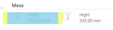
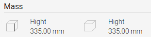
我希望图像位于div的中间,如下所示:
2 个答案:
答案 0 :(得分:3)
您可以使用flexbox:
.row {
  align-items: center;
  display: flex;
}
.row img {
  height: 25px;
  margin-right: 1rem;
  width: 25px;
}
答案 1 :(得分:2)
如果我理解正确你试图垂直对齐一个div,你还有另一个带有图像的div。
垂直对齐div的最佳方法是将图像作为背景图像放入,并为该div设置一个高度,以防止高度变得不动态。它可以让你更有控制力。例如;
<!-- Div with BG Image -->
<div class="col-sm-4 col-md-4">
   <div class="bg-image" style="background-image:url(/img/height.svg);"></div>
</div>

.bg-image {
   background-repeat: no-repeat;
   background-position: top center;
   background-size: cover;
   height: 250px; // this can be anything
}

<!-- Div to be centrally aligned -->
<div class="col-sm-4 col-md-4">
   <div class="bg-image-module">
     <div class="bg-image-module-block">
        <span>Height</span><br/>335.00 mm
     </div>
   </div>
</div>

Give the bg-image-module div these styles:

.bg-image-module {
   display: table;
   height: 250px; //this must be the same as the height on the bg-image div in order to vertically align the content.
}

.bg-image-module-block {
   display: table-cell;
   vertical-align: middle;
 }
这是垂直对齐内容的好方法,您可以将高度更改为您需要的任何内容,并且可以响应地更改。
相关问题
最新问题
- 我写了这段代码,但我无法理解我的错误
- 我无法从一个代码实例的列表中删除 None 值,但我可以在另一个实例中。为什么它适用于一个细分市场而不适用于另一个细分市场?
- 是否有可能使 loadstring 不可能等于打印?卢阿
- java中的random.expovariate()
- Appscript 通过会议在 Google 日历中发送电子邮件和创建活动
- 为什么我的 Onclick 箭头功能在 React 中不起作用?
- 在此代码中是否有使用“this”的替代方法?
- 在 SQL Server 和 PostgreSQL 上查询,我如何从第一个表获得第二个表的可视化
- 每千个数字得到
- 更新了城市边界 KML 文件的来源?